 Time-series decomposition is an important technique for time series analysis, especially for seasonal adjustment and trend strength measurement. Decomposition deconstructs a time series into several components, with each representing a certain pattern or characteristic. This post shows you how to use SAS® Visual Analytics to visually show the decomposition of a time series so that you can understand more about its underlying patterns.
Characteristics of time series decomposition
Time series decomposition generally splits a time series into three components: 1) a trend-cycle, which can be further decomposed into trend and cycle components; 2) seasonal; and 3) residual, in an additive or multiplicative fashion.
In additive decomposition, the cyclical, seasonal, and residual components are absolute deviations from the trend component, and they do not depend on trend level. In multiplicative decomposition, the cyclical, seasonal and residual components are relative deviations from the trend. Thus, we often see different magnitudes of seasonal, cyclical and residual components when comparing with the trend component, while the trend component keeps the same scale as the original series.
How to begin a time series decomposition
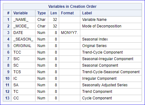
SAS provides several procedures for time series decomposition, I use the PROC Timeseries in this post. Now the first step is to decide whether to use additive or multiplicative decomposition. You know SAS PROC Timeseries provides multiplicative (MODE=MULT), additive (MODE=ADD), pseudo-additive (MODE=PSEUDOADD) and log-additive (MODE=LOGADD) decomposition. You can also use the default MODE option of MULTORADD to let SAS help you make a decision based on the feature of your data. Good thing is, you can always use the log transformation whenever there is a need to change a multiplicative relationship to an additive relationship. The plot option in PROC Timeseries can produce graphs of the generated trend-cycle component, seasonal component and residual component. In this post, I would like to output the OUTDECOMP dataset from PROC Timeseries, load the data and visualize the decomposed time series with SAS Visual Analytics to understand more about their patterns.
See how it's done
I decompose the time series in the SASHELP.AIR dataset as an example. The series involves data about international air travel with monthly data points from Jan 1949 to Jan 1961, as pictured below:
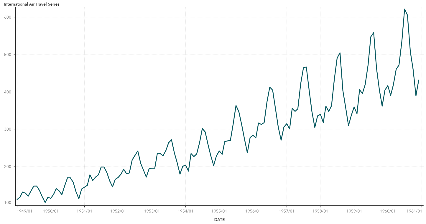
We see an obvious upward trend and significant seasonality in the original series, with more and more intensive fluctuation around the trend. This indicates that the multiplicative decomposition of trend and seasonality components is more appropriate. I get the decomposed components using this SAS code. Here I do not explicitly give the mode option first, and let SAS use the default MODE=MULTORADD option. Since the values in this time series are strictly positive, SAS eventually specifies the MODE=MULT to generate the decomposed series in the OUTDECOMP dataset (see details in the document).
When you load the data set into SAS Visual Analytics and make visualizations, it’s very straight forward to draw a time-series plot showing the decomposed series, respectively.
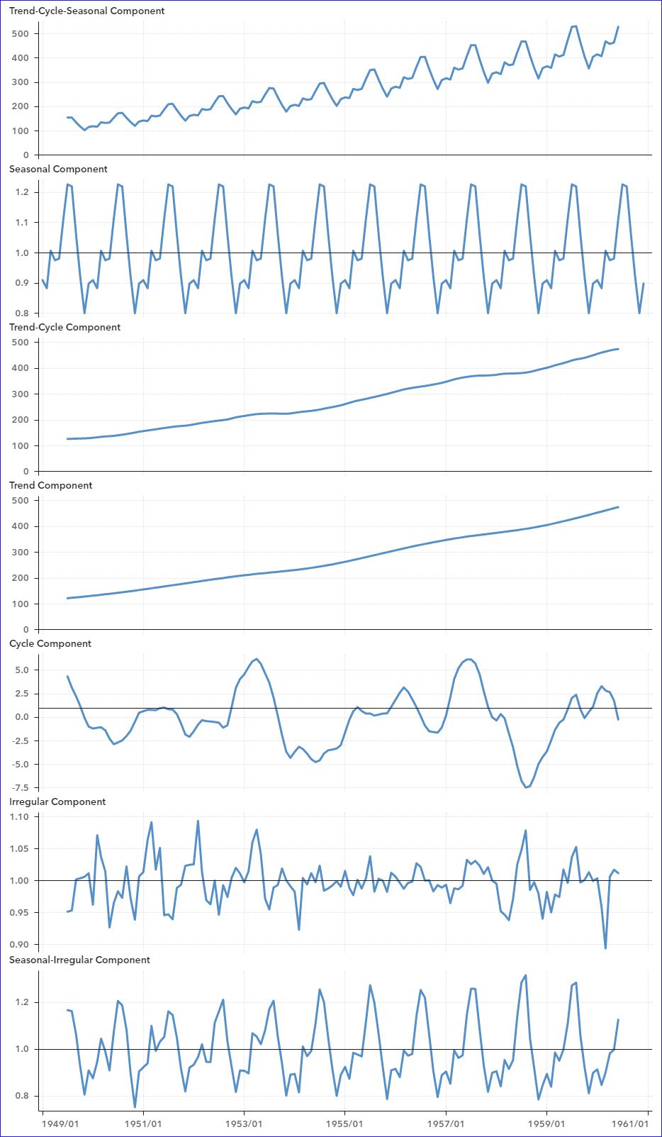
Note that the magnitudes of the Trend-Cycle-Seasonal and Trend-Cycle components are much larger than those of the Seasonal, Irregular and Cycle components. The upward trend and increasing volatility of the Trend-Cycle-Seasonal component reveal an obvious multiplicative composition of Trend-Cycle and Seasonal components. The formula should be: Trend-Cycle-Seasonal Component = Trend-Cycle Component * Seasonal Component.
Can you visually show the multiplicative relationship in the series?
I can easily make the log transformation of the decomposition series using the calculated item in SAS Visual Analytics, and accordingly show the additive relationship of the transformed series. The visualization below shows the additive relationship of the log transformation of the Trend-Cycle-Seasonal component with the log transformations of Trend-Cycle component and Seasonal component, which is the equivalent of the pre-transformed multiplicative relationship.
In the visualization below, the moss-green line series at the bottom of the chart shows the Log Seasonal component, with each vertical black line representing its value. The lines at the top show that the value of the orange line series (the Log Trend-Cycle component) adds to the value that the mint-green vertical lines (value of the Log Seasonal component) will make to the pine-green line series (the Log Trend-Cycle-Seasonal component).
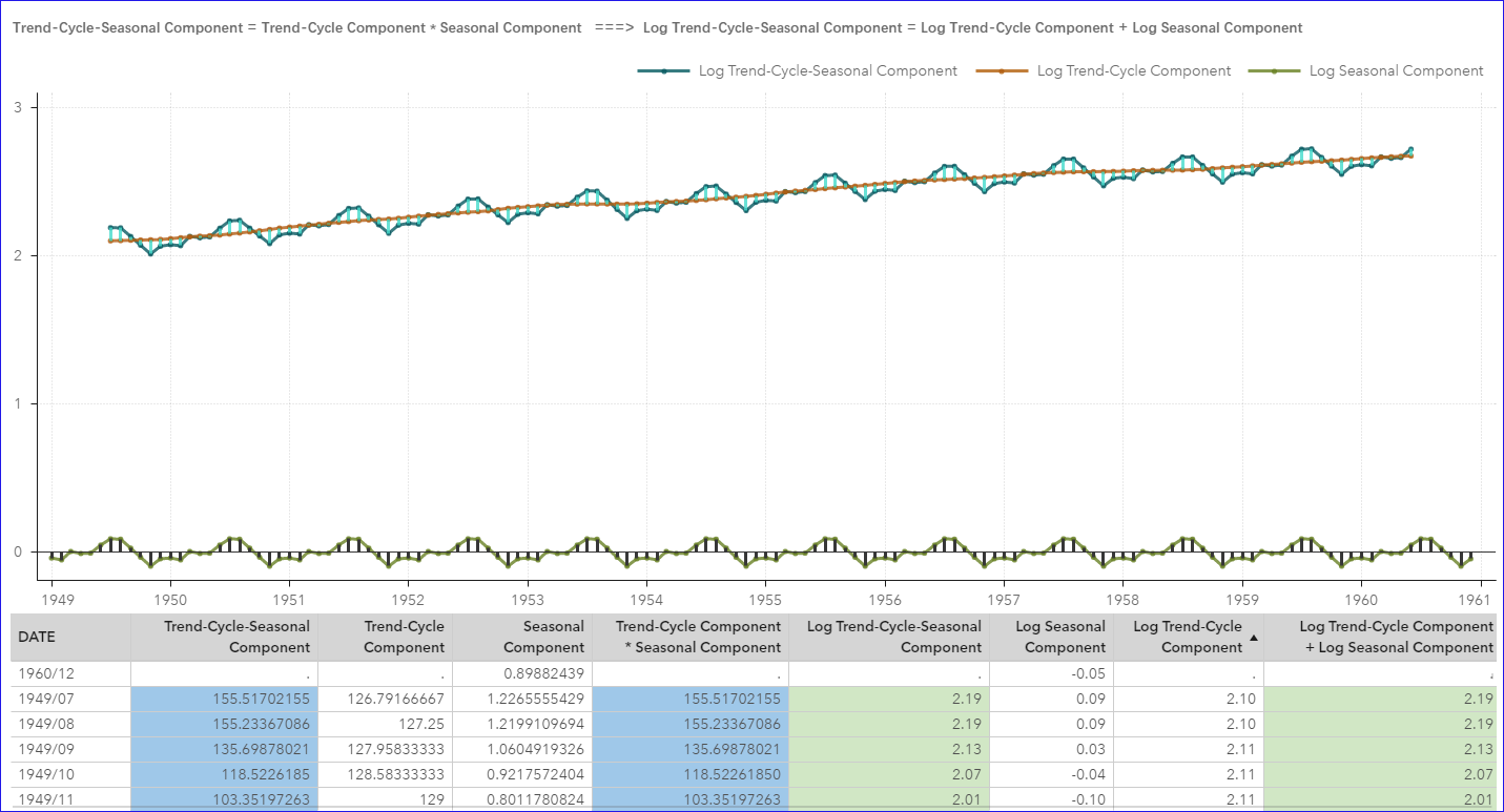
In the list table, note that the value of the calculated item 'Trend-Cycle Component * Seasonal Component’ is equal to the 'Trend-Cycle-Seasonal Component' value highlighted in blue, which indicates the multiplicative composition of 'Trend-Cycle Component' and 'Seasonal Component' to the 'Trend-Cycle-Seasonal Component.' Also, summation of the calculated item 'Log Trend-Cycle Component' and the 'Log Seasonal Component' is equal to the value of 'Log Trend-Cycle-Seasonal Component' in light green. They verify the multiplicative and additive relationships, respectively.
More ways to expose and view patterns
Besides the above multiplicative decomposition, we can dig for more multiplicative or additive relationships from the original series and the decomposed series. Here are the formulas:
Original Series = Trend-Cycle-Seasonal Component * Irregular Component
Seasonal-Irregular Component = Seasonal Component * Irregular Component
Original Series = Seasonal Adjusted Series * Seasonal Component
Trend-Cycle Component = Trend Component + Cycle Component 1
[ 1 Note: Despite setting the MODE=MULT option, SAS Proc Timeseries uses the Hodrick-Prescott filter, which always decomposes the trend-cycle component into the trend component and cycle component in an additive fashion. ]
Considering the decomposed dataset from various time series will have the fixed structure as shown below, we can easily apply the visualizations in SAS Visual Analytics to the decomposed series from different time series. Just applying the new dataset, all the calculated items will be inherited accordingly, and the new data will be applied to the visualizations automatically. That’s the thing I like most for visualizing time series decomposition in SAS Visual Analytics.
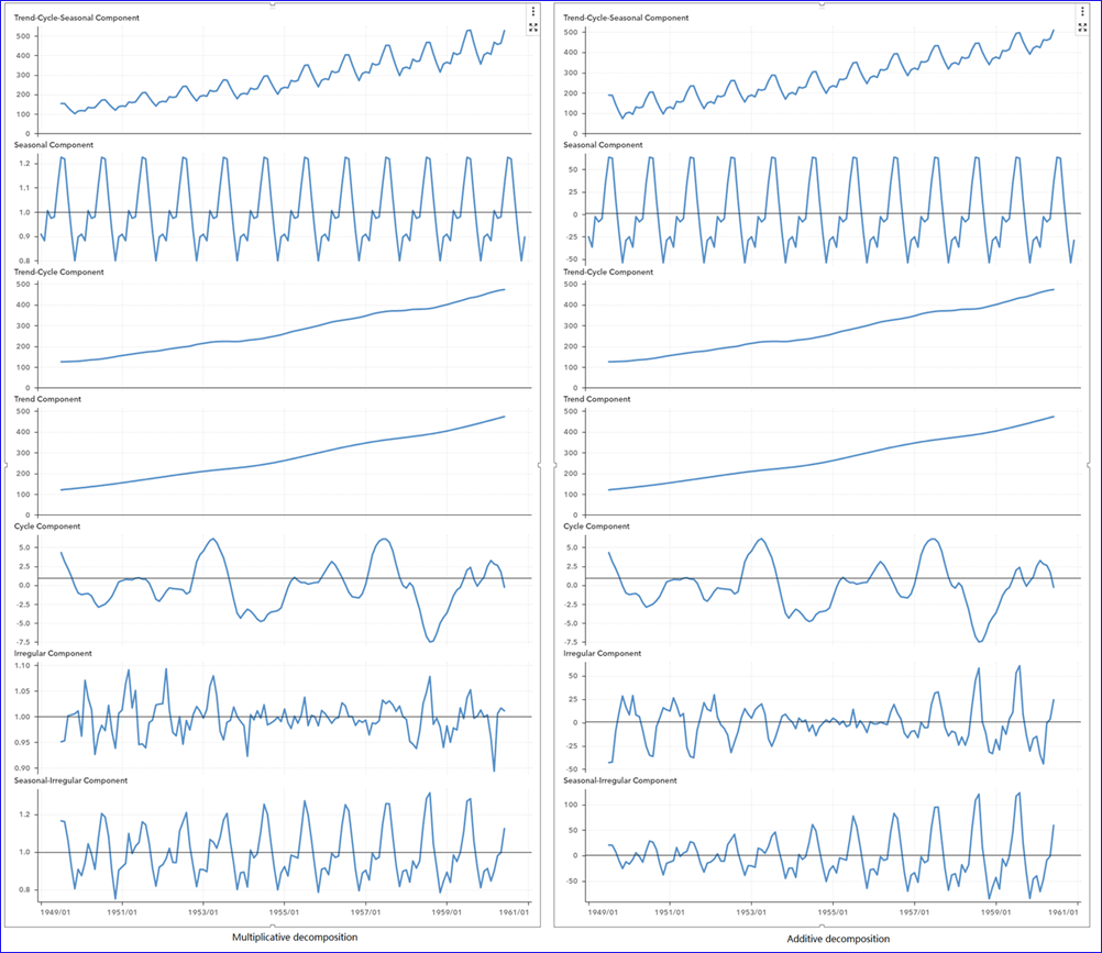
A final decomposition comparison
Let’s compare the multiplicative decomposition and the additive decomposition of the same series. Note the Trend-Cycle components (as well as Trend component and Cycle component) from multiplicative and additive decomposition are the same, meaning that the seasonal component is decomposed differently in multiplicative and additive decomposition.
In the screenshot below, we see that the two seasonal components have similar seasonal fluctuation style, but the value of seasonal components are largely different between multiplicative and additive decomposition. Different decomposition method also leads to different Trend-Cycle-Seasonal component, Irregular component and Seasonal-Irregular component. In addition, we see still some patterns there in the Irregular component from additive decomposition.
But in multiplicative decomposition, the Irregular component seems more random-like. Thus, the multiplicative decomposition is a better choice than additive decomposition for SASHELP.AIR time series.
PROC Timeseries provides classical decomposition of time series, and SAS has other procedures that can perform more complex decomposition of time series. If you want to visualize time series decomposition in a way you like, give SAS Visual Analytics a try!
SAS® Visual Analytics on SAS® Viya® Try it for free!