SAS Visual Analytics 7.4 has added the support for date parameters. Recall from my first post, Using parameters in SAS Visual Analytics, a parameter is a variable whose value can be changed at any time by the report viewer and referenced by other report objects. These objects can be a calculated item, aggregated measure, filter, rank or display rule. And remember, every time the parameter is changed, the corresponding objects are updated to reflect that change.
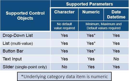
Here is my updated table that lists the supported control objects and parameter types for SAS Visual Analytics 7.4. The type of parameter is required to match the type of data that is assigned to the control.
Notice that SAS Visual Analytics 7.4 has also introduced the support for multiple value selection control objects. I’ll address these in another blog.
Let’s look at an example of a SAS Visual Analytics Report using date parameters. In this fictitious report, we have been given the requirements that the user wants to pick two independent date periods for comparison. This is not the same requirement as filtering the report between a start and end date. This report requirement is such that a report user can pick two independent months in the source data to be able to analyze the change in Expense magnitude for different aggregation levels, such as Region, Product Line and Product.
In this example, we will compare two different Month,Year periods. This could easily be two different Quarter,Year or Week,Year periods; depending on the report requirements, these same steps can be applied.
In this high level breakdown, you can see in red I will create two date parameters from data driven drop-down lists. From these parameter values, I will create two calculated data items, shown in purple, and one aggregated measure that will be used in three different report objects, shown in green.
Here are the steps:
1. Create the date parameters.
2. Add the control objects to the report and assign roles.
3. Create the dependent data items, i.e. the calculated data items and aggregated measure.
4. Add the remaining report objects to the canvas and assign roles.
Step 1: Create the date parameters
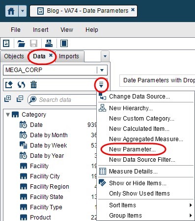
First we will need to create the date parameters that will hold the values made by the report viewers. From the Data Pane, use the drop-down menu and select New Parameter….
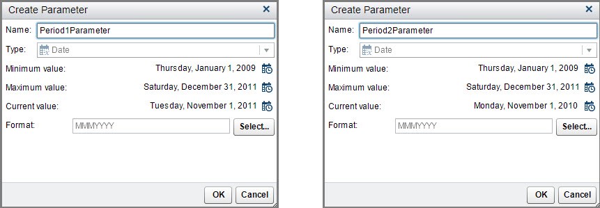
Then create your first parameter as shown below. Give it a name.
Next, select minimum and maximum values allowed for this parameter. I used the min and max available in my data source, but you could select a more narrow range if you wanted to restrict the users to only have access to portions of the data, just so long as the values are in your data source since, in this example, we will use the data source to populate the available values in the drop-down list.
Then select a current value, this will serve as the default value that will populate when a user first opens the report.
Finally, select the format in which you want your data item to be formatted. I selected the same format as my underlying data item I will be using to populate the drop-down list.
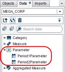
Notice how your new parameters will now be available from your Data Pane.
Step 2: Add the control objects to the report and assign roles
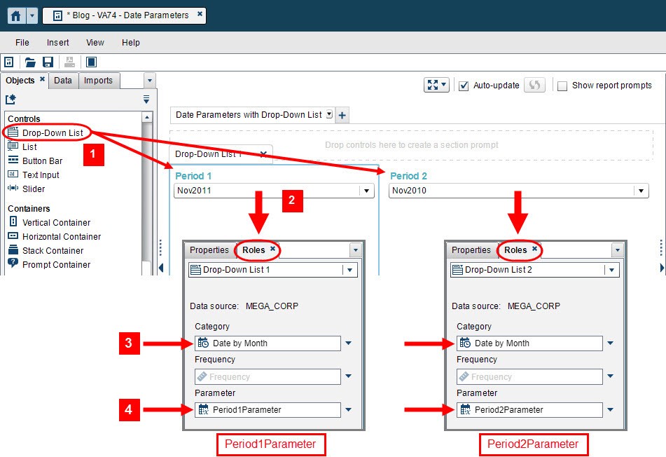
Next, drag and drop the drop-down list control objects onto the report canvas. In this example, we are not using the Report or Section Prompt areas since I do not want to filter the objects in the report or section automatically. Instead, I am using these prompt values and storing them in a parameter. I will then use those values to create new calculated data items and an aggregated measure.
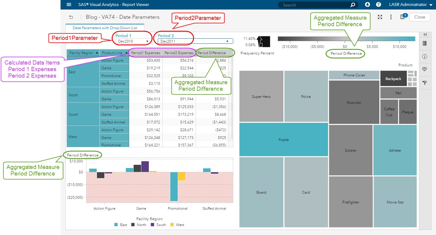
Once your control objects are in the report canvas, then use the Roles Pane to assign the data items to the roles. As you can see from the screenshot, we are using the Date by Month data item to seed the values of the drop-down list by assigning it to the Category role, this data item is in our data source.
Then we are going to assign our newly created parameters, Period1Parameter and Period2Parameter to the Parameter role. This will allow us to use the value selected in our calculations.
Step 3: Create the dependent data items, i.e. the calculated data items and aggregated measure
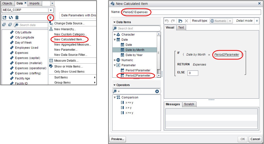
Now we are free to use our parameters as we like. In this example, I am prompting the report viewer for two values: Period 1 and Period 2 which are the two periods the user would like compared in this report. So, we will need to create two calculated data times from a single column in our source data. Since we want to display these as columns next to each other in a crosstab object and use them for an aggregated measure, this technique can be used.
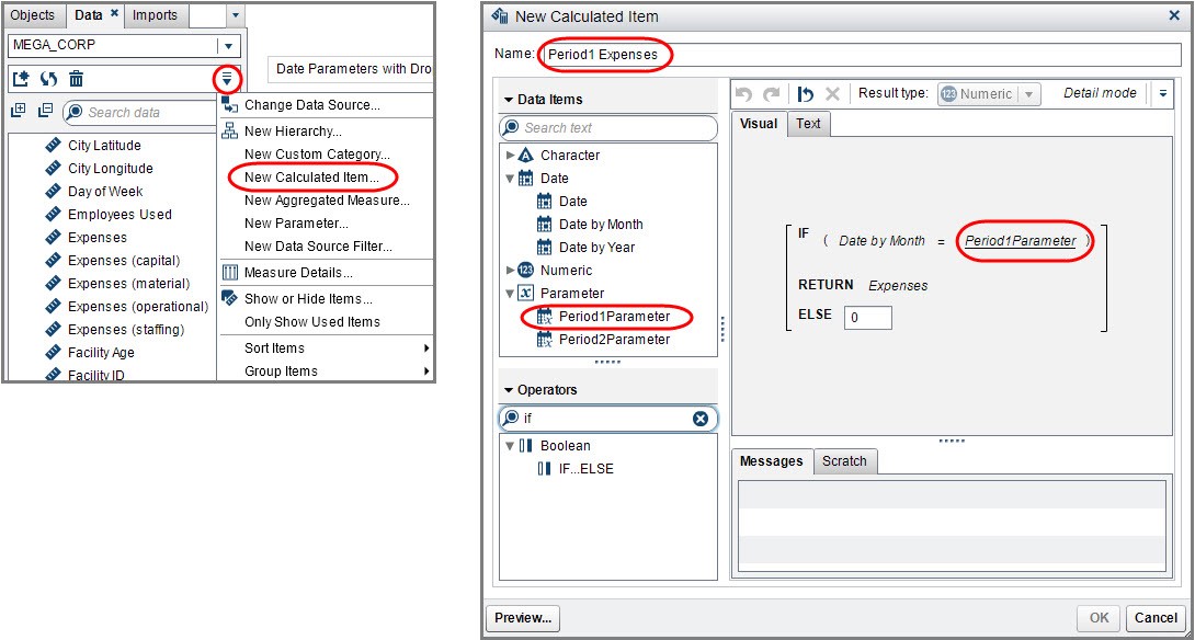
Calculated Data Item: Period 1 Expenses
From the Data Pane, use the drop-down menu and select New Calculated Item…. Then use the editor to create this expression: If the Date by Month for this data row equals the parameter value selected for Period 1, then return the Expenses; else return 0.
Calculated Data Item: Period 2 Expenses
Repeat this using the Period2Parameter in the expression.
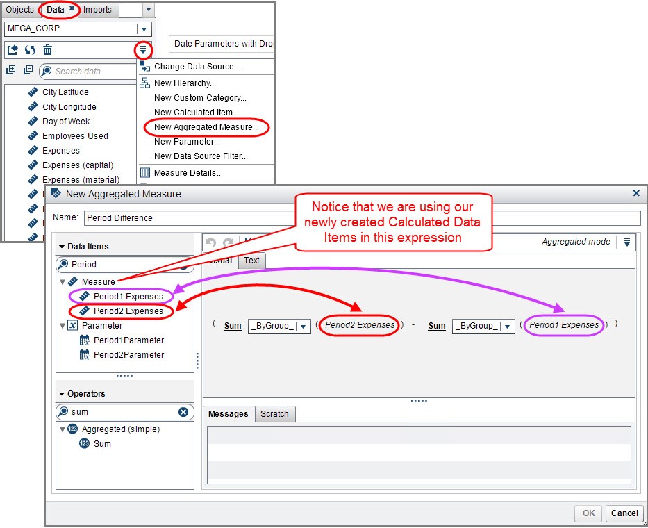
Aggregated Measure: Period Difference
Next, we want to calculate the difference between the two user selected Period Expenses. To do this, we will need to create an aggregated measure which will evaluate based on the report object’s role assignments. In other words, it will be calculated “on-the-fly” based on the visualization.
Similar to the calculated data items, use the Data Pane and from the drop-down menu select New Aggregated Measure…. Use the editor to create this expression. Notice that we are using our newly created calculated data items we defined using the parameter values. This expression does not use the parameter value directly, but indirectly through the calculated data item.
Step 4: Add the remaining report objects to the canvas and assign roles
No that we have:
- our Control Objects to capture the user input.,
- the Parameters to store the values.,
- and the Calculated Data Items and Aggregated Measure created…
we can add our report objects to the canvas and assign our roles.
You can see I used all three new measures in the crosstab object. I used the aggregated measure in the bar chart and treemap but notice the different aggregation levels. There is even a hierarchy assigned to the treemap category role. This Period Difference aggregated measure calculation is done dynamically and will evaluate for each visualization with its unique role assignments, even while navigating up and down the hierarchy.
Here are some additional screenshots of different period selections.
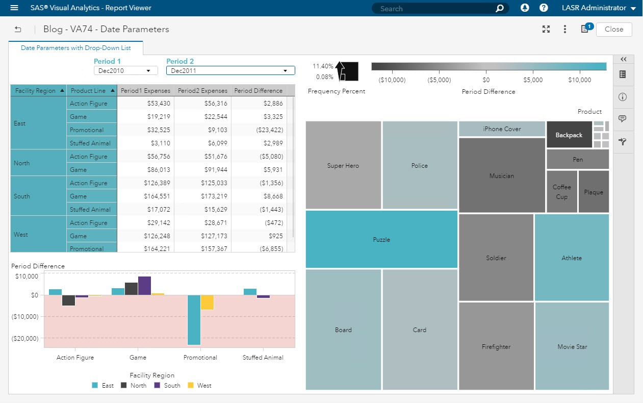
In this first screenshot you can see the parallel period comparison between December 2010 and 2011.

In these next two screenshots, we are looking at the Thanksgiving Black Friday month of November. We are comparing the two years 2010 and 2011 again. Here we see that the Board Product from the Game Product Line is bright blue indicating an increase in magnitude of Expenses in the most recent period, Nov2011.
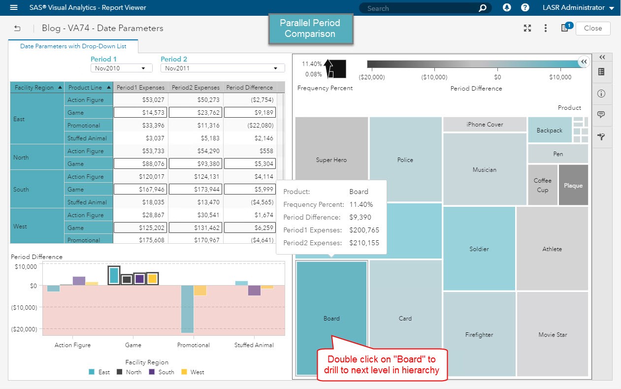
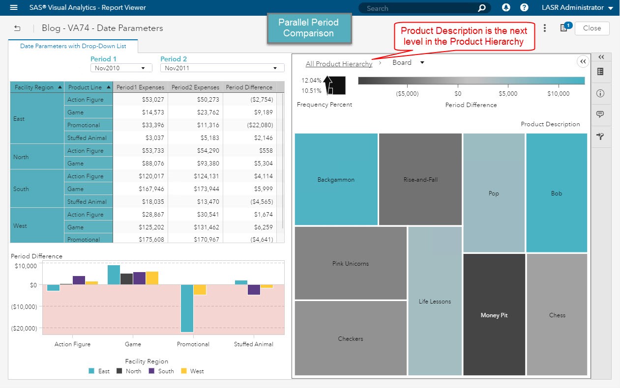
By double clicking on Board in the treemap, we are taken to the next level of the hierarchy, Product Description, where we see a the largest magnitude of Expenses is coming from Backgammon and Bob Board Games.
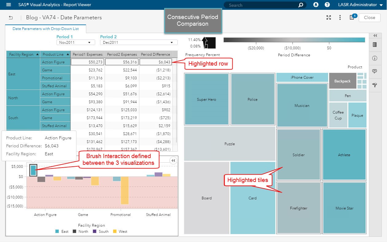
In these final two screenshots we are comparing consecutive periods, November 2011 with December 2011. We can see from the bar chart easily the Region and Product Line where there is the greatest increase in Expenses.
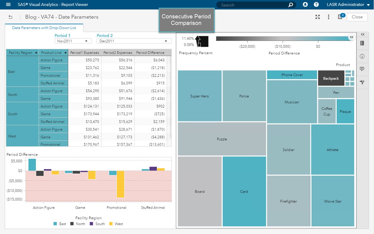
I’ve configured a brush interaction between all three visualizations so that when I select the tallest bar it will highlight the corresponding data values in the crosstab and treemap.
Conclusion
Now you can use date parameters in your Visual Analytics Reports. There are several applications of this feature and this is only one way you can use parameters to drive business intelligence. Using this technique to create columns based on a user selected value is great when you need to compare values when your source data isn’t structured in this manner.

2 Comments
Excellent explanations, this feature is very useful. I can't wait to use it in my reports.
Thanks!
It was very informative