Certain North Carolina counties have been in the news lately, for suspected election fraud involving absentee ballots in the 2018 election. Let's analyze the voter registration and absentee ballot data, to see if we can detect anything suspicious!
In order to definitively determine whether fraud & illegal activity occurred, investigators will need to interview the voters and 'ballot collectors' involved. But in the meantime, perhaps we can identify whether the data from certain counties looks suspicious.
Number of Absentee Ballots
One thing I wanted to look for was counties with a disproportionately large numbers of absentee ballots.
First, I downloaded the absentee ballot data from the NC State Board of Elections (NCSBE) website, and found there were over 2 million 'absentee ballots' for the 2018 election. Upon closer examination, I found that their absentee ballot data included both the traditional absentee ballots, and the ballots from 'ONE-STOP' early in-person voting. Since the in-person early voting wasn't the type being suspected of fraud, I excluded those ballots from the csv file using the following Unix command (this reduced the number of absentee ballots to under 200,000).
grep -v "ONE-STOP" absentee_20181106.csv > absentee_20181106_subset.csv
The number of absentee ballots in each county isn't a great thing to compare, though, because the counties have vastly different numbers of voters. Therefore I also downloaded the voter registration data for each county, so I could perform an SQL join and compute the number of absentee ballots per 1000 registered voters in each county. Here is that data plotted on a county map:
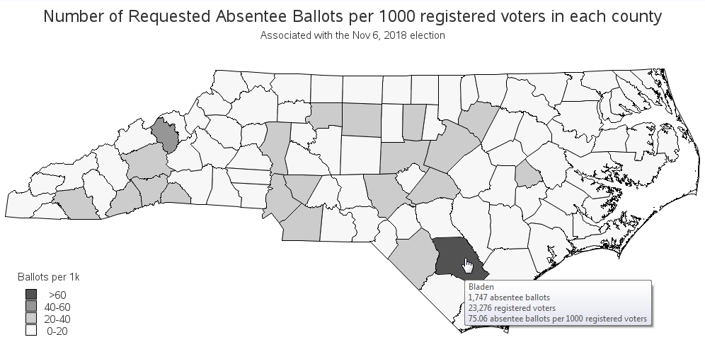
In the map above, Bladen county (one of the counties with suspected fraud) stands out as having the highest rate of absentee ballots per 1000 voters. This doesn't necessarily indicate fraudulent activity - but it is suspicious. The map also lets you look for geographical trends.
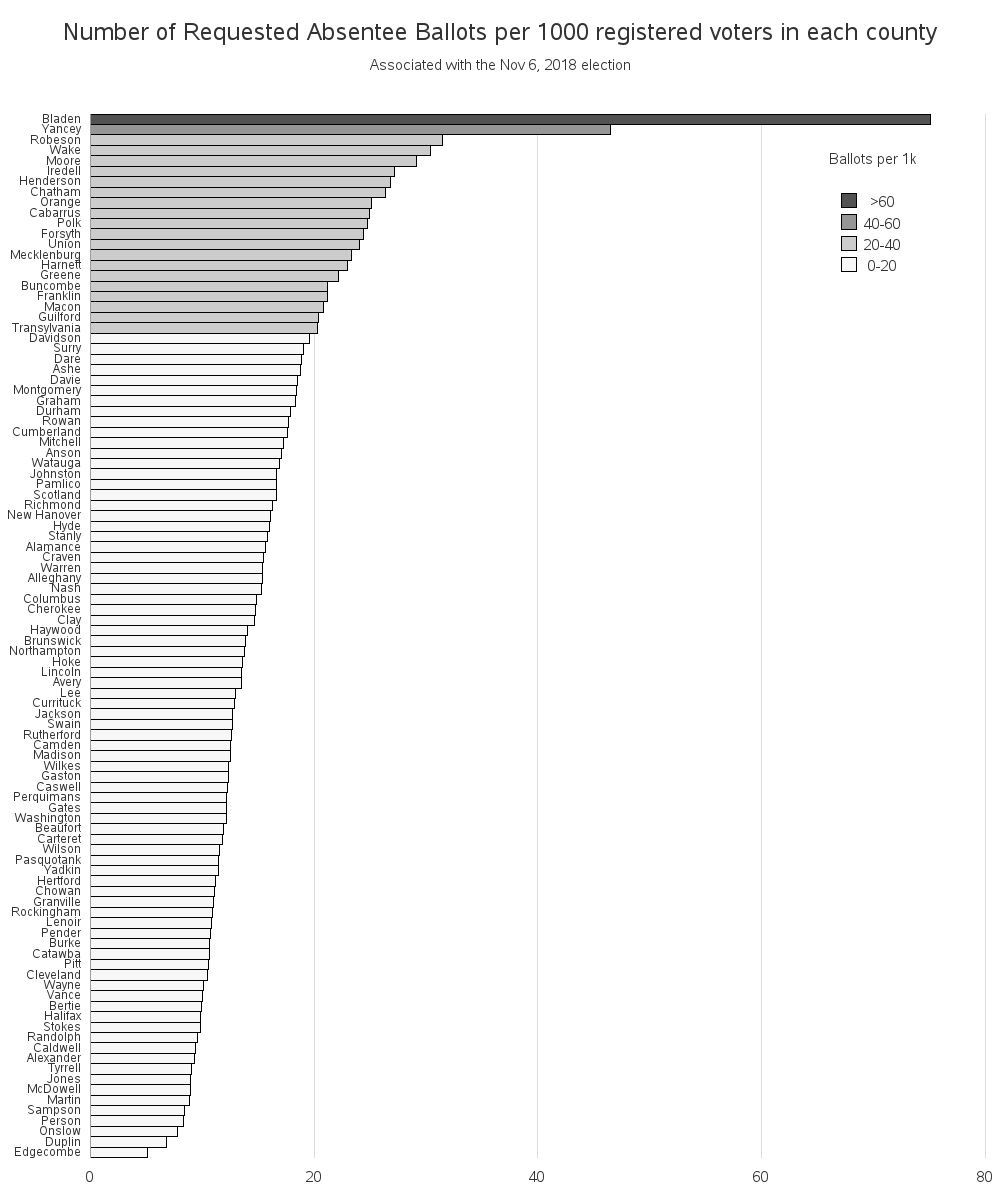
Now, you might be asking - "how suspicious is Bladen county?" It's difficult to compare values on a map, therefore let's plot the same data in a bar chart, where they will be easy to compare. In the bar chart below, you'll notice that Bladen and Yancey counties have much higher values than the other counties.
Absentee Ballot non-Return Rate
Having a high rate of absentee ballots in a county isn't necessarily a bad thing. If people request them, and vote, and return the ballots in the correct/legal way - then that's great! But if a large percent of those absentee ballots are not returned, then that could be considered suspicious. Here are a couple of examples of nefarious activities that might cause it:
- Perhaps these voters did not request the absentee ballots, and therefore did not turn them in. (The presumption being that political activists had requested the ballot for them, in hopes that they would vote for their candidate.)
- Perhaps 'vote harvesters' were illegally collecting absentee ballots, and didn't turn in the ones from people registered to an opposing party.
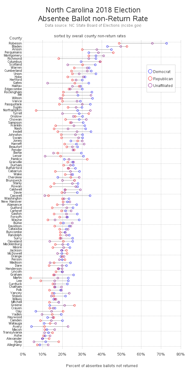
While researching this topic, I found a very interesting article/analysis on the caltech.edu website. They explore several different scenarios for possible fraud, and provide graphs that might be used to look for these kinds of fraud. Here is one of their graphs that caught my attention:
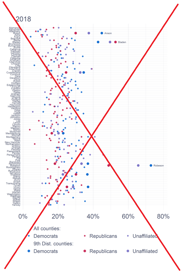
Their graph was a bit difficult to digest. It isn't fully labeled, the color/size legend is a little confusing, the counties are difficult to read, and there is no mouse-over text. Therefore I decided to try creating my own version of the graph, and improve those things. My version is below (click it to see the interactive version, with HTML mouse-over text).
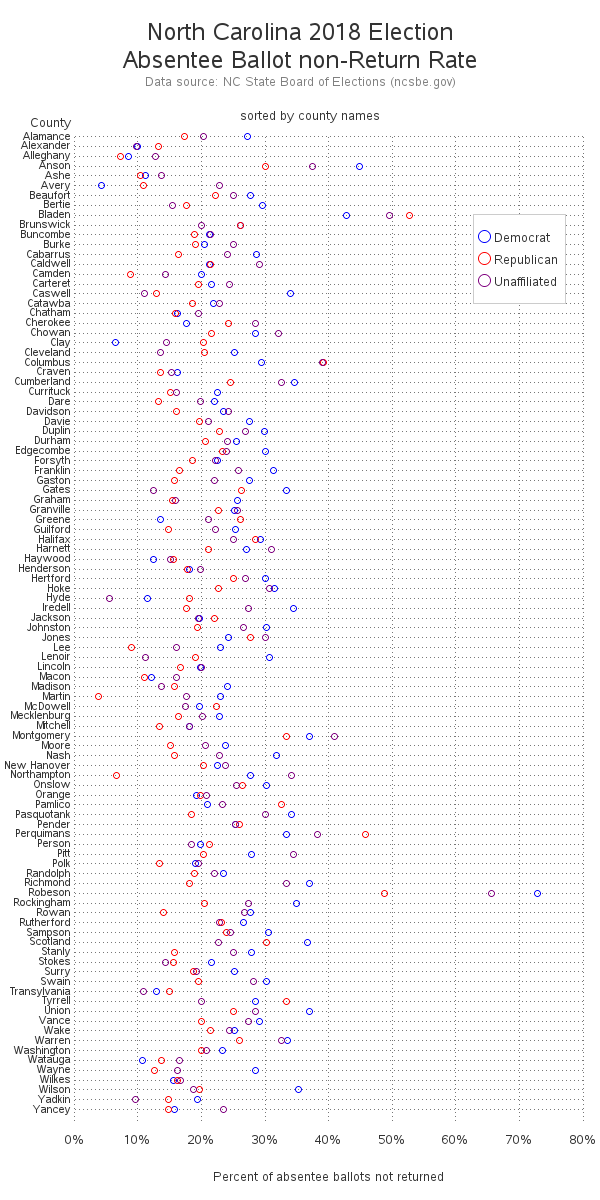
My version is a bit cleaner and easier to read, but I still wanted more out of my graph. I found it interesting to look for the 'outliers' in the above plot, but why not make those outliers easier to find? Therefore I created another version, and sorted it by the overall county non-return rate. Now Robeson and Bladen Counties (two adjoining counties currently under scrutiny for possible fraud) jump to the top of the graph.
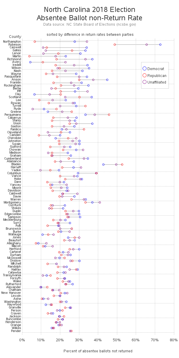
You might have noticed that I connect the plot markers for each county - this lets you more easily group the county values together ... and also lets you see the difference in non-return rates for the political parties. If there is a big difference in the non-return rates for the parties in a given county, that might indicate 'vote harvesters' were not turning in absentee ballots for the 'other party'. I created another version of the plot, sorted by the difference in the minimum & maximum non-return rate in each county. Note that Robeson county is once again near the top.
 Remember - these graphs allow you to look for suspicious activity that might warrant further investigation, but they don't necessarily indicate fraudulent activity has taken place. It will be interesting to see how the investigations turn out!
Here's a link to the code for the first examples, and the second examples, if you'd like to download it, to see exactly how I came up with the values to plot!


1 Comment
I enjoyed reading (and learning) from your article, thank you, and happy holidays.