I recently read an article that said a school in Asheville, North Carolina had the worst chickenpox outbreak in the state in 2 decades. The article was interesting, and it also let me know I had a hole in my knowledge ... "What?!? - There's a chickenpox vaccine?!?"
When I was a kid, we didn't have a chickenpox vaccine. Our parents just exposed us to someone with chickenpox when we were at a young/convenient age, so we would catch it, and once we caught it we were immune from catching it again. Apparently there's a vaccine these days - I guess if I had kids, I would know about such things! Being a data guy, this got me wondering about immunization rates, and how many people do & don't get immunized, etc. And I thought I would educate myself by doing a little research and creating some graphs ...
Data Preparation:
First I needed some data. Luckily the article had a link to some related data. Here's a screen-capture showing some of their table:
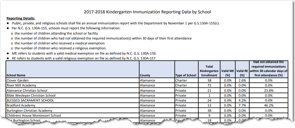
I was happy to see the data, but on the other hand a little sad that it was in pdf format. I didn't have a fancy pdf reader handy, therefore I used the brute-force alternative - I copy-n-pasted each of the 31 pages of the table into a text file.
Unfortunately, the the columns weren't delimited by a unique character (such as a tab), and both the columns, and the words within the columns were space-delimited. Therefore I had to get a little tricky importing the data. For the 6 columns to the right, I was able to parse them using the SAS scan() function, with a negative value - for example, scan(whole_line,-4,' ') gets the 4th space-delimited value from the right, which is the enrollment column. For the school name, I used the substr() function, and read from column 1 until I reached the combination of the county & school type: substr(whole_line, 1, index( whole_line , trim(left( county_name)) || ' ' || trim(left(school_type))) - 2). I used the index() function to test for the word 'Total' in the string, to determine if it was a state-summary line, rather than an individual school - if index(whole_line,'Total')^=0 then output county_data;
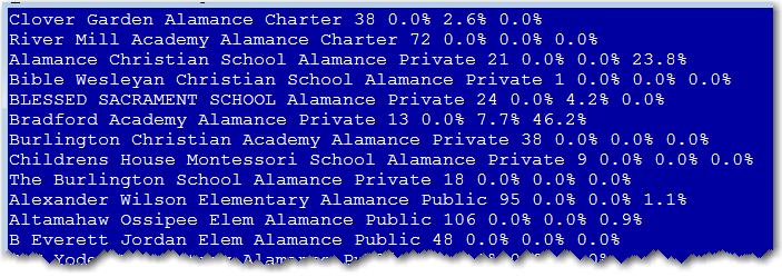
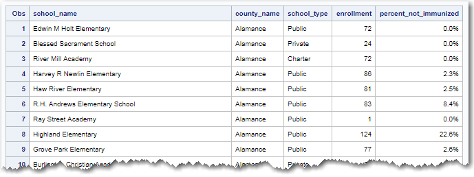
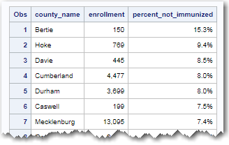
There are several ways to parse text in SAS - this is just the first way that came to mind (there might be better ways, of course!) When all was said & done, I had two datasets. One containing a line of data for each of the nearly 2,000 schools, and one containing an overall summary for each of the 100 counties.
Graphs:
For my first graph, I created a bar chart showing the % of kindergarteners not immunized in each of the 100 counties. It was an OK plot, and let me quickly know the range of values. But the bars sorted in the default/alphabetic order didn't really tell me as much as they could.
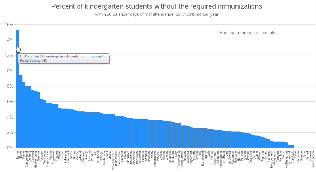
With data like this, it's natural that you would want to compare the values. Therefore I created a new version of the chart, sorted by descending order, which lets you more easily compare the counties and see the spread of the data. Notice in the screen-capture below that I also added mouse-over text, so you can see more detailed information.
The county data was interesting, but since there are typically several schools in a county, I wondered how the individual school values compared. Therefore I created another plot, sorted the exact same way, but with the individual schools plotted where the bars were. Notice in the screen-capture below that the mouse-over text also contains some useful extra details about each school:
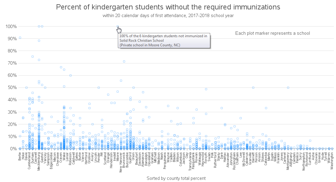
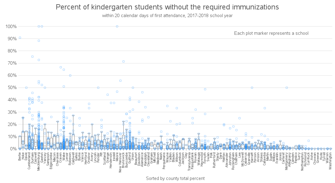
I used semi-transparent markers in the plot above, so you can see where multiple markers are plotting on top of each other ... but that technique isn't quite adequate with this data. Most of the schools have between 0-10% ... but that's not totally obvious from looking at the plot. Therefore I created a 2nd version with box plots overlaid.
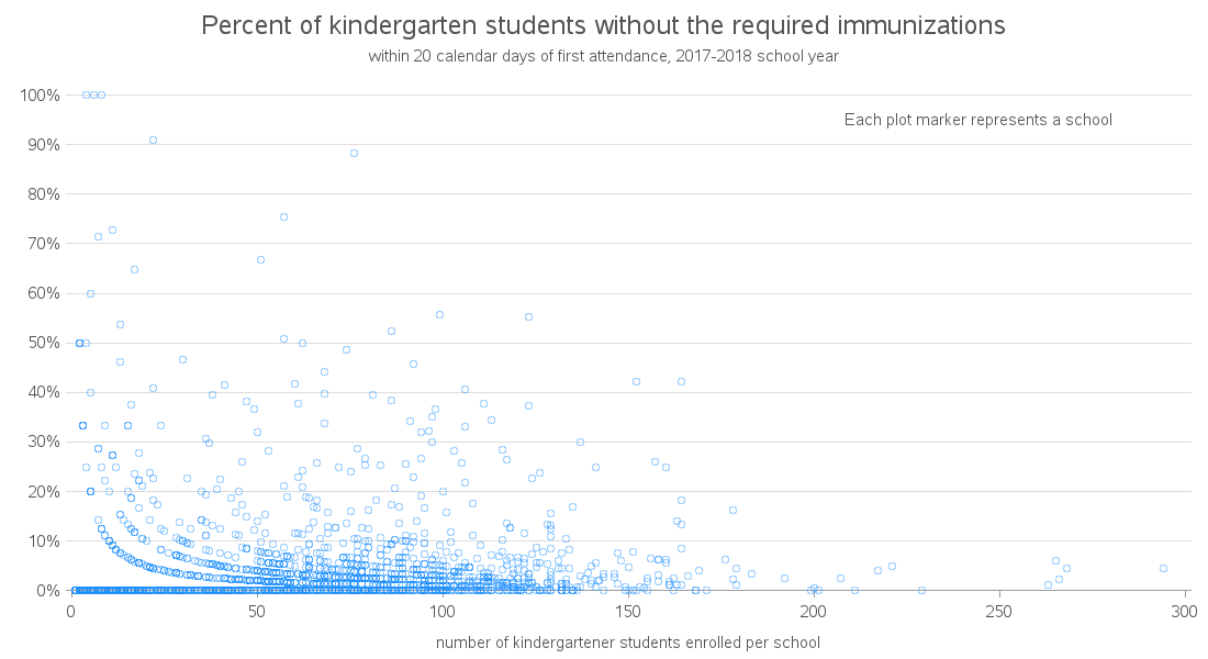
When looking at the mouse-over text, I noticed that many of the schools with high non-immunization rates seemed to have a very small number of students. I wondered if there might be a correlation between school size and the non-immunization rate. Therefore I created a scatter plot:

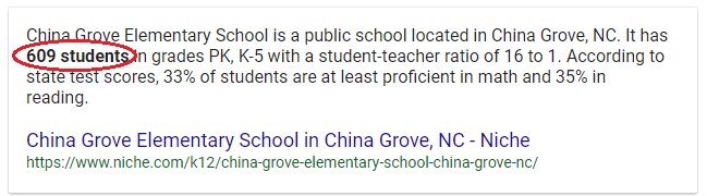
But there was one odd outlier (circled in red, above). What school has 930 kindergarten students?!? I first assumed this was a school in a big city, like Raleigh or Charlotte. But the mouse-over text told me it was China Grove Elementary School, in Rowan County. It just so happens I grew up in Rowan County, and I've driven through China Grove, and it's a pretty small town. Therefore I was suspicious of this claim that their elementary school had 930 kindergarten students. I did a quick Google search, and it appears that school only has about 600 students total (PK & K-5) ... therefore it is very likely the 930 kindergarteners listed in the original data table is incorrect.
I was tempted to change the data value from 930 to 93 (which is a much more likely value) ... but I really can't do that with a high degree of certainty, therefore I decided to just delete China Grove's line from the data (until the value can be researched & verified). I also suspect that the Rowan County % not immunized value is probably impacted by this bad data value ... but I have no way of definitively checking with the data in the table, since the % values are pre-summarized, and they don't include all the raw data they used to calculate it.
Anyway, here's the new scatter plot, with the China Grove value eliminated. Of course, now I'm suspicious that other schools might also have errors in their number of students, therefore I'm not putting too much trust in this graph:
And now for one final visualization ... let's plot the data on a map. Since I only have the school names (no street address), I can't estimate a latitude/longitude location to plot each individual school on a map. Therefore I plotted the county summaries on a county map. Do you see any geographical trends in the data? (feel free to discuss in the comments section)
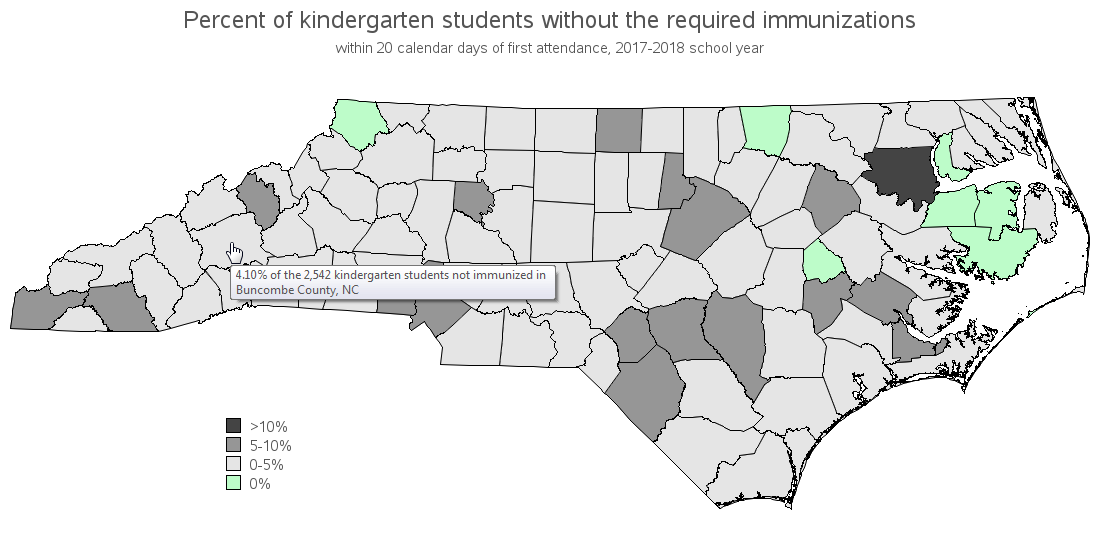
Back to the original article, it was the Asheville Waldorf School that had the chicken pox outbreak. That specific school isn't actually listed in the 2017/2018 data that the article pointed to (perhaps it is a new school just opened in 2018/2019?) ... but Asheville is in Buncombe County, therefore it might be interesting to look at the Buncombe county data and see if they have a non-immunization rate that's higher than the rest of the state. I used the mouse-over text to find Buncombe County in the map above, and it is colored light gray, indicating it is one of the counties with the best immunization rates (only 4.1% not immunized).
Hopefully you've learned some interesting information about immunization rates, and perhaps even a little about wrangling data values out of a pdf file. Note that you can click any of the graphs above to see the full-size interactive version with mouse-over text, and here's a link to the full SAS code used to create them.


5 Comments
Thank you for sharing this! Do you have the source for where you obtained the data? The link to the report is there but there is no broader context or refernce. I would like to reference this in something I am writing. Thanks!
Here's the Washington Post article that linked to the pdf where I got the data. Perhaps that will give you a little more insight into the origins of the data(?) https://www.washingtonpost.com/nation/2018/11/19/anti-vaccination-stronghold-nc-hit-with-states-worst-chickenpox-outbreak-decades/
I think you have an error in your data. I think you should have added:
Valid ME (%) +
Valid RE (%) +
(Had not obtained the required immunizations within 30 calendar days of first attendance (%))
To get your total % not vaccinated.
I have looked for more info on the data but I have not found much.
From what I understand:
(Had not obtained the required immunizations within 30 calendar days of first attendance (%))
Means that the child can not enter the school because they are not vaccinated and have not revived an exemption.
Q. What if a student has not met the immunization requirements 30 days after school started?
A: Parents have until the close of business on the 30th calendar day after school has started to submit immunization records to remain in compliance. On the 31st calendar day, students who do not meet the minimum immunization requirements, do not have an immunization record on file, or are not in-process to receive required immunizations must be excluded from school per public health law. The student may not return to school without those documents.
From:
https://www.immunize.nc.gov/schools/air_k-12.htm
And Info on the exemptions
https://www.immunize.nc.gov/schools/ncexemptions.htm
If you know any more feel free to email me!
Thanks for the great work!
It's not quite clear from the data page whether the 'total' column includes, or doesn't include the ME (medical exemption) and RE (religious exemption).
Thank you Robert for another great post.