Who says technical people can't have fun!?! Similar to Throwback Thursday / #TBT (when people post one of their old/nostalgic photos on social media), I like the tradition of Fun Friday when I use a fun data topic to test our software - a test can be just as rigorous using fun data, as it is using serious data, as you will see in this example!
If you're only interested in my final constellation map, jump to the bottom...
If you're interested in the details, follow along...
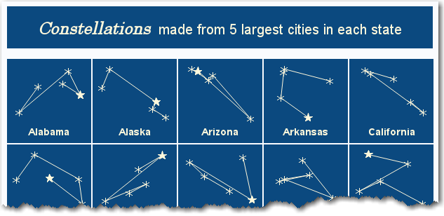
I recently saw the following visualization on Reddit, and thought it might be fun to try to reproduce (and maybe improve!) Below is a partial screen-capture:
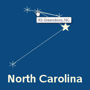
It was interesting and caught my attention, but there wasn't really a legend or key to explain exactly what was going on. For example, what did the size of the markers represented, and was the order in which the stars were connected significant? Therefore I decided to scrutinize the city-constellation of North Carolina (the state I live in), to see if I could figure these things out. I assume the bottom/left star is Charlotte, and the right-most one is Raleigh. And although Raleigh is the capital, Charlotte has a slightly larger population - I guess they made the largest city the largest star(?) And I don't think they really used an algorithm to connect the stars - I assume they just drew the lines manually, however they thought it made the best looking constellation.

Now, let's see how many different aspects of our SAS software I can exercise/test, in creating a similar visualization ... sounds like a Fun Friday to me!
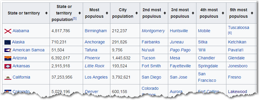
First, I needed to find the largest five cities in each state. A quick Google search found such a list on Wikipedia - my go-to for basic data and lists. But of course, rather than being a simple csv file or Excel spreadsheet that is easy to download and import, their data is in an HTML table:
In the past, I've written code to read the HTML code from a web page, and parse out the pieces I wanted ... but that's a very tedious process. This time I wanted to try something different. I heard that Rick Langston had written a macro to read all the tables from an HTML page, and store the results in SAS datasets (here's his SAS Global Forum paper on the topic). So I got a copy of his macro, pointed it to the Wikipedia page, and I quickly had the data in SAS table form (work smarter, not harder ... thanks Rick!)
%inc 'readhtml4.sas';
%readhtml2(
'https://en.wikipedia.org/wiki/List_of_largest_cities_of_U.S._states_and_territories_by_population'
);
You might notice in the table that Wikipedia include a few entities that aren't actually one of the 50 US states (such as Washington DC and American Samoa). To limit the table to just the 50 states, I could have listed all 50 states in a 'where' clause, but instead I used SAS' Proc Sql to generate a list of the 50 states from the mapsgfk.us_states_attr dataset (working smarter again!), and limited my table to just the states in that list - see code below. I also used Proc Sql to merge in the 2-character state abbreviations.
proc sql noprint;
create table my_data as
select *
from my_data
where state_name in (select unique idname from mapsgfk.us_states_attr where statecode^='DC');
quit; run;
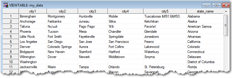
My table contains a separate variable for each city, but what I really need is a single variable called 'city' and 5 rows of data for each state - it's not as efficient a way to store the data, but it's much more convenient for the data-processing I'll be doing. Therefore I used Proc Transpose to restructure the data.
proc transpose data=my_data out=my_data (rename=(_name_=citynum col1=city));
by state_name state;
var city1 city2 city3 city4 city5;
run;
![]()
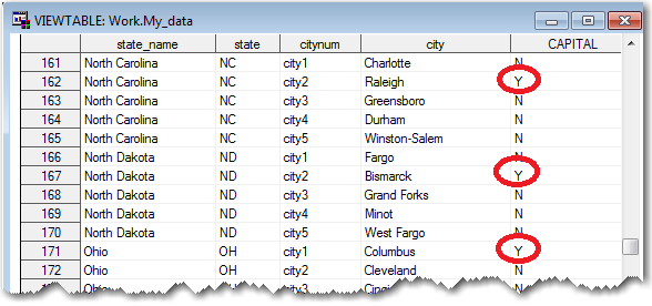
In my plots, I want to make the capital of each state a larger star, therefore I merged in some information from the mapsgfk.uscity dataset, to determine whether or not each city is the capital.
proc sql noprint;
create table my_data as
select unique my_data.*, uscity.capital
from my_data left join mapsgfk.uscity
on my_data.state=uscity.statecode
and my_data.city=uscity.city;
quit; run;
data my_data; set my_data;
if capital^='Y' then capital='N';
run;
Now that I've got all the states & cities, how will I know where to plot them? Well, of course, I'll use their latitude/longitude coordinates! And I can determine those by running Proc Geocode.
proc geocode data=my_data out=my_data (rename=(y=lat x=long))
lookupcity=sashelp.zipcode method=CITY;
run;
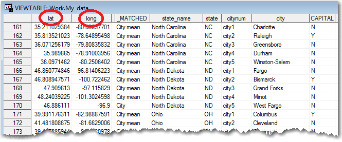
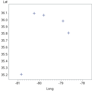
Now I've finally got the data ready to plot! I started with a simple scatter plots, by state. Here's the plot for North Carolina, using the default axes and plot markers.
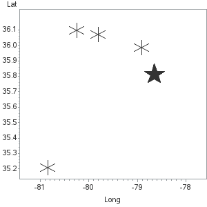
I used symbol statements to specify 'star' markers, based on whether or not the city is the capital of the state (notice how Raleigh is a solid-filled star, and the other cities are simple line-based stars).
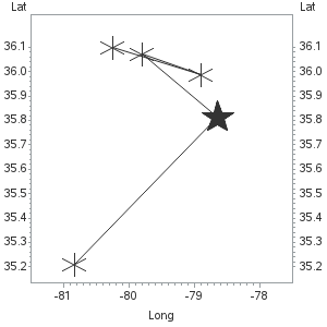
Next, I used Proc Gplot's plot2 statement to plot the data a second time, using a line interpolation to connect the points. Unlike the original plot, I connect the points in the order from largest-to-smallest city. You might notice the plot2 adds a 2nd axis on the right-hand side ... we'll be getting rid of all the axes soon.
 In this next iteration, I use a footnote statement to add a title below the graph (based on the by-value), and axis statements to make all the axes invisible.
footnote1 font='albany amt/bold' h=12 "#byval(state_name)";
axis1 label=none value=none major=none minor=none style=0;
axis2 label=none value=none major=none minor=none style=0;

I specify a yellow color for the plot markers and lines and the footnote text, and a dark blue for the background (using the cback goption).

And I use Proc Gplot's html= option to add HTML mouse-over text to each marker, showing the city name and the size-rank:
data my_data; set my_data;
length my_html $300;
my_html='title='||quote('#'||trim(left(rank))||': '||trim(left(city))||', '||trim(left(state)));
run;
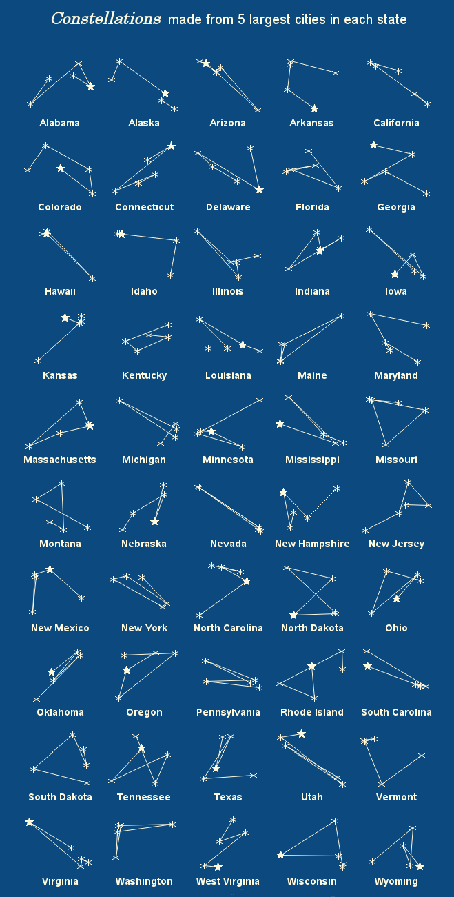
Now let's plot all 50 state constellations in a grid, using SAS' tagsets.htmlpanel, using panelcolumns=5 so they are arranged 5-across ...
Hmm ... this is almost what I want, but not quite! Although the background of each graph is dark blue, the background of the web page/document is not blue. The document background is controlled by SAS' ODS style, and there aren't any styles that just happen to have a dark blue background (style=raven is close, with a black background!) In order to get an ODS style with the exact desired blue background, I'll need to create a custom ODS style. I defined my ODS style using the code below, and called it nightsky.
ods path work.template(update) sashelp.tmplmst;
proc template;
define style styles.nightsky;
parent = styles.default;
replace colors /
"docbg" = cx0b497f
;
end;
run;
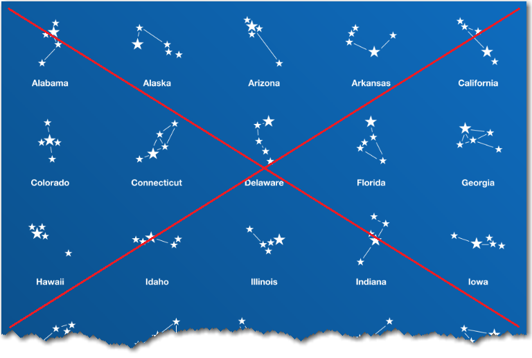
And I finally have my grid of city constellations for the 50 states, just like I want them! Below is a screen-capture - click here to see the interactive version, containing mouse-over text for each city.
Hope you had fun with this example, and perhaps I've inspired you to have your own Fun Friday, learning new SAS features and using them to create a special graph! (Here is a link to my code, in case you'd like to download it and see all the details.)


3 Comments
Nice work once again!
But as a Texas-dude-ette and a Houstonian by choice, I have to go with the Reddit chart simply based on aesthetics. Houston being designed with the largest star because, yeah....fourth largest city in the country. 😄
Nice piece of coding but the results for AL are not what I remember the geographic relationships to look like. The 2nd largest city (Huntsville) is due north of Birmingham and the 4th largest, affectionally known as Ttown bu Auburn fans is located to the Southwest. Montgomery and Mobile are also not in the correct position in the constellation.
I'll have to check on that! One thing to keep in mind is that the horizontal and vertical axes in a scatter plot are each auto-scaled by default - therefore the cities in "tall" states (such as Alabama) and wide states (such as North Carolina) could appear a little "squished" in one direction or the other. I could over-ride the defaults to preserve the aspect ratio (rather than independently auto-scaling the axes), but then some of the individual graphs would have large areas of "white space" (or in this case, blue space).