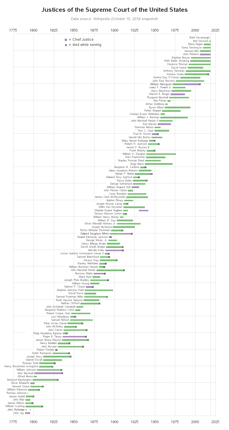
Here in the US, we recently had a new Supreme Court Justice appointed. This is a very important position, and judges usually serve until they retire or die. My buddy Rick gave me a heads-up that there was a table of all the past & present justices on Wikipedia, and he thought I might have fun graphing the data ... and I did!
Before we get started, here's a selfie from my friend Karen to get you in the mood. She has a lot of political energy, and made the long trip to Washington DC last week to support her views (she even got invited to visit some of the senators, who gave her a personal thanks for showing up!)

And now, let's analyze some data about past & present Supreme Court Justices! I started by going to the Wikipedia page Rick had pointed me to, and had a look at their timeline graph. Oh Lordy - it was literally a visual assault on my eyes!
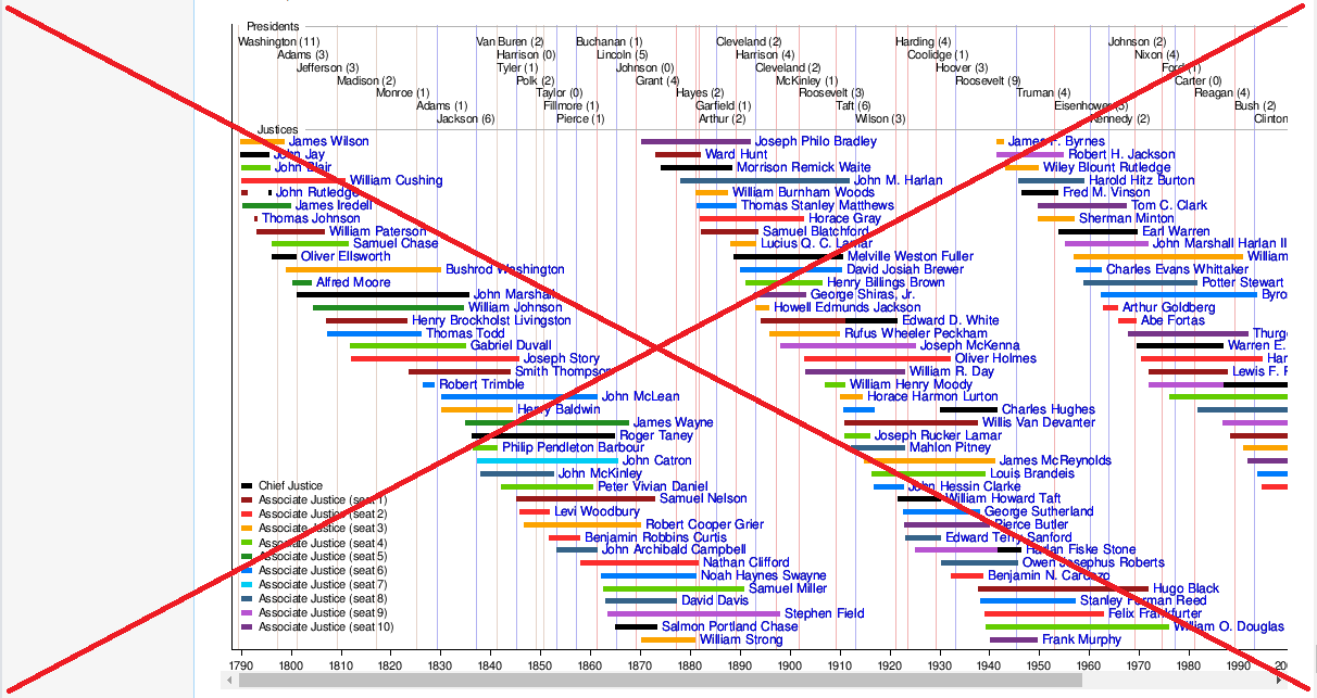
What's wrong with their graph? Here's a list of my main complaints:
- I had to study their graph for a long time to figure out what they were showing.
- They're trying to show too many different things in the same graph.
- The part of their graph that first caught my attention was their colors ... but the colors don't seem to really represent anything important (why would you need to know whether a certain justice is considered "seat 8" or "seat 9"?)
- They visually split their Justices data into three "columns" (sort of), so the layout goes horizontally across the screen, rather than down the screen. I found it really difficult to follow their timeline, when I had to keep visually jumping from the bottom of their graph back up to the top. And then they used seven columns at the top of the graph for the presidents, to show how many justices each president appointed.
- The width of their graph causes it to usually have a scrollbar at the bottom, so you have to scroll to the right to see the most recent (and which I consider the most important) justices. This problem is compounded by the fact that Wikipedia reserves a bunch of space along the left of the screen, for their generic links sidebar. When I first viewed their graph, I didn't notice the scrollbar, and I could not find the most recent justices in their graph.
- They have mouse-over text on the name of each justice, but it only shows the justice's name and has a link to the justice's Wikipedia page. There's no mouse-over text on the colored bar segments, and nothing to tell you the dates served and other interesting information.
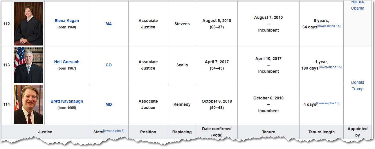
With this being a topic that people are interested in this week, I felt a need to create a better graph! Fortunately they had a table of all the data in the Wikipedia page. Here's a small sample:
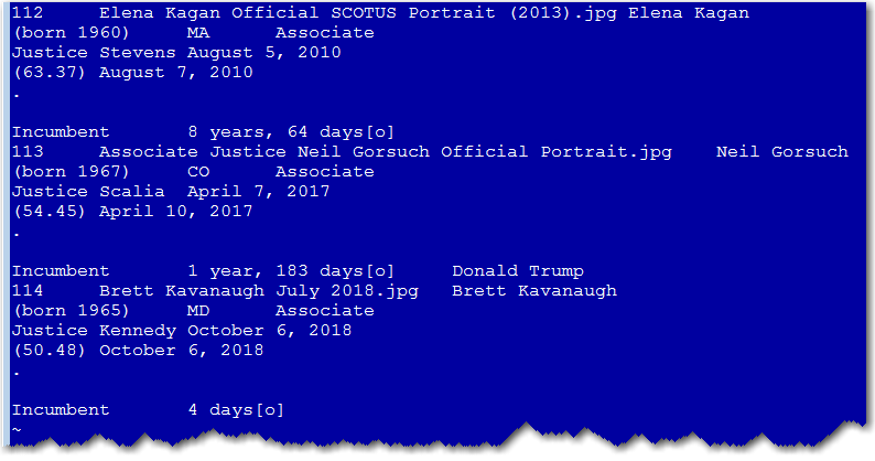
The table wasn't in an easily-consumable form (such as a csv text file, or a spreadsheet), therefore I resorted to copy-n-pasting it into a text file, and then importing it into SAS. The text file is a bit tricky to read, since each row of the table is split into multiple lines in the text file ... but SAS is very flexible in that regard, and is a crackerjack at parsing individual value out of text, as long as there is a consistent pattern and/or delimiter. If you're curious about the details, take a look at my code via this link. Below is a sample of what the text file looked like:
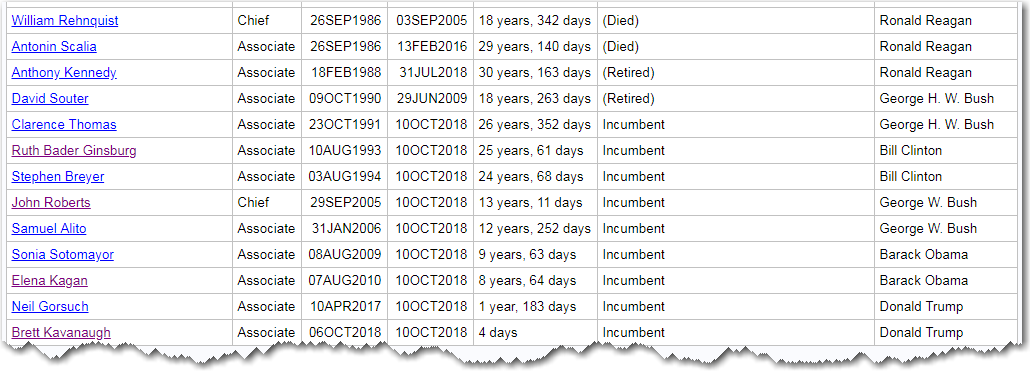
And here's a sample of what the SAS table looked like, after parsing all the important value out of the copy-n-pasted text.
And then, with a bit of SAS graphing magic, I created the following custom timeline graph. I don't try to show as many things as the Wikipedia graph, and I think mine is much easier to get your brain around. Click the image below to see the interactive version, with HTML mouse-over text and drilldowns. And if you would prefer to see the graph sorted so that the first justices are at the top, here's a link to an alternate version where I used gplot's vreverse option to sort the y-axis the other way.
Here's an example of the details I included in my mouse-over text:
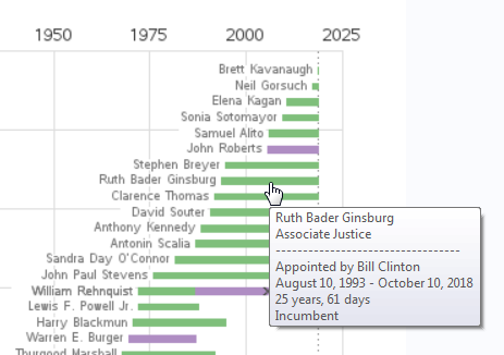
And for the programmers out there who might be curious how I created my custom graph ... I started with a scatter plot, and suppressed most of the things on the axes, and even suppressed the plot markers. I used the annotate bar function to draw a colored bar for each justice, and then the annotate label function to place the justice's name to the left of the bar. I used the annotate html variable to encode some HTML tags for the mouse-over text and drilldown (click the justice bars or names to launch a Google search). I annotated an 'x' at the end of the bars where the justice died while serving. And with the graph being so tall, I didn't want to user to have to scroll to the bottom to see the years - therefore I annotated the years along the top of the graph also. That's a lot of custom 'annotate' code ... but it's all data-driven. Here's a link to the full SAS code.
Now that you've got a simpler SCOTUS timeline graph, do you see anything interesting in this data? Feel free to discuss in the comments!


5 Comments
Great visualization Robert! I noticed that the longest serving judge stayed on 36 years and retired. Also to my surprise of all the justices no longer in office 47% died while serving. Always thought that number was higher.
Love the graph. I am going to look up why some resigned, Kennedy appointment and Johnson appointment in particular. Also the gaps are interesting, one resigned only to be appointed chief justice years later til retirement.
Hopefully my drilldown links will help you search for the answers!
To get a shorter graph with less white space, you could collapse into nine rows, one for each seat. This would yield a more compact graph in which the lengths of vacancies would be more apparent.
Yes. But there would be some trade-offs. For example, it would be more difficult to see when a particular justice moved from a regular seat to the Chief Justice seat.