I attended the Scottish Highland Games this past weekend ... nearby in Scotland County, North Carolina! They put on a great event, with kilt-wearing Scotsmen throwing things, bands playing bagpipes, kids dancing, and clans sharing their family history. And to get into the mood for this event, I decided to create a map showing what areas of Scotland the various family clans were originally from. If you're only interested in the final map, skip to the bottom - if you're a techie person interested in the details of how I created it, follow along!
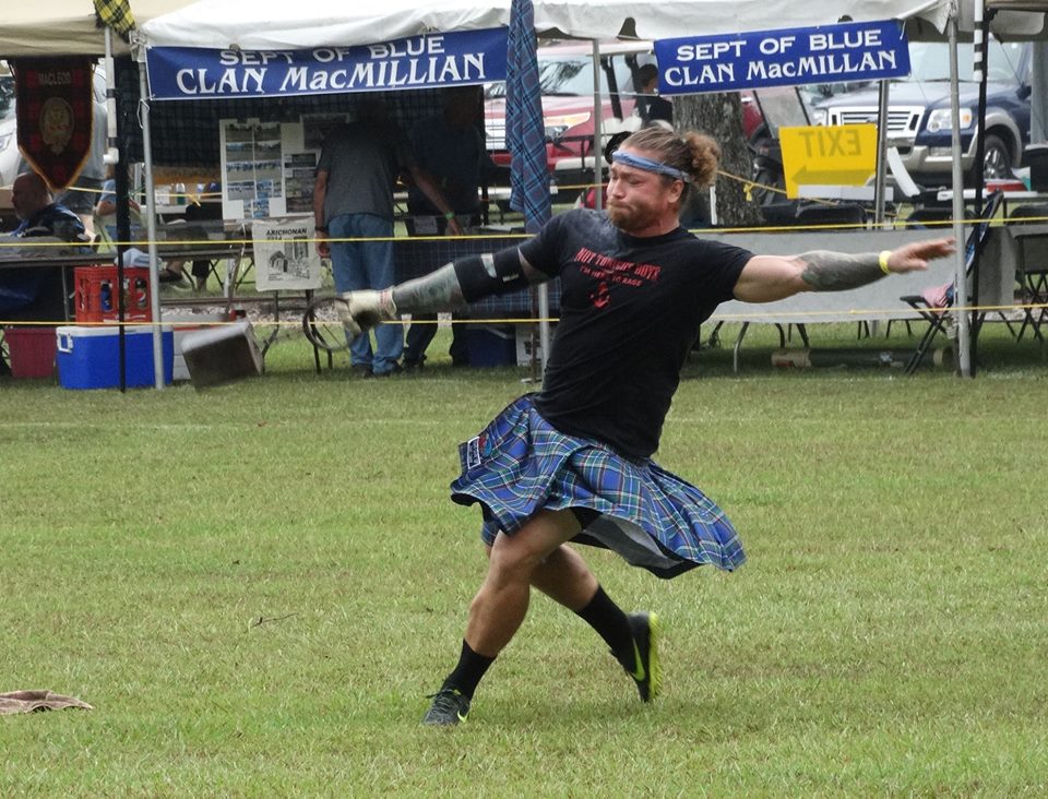
But first, to get you into the mood for a blog post about Scottish clans, here's a picture of one of the athletes winding up to throw a weight. If you'd like to see more photos from the event, there are several albums on their Facebook page. (Notice the Clan MacMillan information tent behind him - we'll come back to that later!)
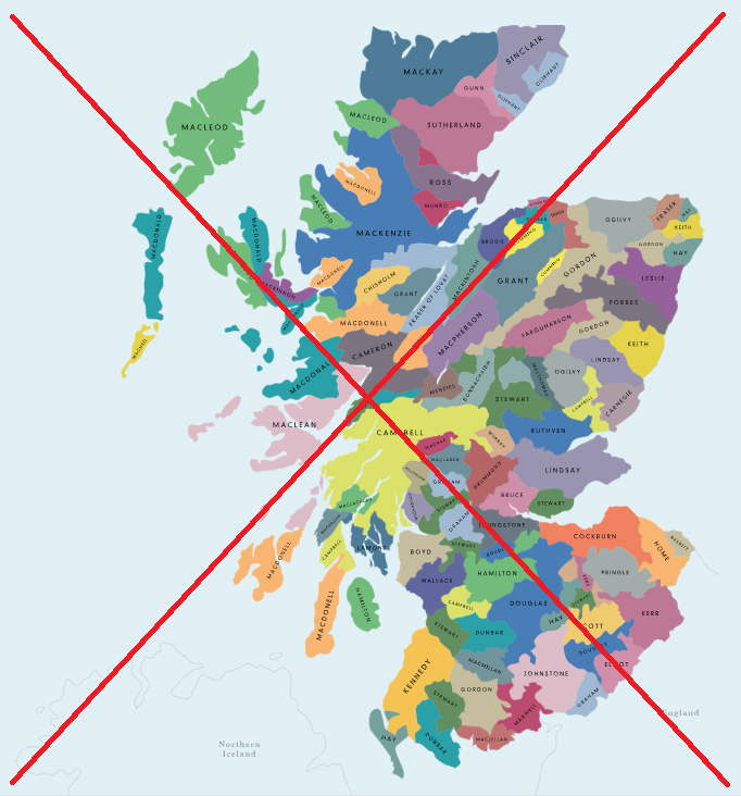
As my starting point for this project, I found a really cool interactive Clan Map on the web. Each clan's area was color-coded on the map, and you could either click a clan to highlight that clan's areas on the map, or search for a specific clan by typing the name in the search box. You can also pan and zoom their map. It's very nicely-done (click the screen-capture below to try it out).
And now, let's see how I created a variation of the map using SAS software. First, we need to get the map(s) of interest, and project and crop them so the layout is similar to the map above. I combined the maps of the UK and Ireland, and used Proc Gproject to crop out just the area I was interested in, by specifying a minimum & maximum latitude, to chop off most of England & Ireland to the south, and the islands to the north of Scotland. I knew I wanted the final map to be rectangular, therefore I first tried using a simple cylindrical projection.
proc gproject data=my_map out=my_map latlong eastlong degrees dupok
project=cylindri
latmin=54.0 latmax=59.4;
id id;
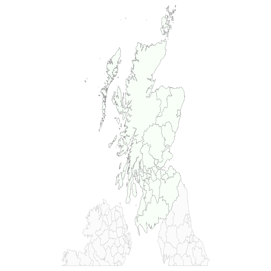
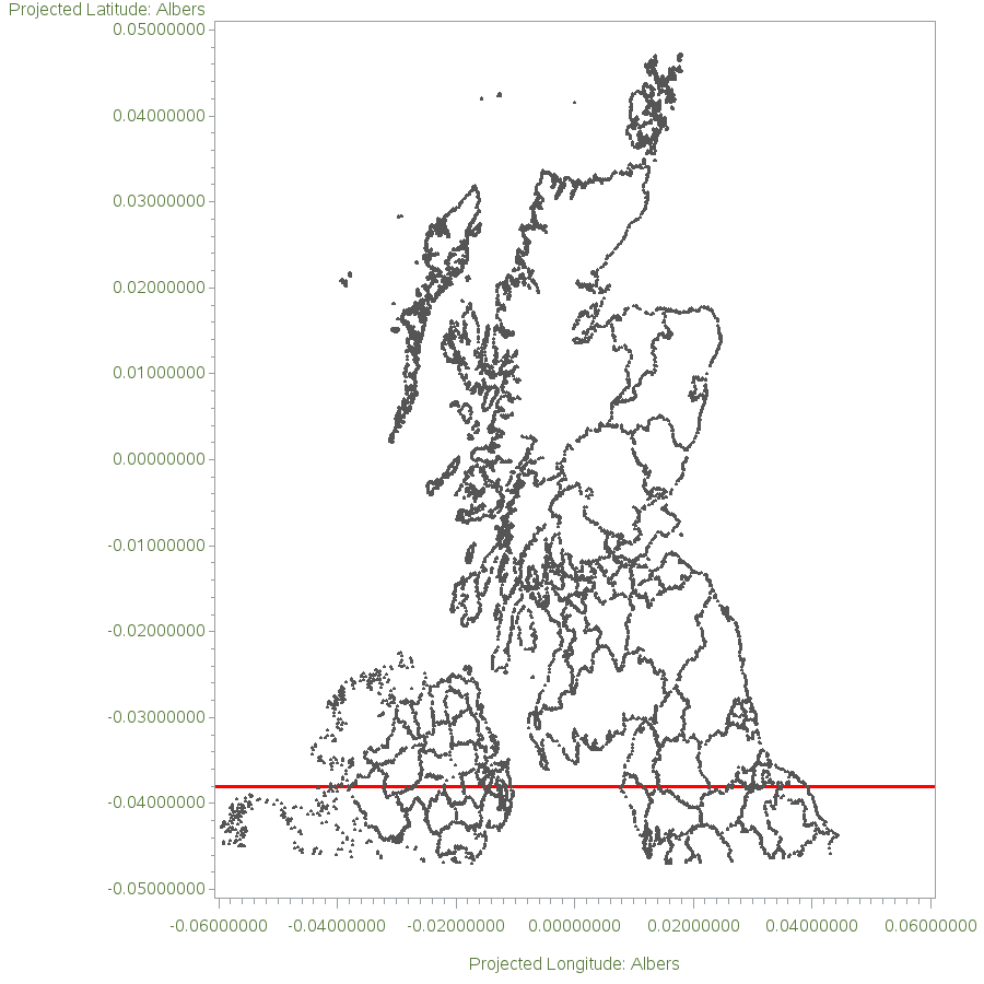
The resulting map was rectangular, but the cylindrical projection of this particular part of the world looks a little squished left/right, so I decided to try something different. I tried using the default projection (Albers), and the proportions of the map looked much better ... but now the bottom edge (clipped at latitude=54 degrees) isn't "square" to the page (I've drawn in a red line, so you can more easily see what I'm talking about.)
proc gproject data=my_map out=my_map latlong eastlong degrees dupok
latmin=54.0 latmax=59.4;
id id;
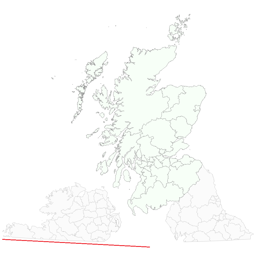
Looking at the values of the projected x/y points in a simple scatter plot, I determined that I would like to "chop" the map off at approximately y=-.038 ...
So I ran Proc Gproject again - this time on the already-projected X/Y values, and I told it to not apply any further projection, and to chop off the map at a "latmin" (in this case, Y-value) of -.038. Now, by projecting once to get the desired look for the map, and projecting a second time to chop off the bottom of the map along a straight edge (using the code below), I finally get the map I want!
proc gproject data=my_map out=my_map project=none
latmin=-.038;
id id;
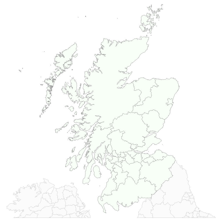
Now that I have the desired map area, how do I mark the clan names on the map? In the original map, someone put in a *lot* of work to create polygons for all the custom borders of clan name areas. I don't have those border polygon coordinates, so I decided to take a slightly different approach and use annotated bubble-markers instead. My bubble markers are a bit more vague in defining which clan lived where ... but that could actually be a good thing, because there was probably a lot of overlap and dispute as to exactly which clan controlled what area. Below is my version of the map. (Oh - and the title is in the 'Harrington' font, if you're curious!)
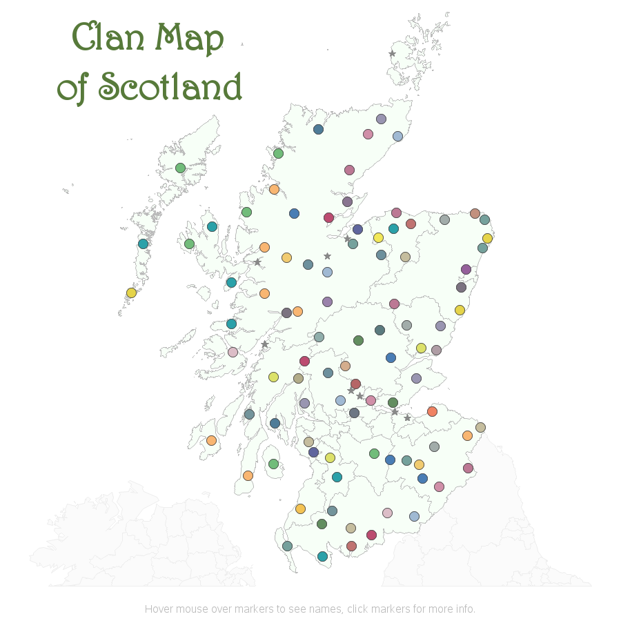
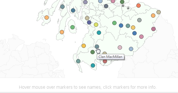
There are a few too many colors to keep track of, but I went with the same colors as the original map (for lack of a better way to do it). If you click the above map to see the interactive version, you can then hover your mouse over the colored markers to see the clan names, and click the markers to launch a Google search for more information about each clan. If a clan had multiple areas, the colored markers will be the same for each of those areas.
And now, back to that picture of the guy throwing things ... Remember the banner on the tent behind him that said Clan MacMillan(?) For fun, click my map (above) and mouse over the colored marker dots, and see if you can find Clan MacMillan in the map - and maybe even click on that dot to see what Google can find about that clan. And if you're in for a challenge, try to find the other Clan MacMillan marker on the map! :-)
Hopefully you've learned a little more about map-making, and perhaps you've even been inspired to attend the Scottish Highland Games in your area!


6 Comments
My paternal grandmother was a Cochrane, but your clan map doesn't appear to have any clans in Renfrewshire (west of Glasgow), where the Cochrane (Dundonald) clan originated.
Fairly recent map with a lot of ancient clans missing
Interesting! I would love to get data for every ~100 years, or so, and create a series of maps over time (maybe even an animation map).
Amazing fun - and a subject near and dear to my heart - Clan Graham, slate blue dots! It's actually interesting how far apart the dots are for those with multiples - and invites poking around in the history to discover why. Thanks for a diverting post on a gray and gloomy day!
Glad you liked it!
Very fun! Love the Google search interaction.