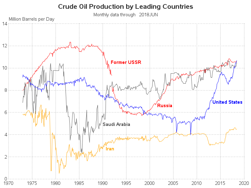
Over the years, the US has drilled for crude oil in several locations, such as Pennsylvania, Texas, Alaska, and the Gulf of Mexico. A few years ago, as the US started drilling more in North Dakota, there were forecasts that we would surpass Saudi Arabia in crude oil production. And recently, after drilling in the Permian Basin of West Texas increased, the US met that forecast even quicker than expected. In the latest data (June 2018), the Energy Information Administration (EIA) indicates the US has passed both Saudi Arabia and Russia to become the world's largest producer of crude oil. How do I celebrate such a milestone you might ask ... with a special graph, of course!
I first checked to see if such a graph might already exist. The EIA had their own graphs of the data (below), but they weren't what I would call great. They had a graph of yearly values (yearly average of daily production, I guess?) but since the year 2018 isn't complete yet, this graph does not show the US as being the top producer. (Will we be the top producer for the overall/average year of 2018 - maybe, or maybe not).
They also had a graph of the monthly data points for the last ~2.5 years, which does show the US taking the lead ... but this graph leaves out the interesting history for the past few decades. There's also some overlap between the time periods in the two graphs - but since one shows annual averages, and one shows monthly values, it's difficult to see the overlap (because they don't necessarily show the same values).

In my graph, I decided to plot the monthly data points, for all the decades available. The lines in my graph wiggle around a little more than the EIA graph - some people call such wiggle noise, but I call it detail.
Here are some of the improvements in my graph:
- I added dotted reference lines, so you can more easily tell where the data lines cross certain values.
- I add the Former USSR line section, because it helps explain the Russia line section.
- I leave out the minor tick marks on the year axis - they seem to just clutter it.
- I leave out China, because it has never really been at the same high level of production as the other countries in the graph.
- I specify in the title exactly which month the data goes through, so you don't have to try to read the axis and guess at it.
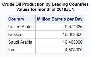
And, for a final touch, I add a small table below the graph, showing the latest monthly data points. As much as I'm a fan of a good graph, I'm also a fan of a nice simple table, when it comes to seeing actual data values.
How'd he do that?
Here are some tips about the specific SAS commands I used to create my graph.
I downloaded the two Excel spreadsheets from the EIA website, and used Proc Import with the dbms=xlsx option to import the data. (Using dbms=xlxs rather than dbms=excel allows you to run your SAS code on Windows or Unix, rather than just Windows.)
PROC IMPORT OUT=data_opec
DATAFILE="Table_11.1a_World_Crude_Oil_Production___OPEC_Members.xlsx"
DBMS=XLSX REPLACE;
RANGE="Monthly Data$A11:O558";
GETNAMES=YES;
RUN;
I used the 'getnames' option to use information from the spreadsheet as the variable names ... but there was an extra row of header information, which caused the data to be read in as character rather than numeric. Therefore I create a 2nd variable as the numeric value that I used to plot the data. Here's a bit of the code, for Saudi Arabia:
data data_opec (keep = country month tbpd); set data_opec;
country='Saudi Arabia';
tbpd=.; /* crude oil, thousand barrels per day */
tbpd=Crude_Oil_Production__Saudi_Arab;
if month^=. and tbpd^=. then output;
run;
I use an SQL query to get the maximum date in the data file, and save it into a SAS macro variable, so I can use it in the title.
proc sql noprint;
select max(month) format=yymon9. into :maxdate from all_data;
quit; run;
title2 ls=0.8 "Monthly data through &maxdate";
All the rest is pretty standard SAS code - assigning colors to the lines and annotated text labels so they show up as desired, and controlling the appearance of the axes and reference lines.
Hopefully you've learned a little about oil producing countries, or writing SAS code to graph the EIA data ... or maybe even both!


1 Comment
Very nice analysis and presentation (and explanation of what you did). I hope you will make some more posts analyzing US oil production (in whatever manner, versus other states, segmented by US states, etc.)