When you were a kid, were you intrigued by the 99-cent X-ray glasses advertised in the back of the comic books? If you ordered those glasses, you were probably disappointed. Now that you're an adult, how would you like to use computer techniques to "X-ray" your data and look for patterns? I guarantee my technique is much more real than the glasses! :-)
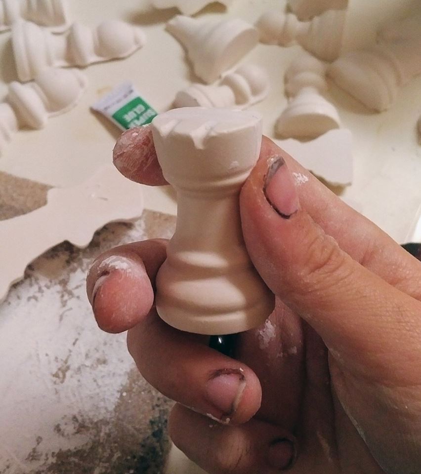
Before we get started, here's a photo hint about the data we'll be looking at. My friend Annie is making her own chess set - pretty cool, eh?!? And you guessed it - we'll be graphing chess data to demonstrate the X-ray technique.
My office neighbor Michael Thomas is a big chess fan, and does quite a bit of work with the North Carolina high school tournaments (here's one of his blog posts on the topic). Therefore any time I see a graph about chess, it catches my attention. Here's a graph from an article I recently saw on the chess.com website:
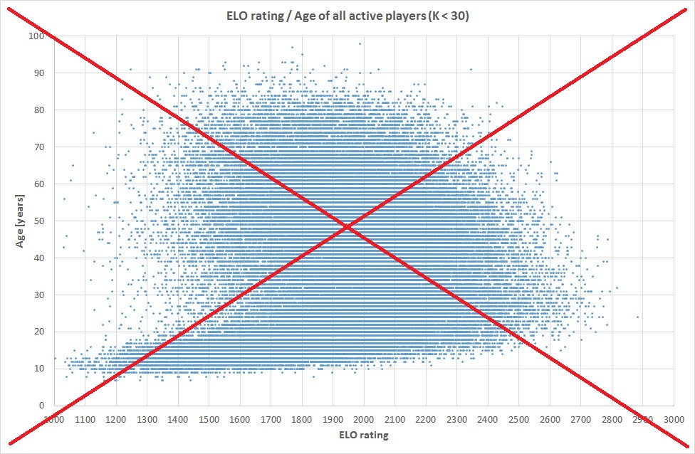
It was an interesting graph, but the layout wasn't very intuitive to me. With data like this, I think it is much more intuitive to plot the Age variable on the horizontal (bottom) axis. So I downloaded the same 2014 data from the World Chess Federation (fide.com) website, imported it into SAS, and created my own graph, with Age along the bottom:
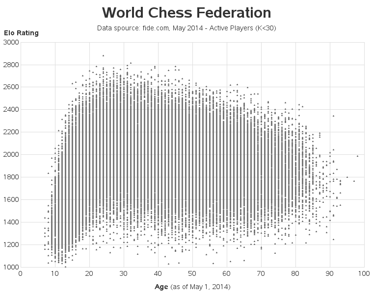
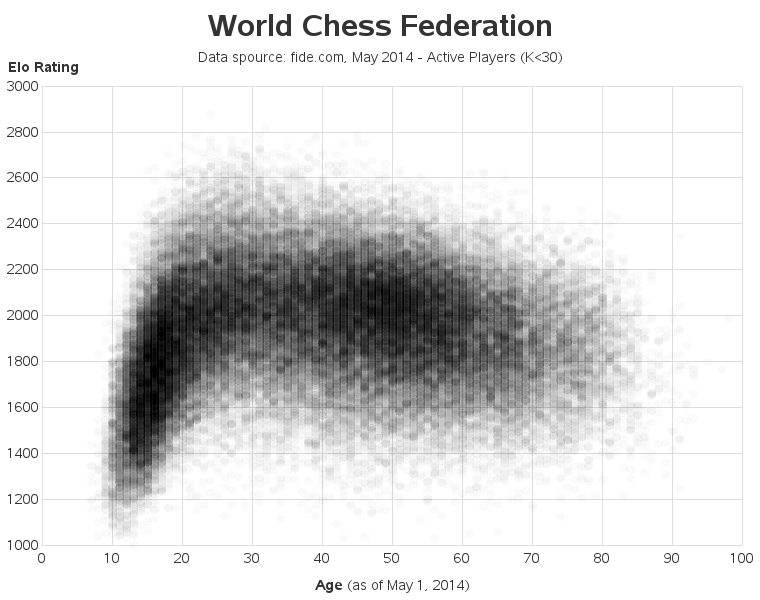
The layout is much more intuitive now, and I can see that as age increases from 10 to 30 the ELO scores quickly increase, and then generally start a slow decline. But I still suspected there was more information lurking in this blob of dots. So I decided to try ... my X-ray glasses! And unlike the X-ray glasses of my childhood, these actually worked! Compare the graph below to the graph above - see all the extra detail?
How'd he do that?
What does a real X-ray do? ... It basically lets you see through something by showing different shades for more dense parts (such as bones), and less dense parts (such as flesh), of an object. My X-ray trick in the graph is to use transparent marker colors, so that when multiple markers are plotted in the same area (ie, a very dense group of markers) that area appears visually darker. Here's the symbol statement I used in the graph above:
symbol1 value=dot height=2.5 color=A00000005 i=none;
The rrggbb = '000000' part specifies the color black, and the '05' part means use a very light/transparent shade of black. Hopefully your mind is spinning now, thinking of all the other data you want to use your new X-ray glasses on! 8-)
Do you see any patterns or trends in the X-ray chess graph? What could be the underlying reasons for those trends? And if you're a chess player with an ELO rating, where do you fall in this graph?

3 Comments
Thanks for writing about plotting with semi-transparent markers to avoid overplotting markers. It's a great technique that is often used when you are plotting tens of thousands of individual points. For an example of using transparency with PROC SGPLOT, see the article "How to use transparency to overcome overplotting." The article also shows how to use PROC KDE in SAS/STAT to display the density of the points as a contour plot. Lastly, you can bin the data into small 2-D regions and use a heat map to show the count of players for each age-ELO combination.
Good tips, Rick!
Interesting. Always wondered how to do transparency in SAS/Graph.
Gives me an idea for an X-ray 3-dimensional layered PIE chart…