The United States declared independence in 1776, and we celebrate it on July 4th every year. But the land areas that make up the United States today weren't necessarily the same as they were back then. So I thought it would be interesting to create a map showing when each county in the US was formed...
I first got this map idea from ph3r's post on reddit. Here's an image of his map:
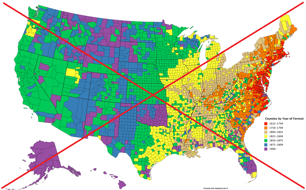
It was a visually captivating map, and definitely caught my attention. I'm not generally a fan of using the ROYGBIV (rainbow) color scheme for data, but in this case it seems to work. So, my only suggestions would be to add a descriptive title for the map, and mouse-over text for each county.
I set to work copy-n-pasting the data for each of the 50 states from the 50 separate Wikipedia tables (here's a link to the page for North Carolina, for example), and then writing code to import the data into SAS. When I copy-n-pasted the tables into a text file, the table columns were tab-delimited, therefore I parsed the text lines using '09'x (the hex code for a tab) as my delimiter. Most of the states had the year in the 4th tab-delimited column, but a few had it in the 5th column, therefore I had to write a little code to handle those exceptions. And 5 of the states had a date rather than just a year, so I had to handle those separately. There were a few other caveats, and preparing the data was definitely the most time-consuming part of this exercise!
I split the data into 7 buckets based on their year, so my legend would be divided like the original map (mostly 25-year buckets, but 1750-1799 was a 50-year bucket, etc). I then created a user-defined-format (UDF) so my bucket numbers would print as the desired year-range text in the legend - bucket 1 prints as 'before 1750' and so on. I prefer using a UDF rather than hard-coding the values in the legend, because the UDF automatically adapts when you do things like change the order of the legend (whereas hard-coded values could become wrong if you make certain changes).
And here's an image of my map - similar to the original, but with a better title and labeling:
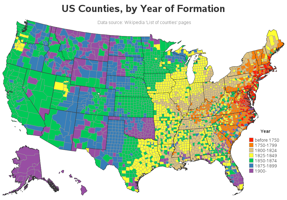
What about mouse-over text? ... Click the map above to see the interactive version with the HTML mouse-over text. Let's try out the mouse-over text in a real-world scenario. Here in North Carolina, there's a town called Snow Camp a little ways west of Raleigh. According to this sign, Snow Camp was settled in 1749.
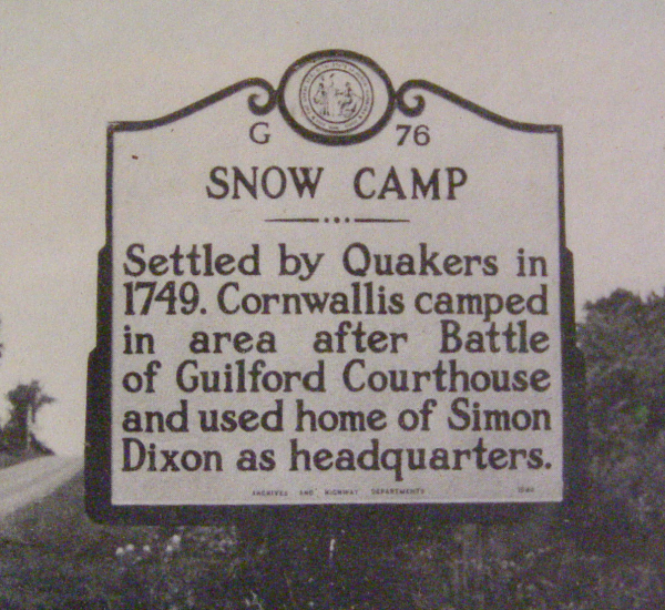
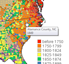
That's earlier than 1776, so perhaps Alamance county (the county Snow Camp is located in) is older than the United States(?) Let's use that mouse-over text to find out ... I brought up the interactive map, moused-over Alamance county, and found that it was formed in 1849. Therefore it appears that Snow Camp was settled about 100 years before the surrounding area became Alamance county. Interesting, eh!?! If you'd like to see a few more pictures related to historic Snow Camp, here area some from my private collection.
Now it's your turn - see if you can use this map to do a little 'exploring' and comment back if you discover anything you think is interesting!


9 Comments
Thanks for the interesting map. What is the little white triangle below Larimer County in Colorado? What are the first County date prior to 1750 and the last County date after 1900? Did you think about creating this as animated GIF?
Good observations and questions. I only used the map points with density<=1 to reduce the visual 'business' of the borders, and also reduce the size of the html file (it uses the border points to describe the borders of the areas for the mouse-over text) - if there are too many points describing the areas for the mouse-over text, then the page can take a long time to load, or even crash the user's browser. Ideally, the map would look good at any density level, but apparently this particular version of the map doesn't look good at density<=1 (I gave our map developers a heads-up in February, so hopefully they'll have an improved map for the next SAS release!)
Maybe the milestone dates could correspond with years that the US acquired territory. https://en.wikipedia.org/wiki/Territorial_evolution_of_the_United_States is a little too fine-grained, but you get the idea.
Good job! Just curious - why is Alaska and Hawaii rendered differently? Are you using a different projection compared to the original one? Seems islands such as Big Island seem somewhat squished in your version. Thanks!
Yep - I'm using a different map projection on Alaska and Hawaii (and resizing, and moving them), to make them fit into bottom/left corner better.
Thanks for sharing! I learned my own county was established prior to 1776. In other words, my county is older than the country. I could tell this when I moused over it, but not before then, since it was colored orange to indicate any time between 1750 and 1799. I think it would also be interesting to see all the counties which are older than 1776 separated by a different color.
Good idea! Perhaps I can come up with some new 'buckets' for the years of the legend colors, corresponding to certain milestone dates, rather than just using 25-year increments!
Maybe the milestone dates could correspond with years that the US acquired territory. https://en.wikipedia.org/wiki/Territorial_evolution_of_the_United_States is a little too fine-grained, but you get the idea.
I think you're on the right track!