Do you procrastinate and find excuses to delay doing certain things, even when you know they really ought to be done? And you probably realize that starting those projects is usually the hardest part, eh? Well, I finally started converting hundreds of my SAS examples to use the new GfK maps, and I thought I'd share some tips to help you get started too!
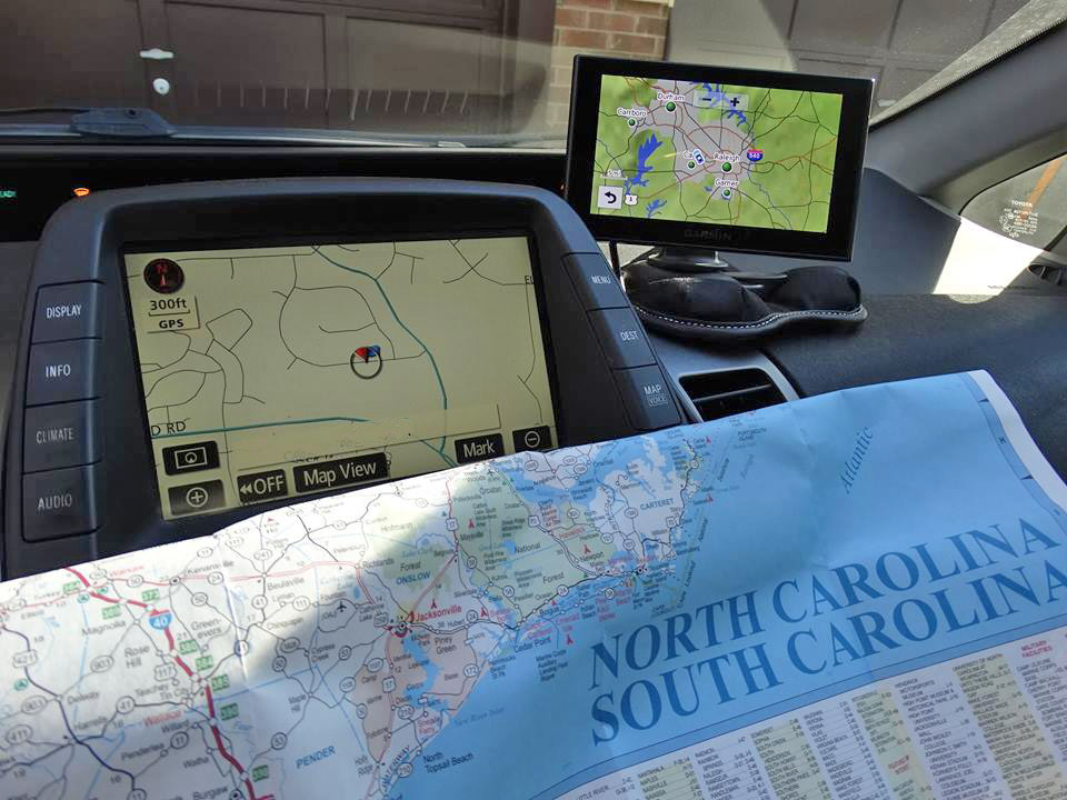
But first, here's a fun comparison of old & new maps (not the SAS maps, but the ones you might use in your car). Below is a picture of a road map, and a GPS in my Prius. These days really I can't imagine trying to get somewhere new without a GPS. Which one do you prefer and use - GPS or paper maps? Aren't you glad you switched over?!? It'll be the same way with using the new GfK maps in SAS! ...
And now, let's get you switched over to start using the new GfK maps in your SAS jobs! These tips will specifically benefit users who have been using unprojected map coordinates, and projecting them with Proc Gproject ... and also maybe annotating markers on the maps at specific lat/long coordinates.
Old Map Datasets:
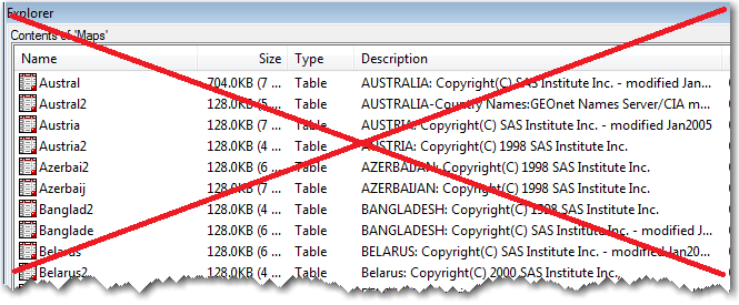
Since the early days of SAS/Graph, we have been shipping maps of the world, continents, countries, etc in the maps library. These maps had names like maps.world, maps.namerica, maps.austral, maps.states, and maps.counties (note that the names are all 8 characters or less, because that was the length limit for dataset names back in the old days when we first start shipping maps).
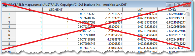
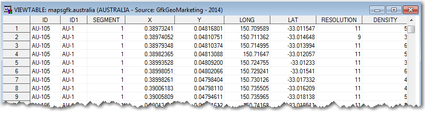
Inside the map datasets, some maps had projected x/y coordinates (like maps.uscounty), some had unprojected x/y coordinates in westlong radians (like maps.counties), and some had both projected x/y coordinates and unprojected long/lat coordinates (such as most of the country maps). Below is a sample of the old unprojected maps.austral (the Australia map):
You might be thinking ... What the heck are radians, and why are the unprojected coordinates in radians rather than degrees? And why are these longitude values negative - I thought Australia's longitude values would be positive? And why are the unprojected coordinates in X/Y variables in some maps (like maps.states), and Long/Lat variables in others? Well, that's just the way these maps were originally set up, back in the day! As my favorite country music singer Ray Scott says in his song Those Jeans ... "Don't judge." ;-)
New Map Datasets:
Some of the old SAS maps were getting outdated (over the years, borders sometimes change, as well as names of countries, regions, etc), so we started looking for new/updated maps. We made a deal with GfK GeoMarketing GmbH to redistribute a copy of their maps with our software, and those are the maps you see in the mapsgfk library.
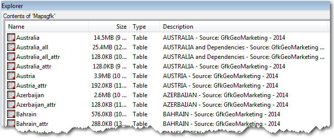
You'll notice that the mapsgfk datasets have longer names (since SAS isn't limited to 8 character names these days), the X/Y variables are consistently the projected coordinates, and unprojected coordinates are stored in Long/Lat variables. Also, the Long/Lat values are in eastlong degrees (rather than westlong radians) - this is much more intuitive and familiar for most people. The new GfK datasets also already have a density variable in them, so you don't have to run Proc Greduce to simplify the borders.
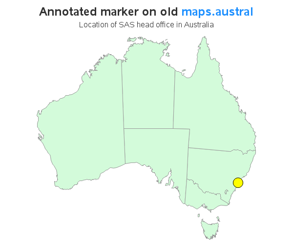
One of my favorite sayings is "Show me - don't tell me!" so let's work through an example ... For this example, I decided to take the lat/long coordinate for the SAS head office in Australia, and plot it on the map of Australia (first using the old maps, and then using the new maps). This requires several steps, and demonstrates just about every change you might need to make. I'll be using this same location data for both examples:
data anno_points;
input lat long;
anno_flag=1;
datalines;
-33.8207841 151.1529074
;
run;
Old SAS Code
Here is a simple example that demonstrates how to plot a marker at a lat/long coordinate of the SAS head office in Australi, using the old SAS maps. Follow along in the code-comments, and pay special attention to the red colored code, to see what's different in the code in the traditional/old SAS maps, and the new GfK maps.
/* convert the eastlong degrees to westlong radians */
data anno_points; set anno_points;
x=atan(1)/45 * -1*long;
y=atan(1)/45 * lat;
run;
/* get the lat/long into the y/x variables */
data my_map (rename=(lat=y long=x));
set maps.austral (drop = y x);
run;
/* Reduce the complexity of the map borders */
proc greduce data=my_map out=my_map;
id id;
run;
data my_map; set my_map (where=(density<=2));
run;
/* combine, project, and separate */
data combined; set my_map anno_points;
run;
proc gproject data=combined out=combined dupok;
id id;
run;
data my_map anno_points; set combined;
if anno_flag=1 then output anno_points;
else output my_map;
run;
/* turn x/y point into annotate commands */
data anno_points; set anno_points;
length function $8 style $35 color $12;
xsys='2'; ysys='2'; hsys='3'; when='a';
function='pie'; rotate=360; size=2.0;
style='psolid'; color='yellow'; output;
style='pempty'; color='black'; output;
run;
title1 ls=2.0 "Annotated marker on old " c=dodgerblue "maps.austral";
title2 ls=0.8 "Location of SAS head office in Australia";
pattern1 v=s c=cxd3fbda;
proc gmap data=my_map map=my_map anno=anno_points;
id id;
choro id / levels=1 nolegend coutline=gray99;
run;
New SAS Code
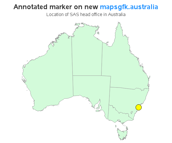
And here is equivalent code to produce the same map, using the new mapsgfk.australia map:
/* dataset name frequently have >8 characters */
/* use the lat/long directly, and density is already here */
data my_map;
set mapsgfk.australia (where=(density<=1) drop=resolution);
run;
/*
The GfK maps a lower-level of borders than you're used to
in the country maps, therefore you might need to remove
the internal borders (id) and use a higher-level border (id1).
*/
proc gremove data=my_map out=my_map;
by id1 notsorted;
id id;
run;
/* combine, project, and separate */
data combined; set my_map anno_points;
run;
proc gproject data=combined out=combined dupok
/* gproject defaults to using x/y, westlong, and radians */
latlong eastlong degrees
/* might have to use latmin/latmax/longmin/longmax to get rid of islands */
longmin=111.8 longmax=154.5
latmax=-10.3 latmin=-45;
id id1;
run;
data my_map anno_points; set combined;
if anno_flag=1 then output anno_points;
else output my_map;
run;
/* turn x/y point into annotate commands */
data anno_points; set anno_points;
length function $8 style $35 color $12;
xsys='2'; ysys='2'; hsys='3'; when='a';
function='pie'; rotate=360; size=2.0;
style='psolid'; color='yellow'; output;
style='pempty'; color='black'; output;
run;
title1 ls=2.0 "Annotated marker on new " c=dodgerblue "mapsgfk.australia";
title2 ls=0.8 "Location of SAS head office in Australia";
pattern1 v=s c=cxd3fbda;
proc gmap data=my_map map=my_map anno=anno_points;
id id1;
/* since id isn't numeric, use segment instead */
choro segment / levels=1 nolegend coutline=gray99;
run;
Benefits of Using the New Maps
As you can see, it will require a little work to converted your old legacy code from using the traditional/old SAS maps, to the new GfK maps ... but hopefully you will find it is worth the effort. Here are some benefits you will see:
- The new GfK maps are updated on a continual basis, and are therefore more accurate.
- The new maps are more consistent (Lat/Long are always unprojected, and Y/X are always projected), therefore it's easier to write re-usable code.
- Proc GProject has been enhanced so that it can be used directly on the Lat/Long variables in the GfK maps, by specifying the 'latlong eastlong degrees' options ... which makes using the GfK maps easier and more intuitive.
- The new GfK maps already contain the 'density' variable, so you don't have to run Proc Greduce.
- The GfK maps tend to show more detail. That's generally preferable (but sometimes you might need to get rid of small/outlying islands, by using Proc Gproject to clip out just the geographic area of interest).
- The GfK maps go to a lower level of granularity (generally two levels - with the 'id' and 'id1' variables), which provides you with more flexibility. (But It's a bit of extra work to use Proc Gremove to get rid of unwanted internal borders, for the situations where you don't want those extra levels.)
Hopefully I've inspired you to convert your old SAS code to use the new GfK maps. How is the conversion going for me, you might ask? So far, I've converted 333 of my mapping samples to use the new GfK maps, and have 402 I still need to convert - I'm almost half way there! :)

4 Comments
Nice! Thanks for the great work.
wow!
I love the illustrative explanations. I am sending this on to our users.
I think this will be very helpful for those renovating code! I like the background explanations.