The flu seems to be especially potent this year. "How potent is it," you might ask? ... Well, let's plot some data on a map to help find out!
Here in the US, the Centers for Disease Control and Prevention (CDC) compiles data about diseases, and provides reports and graphs on their website. For the flu, they provide an interactive map animation (see screen capture below, or click here to see their actual map).
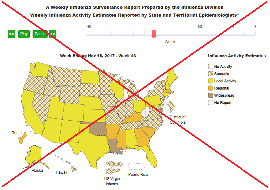 I was glad to see they had a map, but there were several things I thought could be improved:
- Their colors and patterns are not intuitive - I can't tell just by glancing at them, which ones are color and pattern is better/worse than another.
- The title is separated from the map by the animation controls - this makes it difficult to know the title goes with the map, and also makes it impossible to do a screen-capture without including the animation controls.
- They include several non-states in the map (Guam, US Virgin Islands, Puerto Rico, and DC). This makes the map a bit cluttered.
- They show both the date and the week number, which can be a bit confusing (especially since the week number resets to '1' in January).
- The legend has the lower values at the top, whereas I think it's best to put the highest values at the top.
I wouldn't be much of a graphics expert if all I did was complain about other people's graphs, so I set about creating my own new/improved map (practicing what I preach). The first step was to get the data. The CDC page allowed me to select each year's data, and download it as a csv file. I then imported the csv data into SAS, and started working on my map.
Here's a snapshot of my map, plotting the same week's data as the CDC map snapshot above:
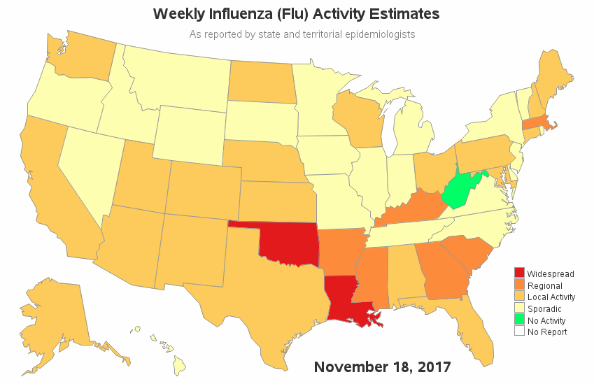
- I used green for 'No Activity', and gradient shades of red for the levels of flu activity. I think this is much more intuitive, and easier to understand at a glance. (Perhaps the original used certain colors and cross-patterns to help people with certain kinds of color blindness? If that's the case, then perhaps they could provide that as an 'alternate map' users can click an button to see, rather than forcing everyone to use it.)
- My title is close to the map, so there's no uncertainty about what is being shown in the map.
- I only include the 50 states in the map. I think this reduces a lot of clutter. Perhaps a button could be added, that users can optionally click, to see a map with territories (but don't make that the main/default map).
- I only show the date, and not the week number.
- I order my legend so that the worst flu values are at the top.
And below is the animated gif version of my map. Although an animated gif doesn't give the user the ability to stop & start the animation (to scrutinize a specific date), it does have a few advantages over the CDC's animation application. The gif animation doesn't require the user to click a 'start/play' button - it starts automatically. Also, any browser can play a gif animation, whereas some browsers might not be able to play the CDC's animation.
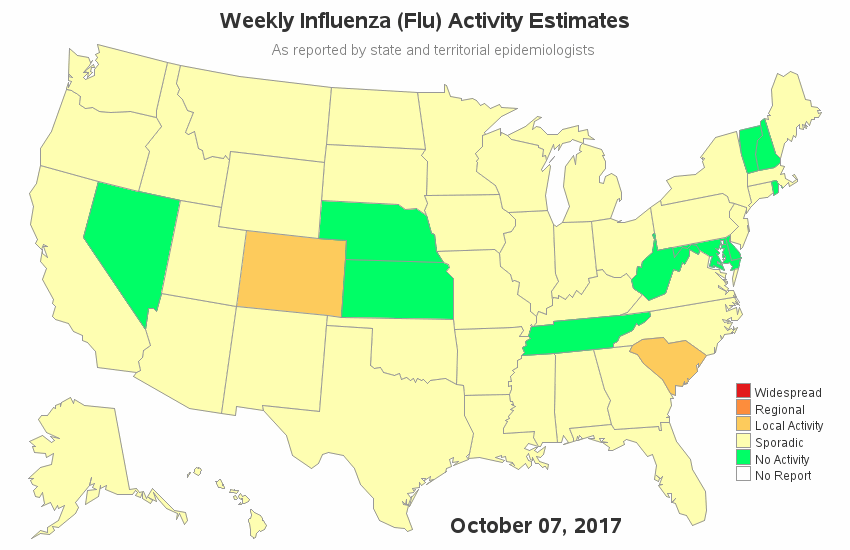
If you'd like to see my gif animations of previous years, here are a few to choose from: 2014-2015, 2015-2016, 2016-2017, and 2017-2018.
Looking at these gif animations, so you see any trends? Does the flu generally start in one part of the country, and spread to the other states? Do certain states tend to have less flu than others? What are your observations, and what is your guess at the root cause? (feel free to discuss in the comments section!)


5 Comments
hello, sir Robert....
i just loved the animation presented in the map. the map provides smooth and clear view of the topic than the one used before. in my observation flu is a disease the spread from one person to the other. the colors used in the map gives a clear information but they create ambiguity in mind when starts automatically as one can not remember the scenario quickly. you must introduce the start and stop button so that they can be easily understood and examined. Thanks for such great work!
Powerful animation, thanks!
Maybe for my next 'trick' I'll do a version of the animation using JMP, so you can stop/start/control the animation! :)
Robert,
You may like green but aren't you forgetting about those of northern European decent who may have inherited colorblindness? CDC would not be able to use your version because it is not section 508 compliant.
I ran my map through the tester on vischeck.com, and when I simulate what it would look like to a colorblind person, I am able to distinguish all the colors used in the map.