With all the talk about Bitcoin in the news lately, I decided it was time I created a Bitcoin graph! Follow along as I track down the data, create a graph, and then polish up that graph to make it shine.
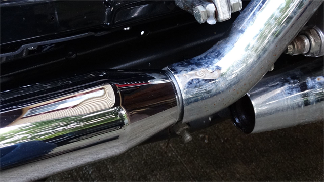
But before we get started, here's a little example to show you what a difference a bit of hard work and polish can make... This is a picture of the side pipes on my sister's Harley. When she had kids, she decided to retire her bike for a while (it sat for about 10 years), and the chrome pipes were looking kinda dull. But I used some Wenol metal polish, and quite a bit of rubbing and patience, and got them shining again! The sections of pipe on the right show what they looked like after sitting for 10 years, and the section of the left shows what the chrome looked like after I worked on it. See what a difference a good polishing can make!
And now, let's polish up some Bitcoins! (or, rather, a Bitcoin graph!)
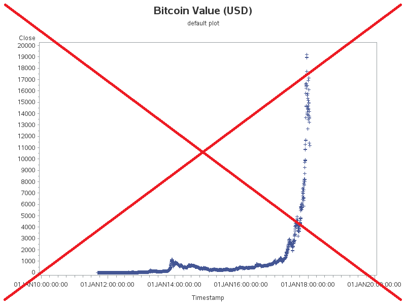
This past fall (2017), the value of Bitcoins shot up from less than $5,000 to almost $20,000. But the value peaked in mid-December, and has generally been falling since then. It's almost down to $10,000 now (mid-January, 2018). Did you catch all those numbers? ... Would you rather see them in graphical form? ... Me too! Therefore, let's create a graph!
I did a little searching, and found some data on bitcoincharts.com. I clicked 'charts' (near top/middle of page), made sure the symbol was set to 'Bitstamp (USD)', Time Period: All, Daily, Chart type: Closing Price, and clicked 'Draw'. I then clicked the 'Load Raw Data' link at the bottom/left of the chart, and copy-n-paste the data into a text file I could read into SAS.
I used Proc Import to read in the tab-separated values in the text file (using the dbms=tab option). It did a great job, and even handled the time stamps automatically. I used Proc Gplot to create a simple graph, using all the defaults, and this is how it came out (below). It's not a bad graph, but it's not a great one either.
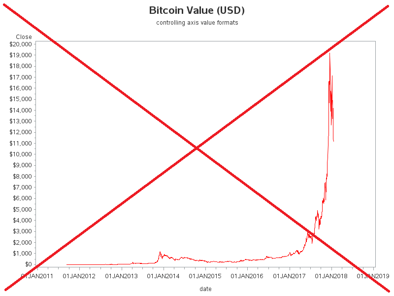
Let's polish up this Bitcoin graph! My first enhancement was adding some formats to the values on the axes. By applying the dollar. format, you see values like '$20,000' rather than '20000'. I also show just the date part of the time stamp on the bottom axis, rather than the full date & time. And rather than the default blue '+' plot marker, I use a red line to connect the data points
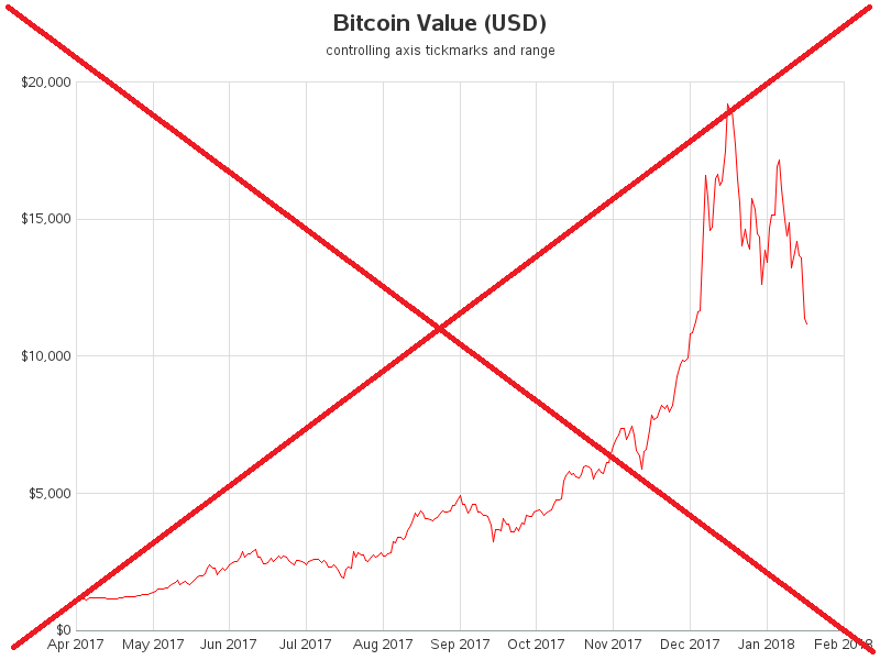
The graph is looking better, but it still needs some more elbow grease. For example, there are too many values along the axes for my liking, Using the order= option on the axis statements, I was able to control exactly how many tick marks/values are shown along the axes, and also truncate the date axis to show just the range of dates I'm interested in. I've also shortened the date formats, to show 'Jan 2018' rather than '01JAN2018'.
The above graph looks pretty good, but I wanted to pull out all the stops and really polish this graph up. So I rolled up my sleeves, set my mind to it, and went into spit shine mode! Here's the final graph (click the screen-capture to see the full size interactive version with HTML mouse-over text):
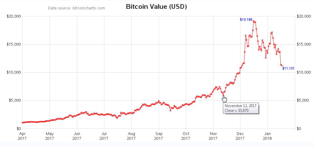
Here are some of the tricks I used to create the final graph:
- I used the goptions xpixels= and ypixels= options to change the proportions of the graph, making it more long & narrow, as is more befitting for a time-series graph.
- I used Gplot's plot2 statement to add an axis on the right-hand side of the graph (I didn't really want to plot an additional set of markers, therefore I used a special symbol statement to make those markers 'invisible').
- I used the symbol statement to add small circular markers to the line - this helps you 'see' what the data is doing, and also gives a place to add the HTML mouse-over text (click the graph screen-capture above, to see the interactive version with the HTML mouse-over text).
- I used the split option on the axis statement, to separate the month & year onto two lines in the bottom axis.
- I used Proc SQL to determine the peak value (and the last/final value), and then turned those data points into an annotate dataset, so I could show those values in blue on the graph.
- And I used the note statement (rather than title or footnote) to add a bit of text in some otherwise unused white space, letting people know where the data came from.
For those of you who are curious about all the details, here's a link to the code I used.
So, do you have any Bitcoin stories to share with us? Perhaps you bought some Bitcoin early-on, and would be a millionaire now ... except you forgot your password? Maybe you bought some Bitcoin this past December, and it lost half its value? Or perhaps you were somehow scammed or hacked, regarding Bitcoin? Feel free to share your story in the comments section!


4 Comments
Thanks.
Rob,
The "split" option is nice when a label has two words (month~year) or only has a few combinations (‘My Happy~Place in Cary’) to find a splitting point; however, I’m wondering if SAS GCHART has capability to (or in the future) always split the label once it exceeds XX length? For example, I have 10K locations running in a loop of HBARS. Sometimes the label is quite long leaving little room for the bars. My current fix is running the parameter through a length check and adding a split character. I hope the capability is out there—I can’t find the syntax though. Thanks.
I don't know of an option to split Gchart text at a certain length (only the 'split' character that you mention). But it's possible one exists, that I don't know about! :)
Great tip.
"I used the goptions xpixels= and ypixels= options to change the proportions of the graph, making it more long & narrow, as is more befitting for a time-series graph."