As marijuana has become legal in several states, it's been a frequent topic of interest in the news. And as with any interesting topic, I like to find useful ways to visually analyze the data. In this case, let's have a look at the price of marijuana, and how it varies from state to state...
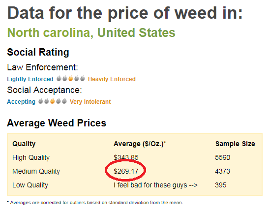
First, I needed some data. After a bit of Google searching, I found a website called priceofweed.com that has crowd-sourced marijuana price information. It lets you search for various areas (such as states), and here is an example of the type of data they have for North Carolina:
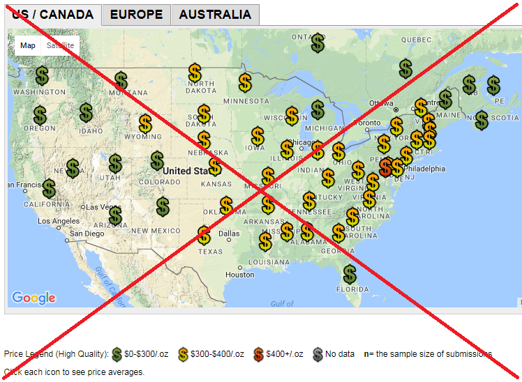
Their web site also has a map of the US, with color-coded '$' characters representing the price of marijuana in each state. It's a cute map, but not very analytic in my opinion.
So of course I decided to try creating my own version. The most difficult part was getting all the data. The data for each state was on a separate web page, embedded in the html code. Therefore I wrote a SAS data step to loop through each US state, and call a macro which I set up to 'scrape' the data out of the html code. I combined the data for all 50 states into a single dataset, and then saved it in a permanent library (so I wouldn't have to re-read all 50 web pages each time I experimented with my graphs). Here's a link to the code, in case you'd like to see the exact syntax.
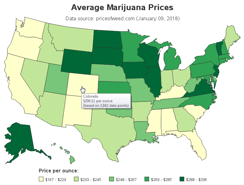
Rather than plotting colored markers on my map, I used a choropleth map. And rather than having three colors (green, orange, red) for three price ranges (0-300, 300-400, 400+), I used quintile binning so that each of my 5 gradient shades of color represents 1/5 of the states. I also added a title & time stamp, and each state has HTML mouse-over text (click the screen-capture below to see the interactive map).
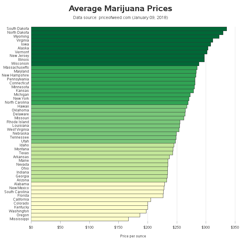
I was pretty happy with my improved map ... but I still felt something was lacking. It was interesting to see how the prices varied state-by-state, but I thought it would be even more useful to have an easy way to compare the prices of the states. Therefore I set up a sorted bar chart (and color-coded it the same way as the map, for each cross-referencing). I think the combination of the map and bar chart provide a lot of insight into the price data.
What other ways would you like to graphically analyze this data? I wonder if there might also be a correlation between price and the legalization status in the states (see my previous blog post showing which states have legalized marijuana use). And how might you re-use these techniques with data other than marijuana prices? I'll give this some more thought ... but I think I'll grab a snack first!
Note that buying marijuana is not legal in many states (see my prior post for when and where it’s been legalized). And although there is price data for all states, of course I'm not encouraging anyone to buy marijuana in states where it's illegal.


8 Comments
Your bar graph (color grouped by quintiles) makes it more quickly understandable to me.
From Nebraska. It's like 200/oz here. This data is inaccurate at least on that point, which calls into question the validity of the rest.
Hmm ... the Nebraska price was based on 995 data points. Perhaps you can go to their web page (priceofweed.com) and help them out with one more data point! :)
I guess in the states at the bottom the market must be saturated.
"Think Stats, 2nd Edition" by Allen B. Downey deals with this same data in Chapter 12 on Time Series Analysis. It's available on Safari Books Online for your perusal.
Thanks for the tip!
I thought if there was a way to combine the price with the legalization and law enforcement status, that might be useful. I was just wondering why the price is so high in VA when they are probably really good at growing weed with their already established practices with tobacco?
I keep thinking NC should legalize growing and ship to states that have legal consumption status. Compete on the "natural grown" vs greenhouse. NC also has a strong history with tobacco. Looks like a new cash crop to me! (Maybe getting too political for a SAS graph).
Back to the question.. WHY does the price vary so much per state, especially ones that have a suitable climate for growing. If we could answer that question with one graph, I'd be impressed!
That would be a "Eureka Graph", eh!?! :)