When I was growing up, our family had a bookcase containing a set of encyclopedias - it was where I went to obtain information and facts about various things, to satisfy my curiosity and impress my friends. Now that we have the Internet, Wikipedia has taken the place of encyclopedias for me - and I suspect for a lot of other people! So, what Wikipedia pages do you think are the most popular - let's dig into some data and find out ...
But before we get going, here's a picture to get you in the mood for this topic. My buddy Paul had his parents take a picture of this fine set of Encyclopedia Britannica from 1953 (Coronation of Queen Elizabeth II edition) with yearbooks. Does this bring back memories? I suspect that in addition to the encyclopedia industry, there was also an entire industry for making book cases to hold encyclopedias, eh? Thanks, Paul!

And now, on with the data analysis! Paul Kaefer (no relation to encyclopedia-Paul) recently pointed me towards an article that touches on answering my question about the most popular Wikipedia pages. In the article, Nikhil Sonnad shows a calendar chart of the most popular Wikipedia page for each day of the year 2014. He gradient-shades the days based on the number of views the page got that day, and you can click on the days to see what page was the most popular that day. Below is a screen-capture of 1 month (click the link above to scroll through all 12 months).
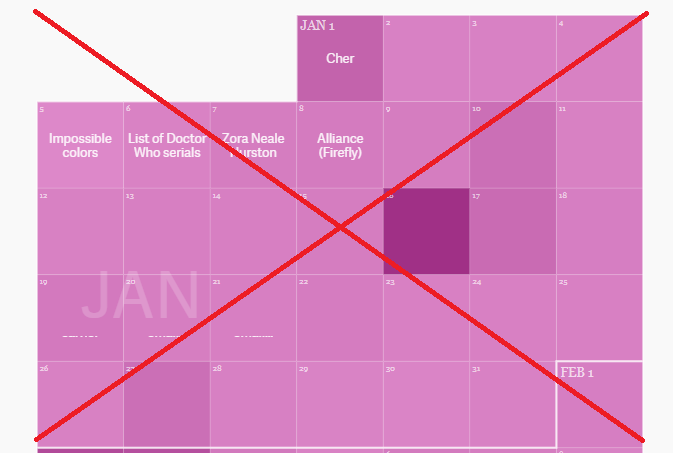
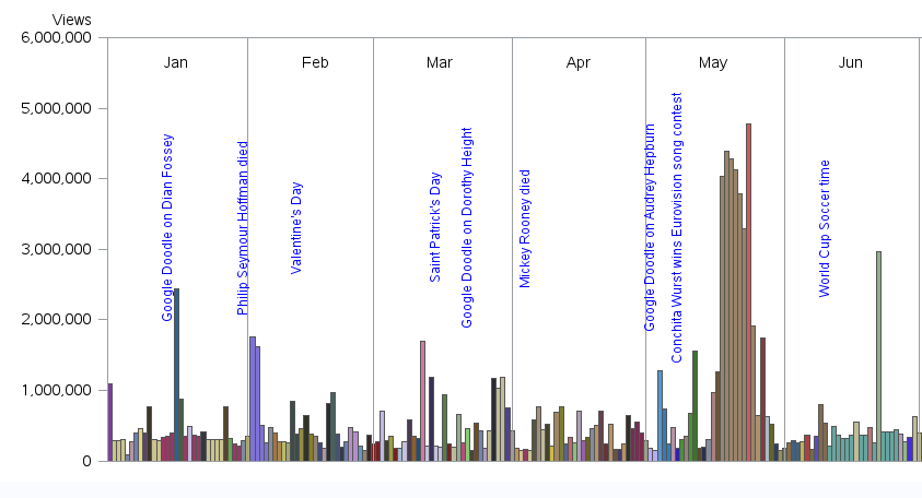
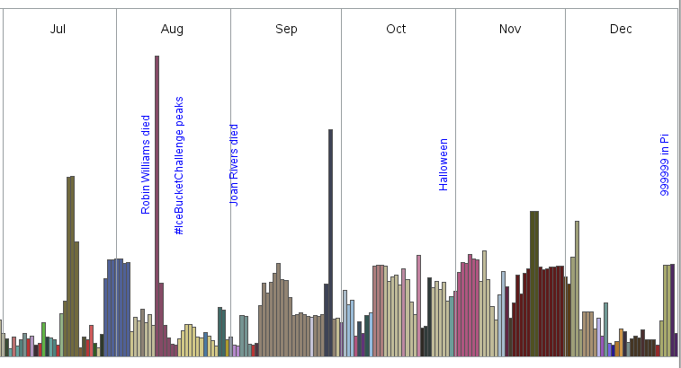
To me, this is *very* interesting information ... but the visualization makes you work *really* hard to make any sense out of it. Kaefer suggested that I figure out a better way to visualize the data, so I downloaded the raw data, imported it into SAS, and started playing around with graphs to see what I could come up with. Below is a screen-capture (in two pieces) of my final graph - click here to see the interactive version with the HTML mouse-over text and drilldowns to the Wikipedia pages.
Here are some of the features of my chart:
- I use bar heights rather than color shades to show how many views the pages got on each day (this makes it much easier to quickly compare the bars, and also frees up color for a different use).
- I used a different color for each page - there are too many colors to worry about having a legend and trying to discern what each one is ... but you can now easily see when the same page was the most popular for several days in a row.
- I set off each month with reference lines, and added monthly labels at the top of each group of bars.
- I also annotated some notes (blue text) showing events that might have influenced what Wikipedia pages were being viewed.
- I added HTML mouse-over text to each bar, showing the page name, the date, and the number of views the page got on that day.
- And, you can click on each bar to quickly/easily go to that Wikipedia page.
I think this is an handy way to study some interesting data. Click my chart above and view the interactive version, and see what you think. Did you find anything interesting or surprising? Do you have any additional explanations why certain pages might have been popular on a given day in 2014? Feel free to share your thoughts and theories in the comments!


3 Comments
The original, with page names in the blocks, does allow a familiar and intuitive way to see "what" and "when" something happened (weekends, mondays etc). The wall calendar presentation does add value.
The article was written on Jan 7 2015 and that's the last day descriptive text was in a day box (of course) - perhaps the article should have shown historical data instead of a year in the future (w.r.t. the date the article was written) and then it would not have given the impression of being really hard to find info. (Imagine your chart with future dates, your bars would all be zero).
Soooo - I really like your chart (and all your posts!) but like most issues, there is a context to the story that explains things. In this case the difficulty using the original has more to do with point in time context in my opinion. I think you solved some different issues in a sense, albeit in your typical expert way! Cheers!
Ahh - good points!
Thanks for the great post! I wonder why 999999 in pi appears. Definitely makes me think about how some of these were likely posted online someplace like reddit.
Would be great to see an update for 2017...