I was recently reading the Wikipedia page about the U.S. presidents. There was a table with a lot of interesting data, but I thought it would be much easier to get a handle on the information if there was also a timeline graph. So, of course, I set out to create one!...
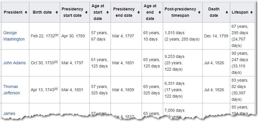
Here's a sample of the data in the Wikipedia table:
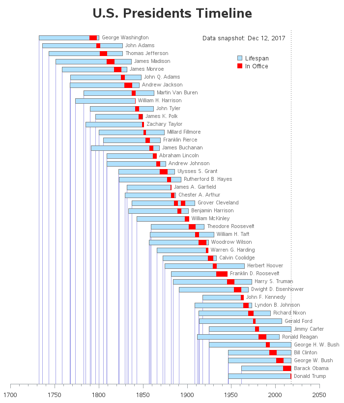
I copy-n-pasted the data from the table into a text file, cleaned it up a bit using an editor, and imported it into SAS. After giving it quite a bit of thought, and experimenting with several different ways to plot the data, I came up with the following graph. (click on the image below to see the interactive version, with HTML mouse-over text and drilldown links)
Here are some features and customizations in my graph:
- Each blue bar represents the lifetime (birth-to-death) of a president.
- The red segment(s) in the bar represent the time period each president served in office. Note that Grover Cleveland served non-consecutive terms, and therefore has 2 separate red segments.
- There is a dotted reference line at the current date - if a blue bar extends to that line, then that president was still living at the time of the data snapshot.
- There is a note in the top/right corner of the graph showing when the data snapshot was taken.
- I added blue reference lines extending from the birth dates down to the horizontal axis. I find it interesting that there was certain time periods when several presidents were born, and other time periods when no presidents were born.
- The time axis has labeled tick marks each 50 years, and minor (unlabeled) tick marks at each 10 years.
- I placed the names inside the graph, beside the bars, rather than along the left axis. I think this makes them easier to relate to the bars.
- And if you view the interactive version, the bar segments have mouse-over text, and you can click the bars to launch a Google search for more information about each president.
And, as always I recommend looking at data in several different ways to get a more complete understanding. This graph focuses on when the presidents were born/served/died along the timeline. And in my previous blog post, I shared a different graph of the same data, that focuses on comparing the ages of the presidents. Each graph "keeps it simple" (see the KISS Principle), rather than trying to show too many different things on one graph.
Does anything jump out at you about this graph? Were there any 'surprises' in the data?
Bonus Material:
And here's a little bonus for those of you who read all the way to the bottom of this blog post! Speaking of past presidents ... Do you remember hearing the story about young George Washington chopping down his father's cherry tree, and then when asked if he did it, he answered "I cannot tell a lie..." The picture below is of a hatchet my friend Jason owns. He says it is the very hatchet George Washington used! Unlike some antiques/relics that sit in a museum, this one has remained in use all these years. It has seen so much use, that the wooden handle has been replaced three times ... and the metal head has been replaced twice. Thanks Jason!


2 Comments
Hey Robert,
Always appreciate your eye for visualizing data!
I think on this one it might depend on what information you want to glean. In my case, I was drawn to the idea of a president being alive during subsequent presidencies. For example, was Taft alive during Coolidge's presidency? Or was Truman alive during Johnson's? Maybe not the best presentation for what I was intending to discover. But maybe perfectly presented for other interpretations?
What do you think?
-Kevin
Good observation! ... Ideally, you would start with the question you want answered, and then design a graph that would work really well for answering that specific question.