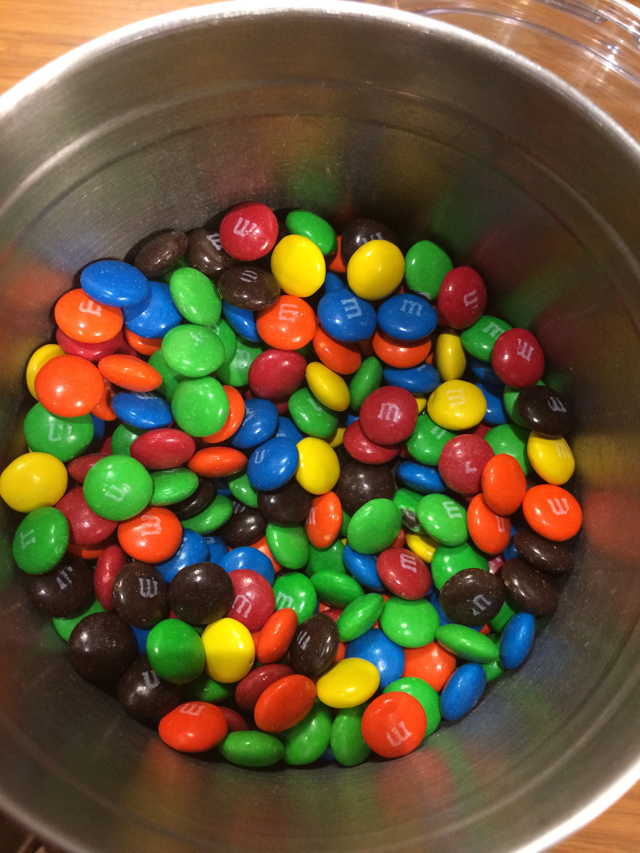
Some people might think it's an urban legend that SAS gives its employees free M&M's. Well, I'm here to tell you it's true! Every Wednesday at the Cary headquarters, a bucket of M&M's shows up in each of the break rooms. I'm only half-kidding in my suspicion that this is some people's favorite employee benefit. Today happens to be Wednesday, and here's a picture of some M&M's from the break room as proof (thanks for the photo, John!)
After seeing all these M&M's for the 25 years, I thought it might be interesting to play with graphing some M&M data. I didn't really want to spend a lot of time collecting my own data (and I would probably put on quite a few pounds doing so), therefore I looked to the Internet and found a sample graph in a teacher lesson-plan.
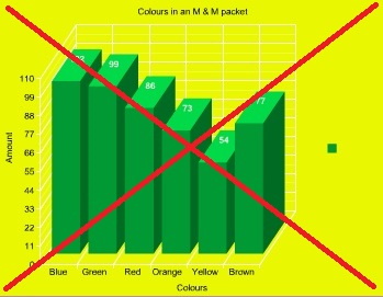
The good thing about the graph is that it had each bar labeled with the color, and the number of M&M's of that color. That's about as far as the 'goodness' goes, though. Here are some problems that jumped out at me:
- 3D bars are a poor choice - they're difficult to compare, and difficult to see exactly which axis values the bars line up with.
- The numeric axis is labeled by increments of 11 ... that is a very odd increment to choose (no pun intended!).
- A color legend is shown, even though only one color was used for the bars.
- It's OK to use just one color for the bars, but that one color should probably not be one of the M&M colors, as that could cause confusion.
- The color selection (bright green bars on a bright yellow background) is a bit garish.
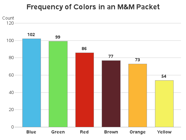
I created a SAS dataset with the data from their graph, and started working on my new/improved SAS graph. I'll show you some of the intermediate versions along the way to creating the final graph. Here's the first version, using all default settings:
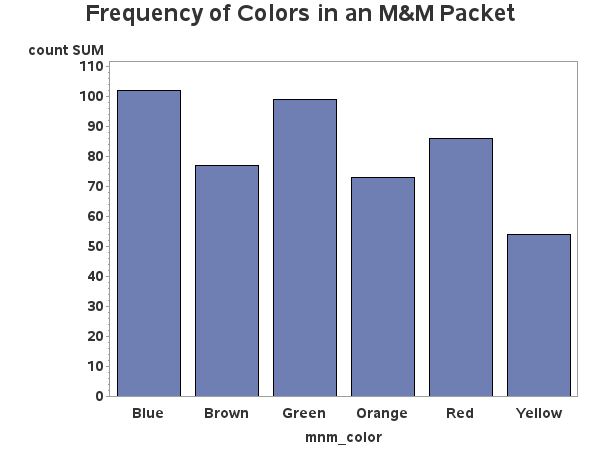
Let's work on the axes first. We don't really need the label for the bottom axis, and let's shorten the numeric axis label to 'Count'. Let's also remove the minor tick marks, and de-emphasize the numeric values a little by using a non-bold font. All of these changes were made using axis statements, and the graph looks a quite bit cleaner and less cluttered.

Now, let's work on some things inside the axes. Since the main focus of the graph is the frequency count of each color, let's use the outside= option to place the frequency value on top of each bar. Also, let's use the descending option to order the bars by their height. Let's use the autoref option to add reference lines, and the noframe option (and style=0 on the axis) to remove the frame around the graph. The graph is now becoming much easier to read!
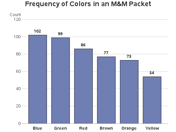
How about some color. Each bar has the color name written below it, but I think it would be helpful to also color the bars the same as the M&M's. Therefore I specified six pattern statements, containing the six desired colors, and the graph is now even more delicious!
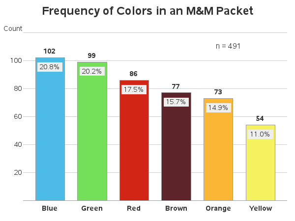
The above is a fine chart. It's not too cluttered, and it lets the user quickly see how many M&M's there were of each color. But I tend to lean a little towards analytics in my graphs, therefore I wanted to add a little more information. I thought it would also be useful to know how many total M&M's were in the packet, and also what percent were of each color. I used SQL to calculate the total number, and stuff it into a macro variable. I then used that macro variable in a data step to calculate the percent for each color. I used the annotate label function to add the percents and n=491 to the graph. A nice, tastefully-done, graph eh?!?
So, how do these M&M counts compare to the M&M's you might have eaten in the past? Do you think the ratios are random luck, or does the manufacturer have target values for each color? And if they use target values, have the targets changed over time? Hmm ... I think I'll go do some research right now - it is Wednesday, after all!
M&M candy color frequency graph! Click To Tweet


5 Comments
The question about target values for each color is interesting. I would venture to guess that the ratio lends itself to being visually distinct from other bite-sized colorful candies (which will remain nameless). In other words, if you see a glass bowl of candy, the colors and ratios of colors would help an observer know if that is a bowl of M&M's vs. some other candy, from a small distance.
I hand't thought of that ... but now that you mention it, I bet you're right!
Hmm, perhaps SAS needs to add M&M Blue, M&M Yellow, etc. to it's color spectrum!
Sounds like a good idea to me!
Thanks, Rob. Always a fun topic. For a statistical analysis of the proportion of colors in plain M&M's see "The distribution of colors for plain M&M candies." The comment section includes many links to other investigations and reports on this tasty topic.