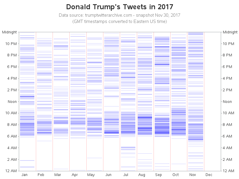
Since Trump became the US president, many people have noticed that he posts a lot of tweets. While some people choose to analyze and critique the content of those tweets, I was more curious about something a little less controversial - the timing and frequency. Follow along as I dig into some twitter data, and find the best way to visually analyze it!
But first, speaking of "tweets" ... Here's a picture of my friend Danielle's favorite tweeter. Thanks for letting me use your picture, Danielle!

As I was looking into this topic, I came across a related graph on reddit. This pointed me to the data I would need, and served as a good starting point.
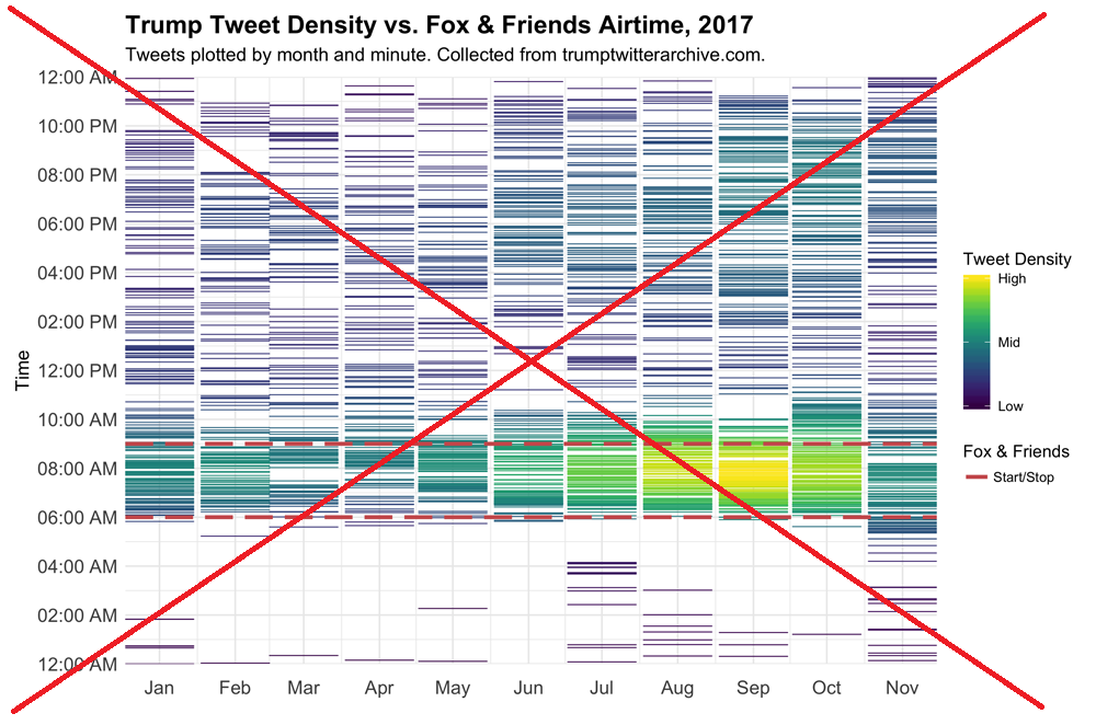
In my version, I decided to make a few changes...
- Rather than using a 3-color gradient, I used a single color with transparency. That way, when multiple tweets lined up in nearly the same spot in the graph, the colors would combine and make a darker shade.
- I added a note indicating when the data snapshot was taken (Nov 30, 2017).
- I added time labels along the right-hand-side axis tick marks.
- I include a blank space for December in the axis, making it more evident that this data does not include December tweets.
- I left off the 'Time' label on the Y-axis (I think people will know that these are 'time' values).
- I added 'Noon' and 'Midnight' labels on the time axis, to help prevent confusion between 12pm and 12am.
- I use reference lines between the months, instead of in the middle of the months.
While importing the data, I noticed that there were actually tweets available for quite a few years, and thought it might be interesting to also plot the previous years' data. The original author also went down this path, posting the following graph in a follow-up comment on the reddit thread. But his new graph had several problems... Why didn't the "High Tweet Density" colors in this graph match up with the colors used in the previous graph? (Has the definition of "High" changed?) And the tick marks & labels along the bottom axis are poorly chosen (looks like he let it auto-scale, and didn't include the year in the labels ... which makes them very confusing).
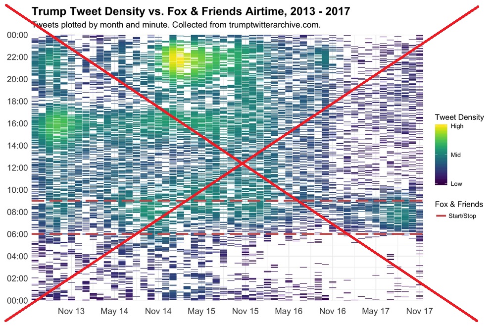
In my version, I label the bottom axis by year, and add reference lines between each year. I also go back to 2009, rather than just 2013 (if you're going to show a historical graph, why not go back as far as you have data, eh?)
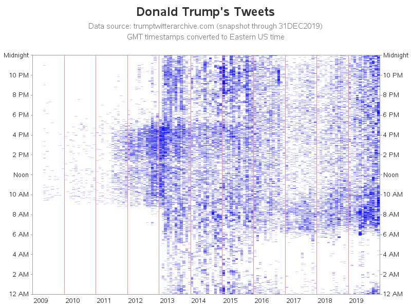
Looks like Trump's tweeting habits have varied over the years - can you correlate any events, or maybe his "job changes" with the density of his tweets? Or perhaps he changed the type of phone he was using in early 2013? I wonder if he was using an automated system to tweet during the night, in the 2013/2014/2015 time period? Perhaps he had employees tweeting for him?
It was a big surprise to me that it appears Trump has actually been tweeting less since he became president! What interesting things do you see in these graphs?


11 Comments
Hi Robert,
This is really interesting. Are you able to share the code for this?
Thanks
Certainly! http://robslink.com/SAS/democd96/trump_tweets_info.htm
Why should Analytics not be used in the political realm? It seems to me that on either side of the spectrum, heavy investments are made in this space, but with the objective to influence opinion, to make money on clickbaiting. We may need some analytics to help understand the impact of social media. Or do we need Artificial Intelligence to bring the world back to center?
Robert,
As a huge fan and someone who deeply admires your work, I don't think this is an area of curiosity. SAS, as a system used by lots of people, needs to be 100% agnostic on the data analysis. You didn't cross any lines but there are lots of data areas to explore outside of religion and politics: I would leave those alone. Perhaps an analysis of NORAD tracks Santa is best (which really impacts more people now).
Merry Christmas and Happy New Year. Thank you for everything in the world of data and graphics.
- Alan
I saw nothing wrong with his choice, as there was no analysis of the content of the tweets, and no political content of his post. He interpreted data that was readily available from a Reddit post. Interpreting data in the way he did is pretty agnostic.
I agree with Abby. It's just data on the timing, not the content. Interpretations are when things can get political.
I also agree with Abby. This post is more interesting because it's timely and relevant to current events -- and it's not inappropriately political. I enjoy learning about ways to graph new-ish things like tweets.
My thought was there were loads of other data to play with. Agreed on being agnostic but for work-stuff, I try and stay 1000 ft away from anything controversial. Just makes it smoother.
My .01
Looks like our 'beloved' president may actually be getting more sleep since ascending to the presidency. That's a good thing, isn't it.
There are a few anomaly in the early morning of July and Nov. I believe your data may not adjust time zone effect. For example, President Trump traveled to Asia this Nov. Your data may still consider he is in eastern time zone.
Since there is no location data for where the tweets were made from, I just adjust all the GMTs to Eastern US time.