Whether or not to legalize marijuana is a hotly debated topic these days. And no matter which side of the debate you're on, I think you will be interested in seeing several ways to visualize which states have legalized marijuana, and when ...
Their Version
Here's the original graph that got me thinking about this topic. It's a timeline showing when each state legalized marijuana for medical use (red dots) and for recreational use (blue dots).
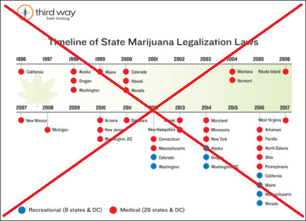
It was an interesting topic, so I studied their graph a bit. But the more I tried to understand it, the more I found that it was unnecessarily difficult to make sense of. One problem was that the timeline was split into two separate pieces. Also, the gradient shading and leaf outline under one section of timeline, but not under the other, added a bit of visual confusion I had to wade through. And it was just by luck that I noticed elsewhere on the page that the data is only through April 29, 2017 (ie, 2017 only represents a partial year).
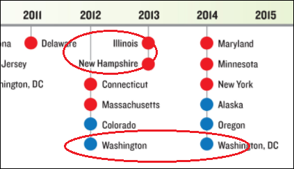
And then there was the biggest problem, as shown in the close-up image below. In order to fit the long names in, they moved some of the markers out farther from the timeline (for example, moving the 2012 markers out 2 spaces, to make room for the 2013 state names). This visually makes 2012 look like it has as many markers as 2014 - see the parts I've circled below.
My Version(s)
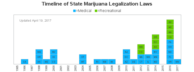
In my version, I fit all the data into a single continuous timeline across the page, rather than splitting it into two pieces. I was able to do this by using 2-character state abbreviations rather than the full state names. I also changed the colors, and used blue for Medical (I often associate blue with hospitals), and green for Recreational. You can click the image below to see the interactive version, with HTML mouse-over text showing the full state names.
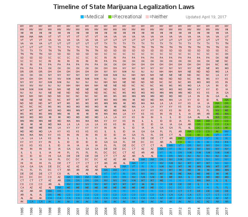
But as I was creating the chart above, my brain was already working on another way to visualize the data. I thought it would be interesting to see the cumulative number of states with legalized marijuana, rather than just knowing when each state legalized it. Therefore I created the following chart, which shows the growing number of states, and also visually shows the percent of states.
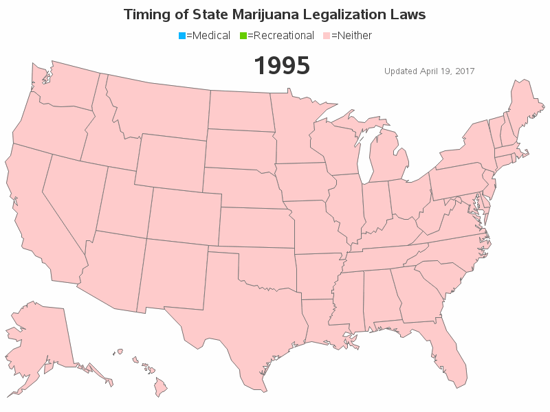
If you've read many of my previous blogs, you probably know I'm a big fan of plotting data on maps. This time I decided to use an animated map, so I could see the geographical distribution and how it changed over time. (As with my other graphs, you can click the image in the blog to see the interactive version with HTML mouse-over text.)
So there you have it - three different ways to visualize the same data ... each giving you a slightly different bit of insight. If you had to choose one graph, which of these three would be the most useful & informative?


1 Comment
Really nice work! I love it. It definitely gives a much more accurate picture of the timeline of legalization.
Cheers,
WeedUpdate