If you're preparing a big Thanksgiving dinner, then you don't want to leave out the most popular side dish, do you?!? But what is the most popular side dish? ... If you don't already know, then perhaps some data & analytics can help!
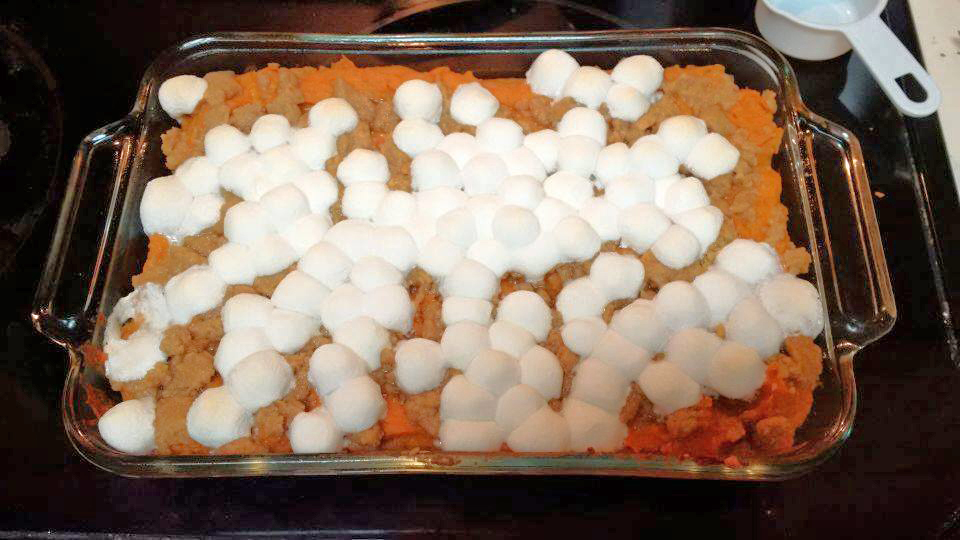
But before we get started, here's a picture of my friend Annie's favorite Thanksgiving side dish. Hmm ... or is it technically a dessert? Whatever category you put it in, it's my favorite too! :)
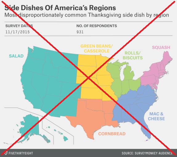
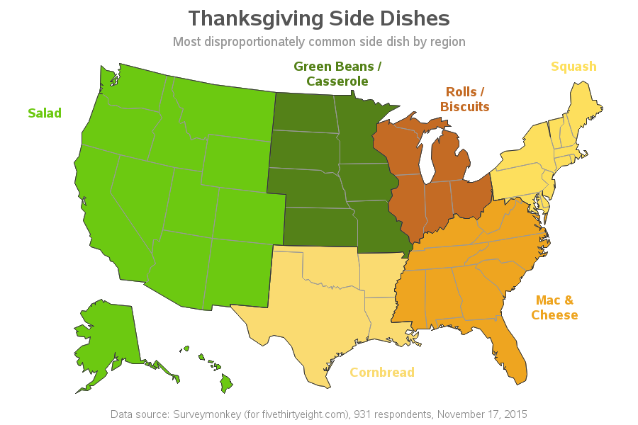
One of my favorite data visualization websites (fivethirtyeight.com) was also wondering about the most popular side dish, and they actually did a survey to find the answer. Then they plotted the results on a map:
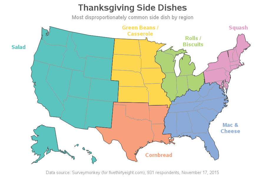
It's a decent map, but I had a few small changes I wanted to make. So I rolled up my sleeves and created my own version using SAS software. My main changes were cleaning up the titles and text a bit (making it easier to quickly see what the map is about), and adding darker borders around the regions.
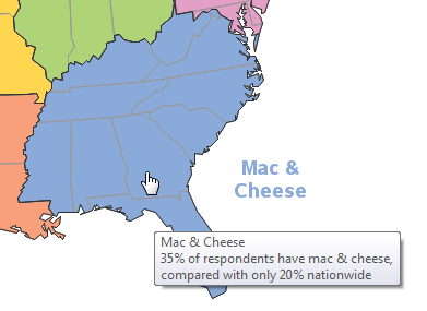
But there's still one question the map doesn't answer - just how "disproportionately common" were these side dishes in the regions? I don't have the raw survey data, so I can't calculate the values, but they do mention the numbers for some of the regions in their article. So I added that info in HTML mouse-over text, for those regions. Click my map images here in the blog, to see the interactive version with the HTML text. Below is a screen-capture example:
I was pretty happy with the new map, but I wondered if it might be even better with more meaningful colors? For example, green for lettuce, and a cheesy-orange color for macaroni & cheese. So I did a Google image search on each of the food names, and then used the Pixeur tool to mouse-over the images and get the hex rgb color codes for the colors used in them. It was a bit difficult to come up with a good representative single color for each food (especially bread, because you just about need both brown & white to make people think 'bread'), but here's my best attempt:
What other changes and enhancements would you make to the map? And what's your favorite Thanksgiving side item? (Did the map get it right?)


2 Comments
Hello. Nice map for the holiday. Do you typically share SAS code on your graphing? Thanks!
I *especially* share my SAS code on the holidays! - Happy Thanksgiving! http://robslink.com/SAS/democd95/thanksgiving_side_dishes_info.htm