Here in the US, we're preparing to celebrate the Thanksgiving holiday. Therefore this Thursday most families in the US will be having a big turkey dinner. Although I'm a bachelor guy and eat out all the time, I'm actually a pretty good cook - and I'd like to share with you some of my turkey cooking tips ... cooking the turkey data, that is! ;-)
But before we get started, here's a picture of my oven. When I first bought my house (in year 2000) I gave it a good cleaning ... and I still haven't gotten it dirty again! :-)
A few years ago, I found this pleasantly eye-catching graph about the traditional Thanksgiving holiday dinner:
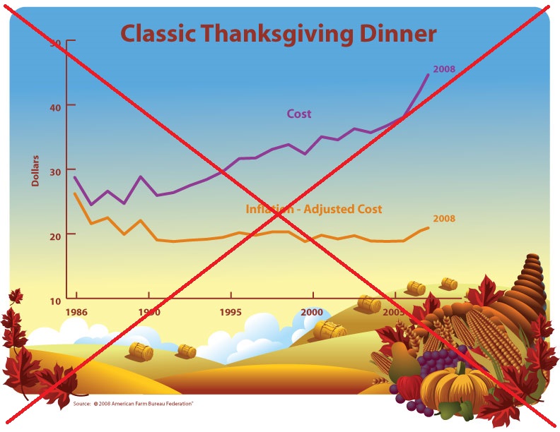
It was a decent graph done in good taste, but like any self-respecting cook I couldn't help but make a few changes to their recipe. I carefully considered the ingredients for a good graph, and stewed on it a while. I wanted to serve up the data in a way that it was easy to digest, but still looked delicious. After slaving away over a hot computer for several hours, I finally rolled out my new creation ...
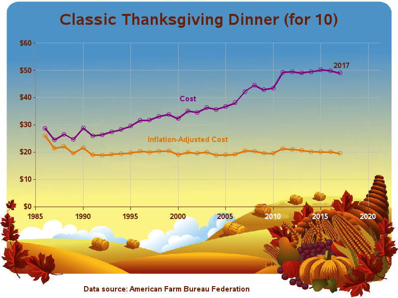
Here are a few of the key ingredients in my recipe for a good graph:
- I added "for 10" to the title, so you'll know how many people the $50 dinner is for (a very important detail, eh?)
- I added light reference lines, so it's easier to see whether the prices are increasing or decreasing.
- I added markers along the plot line - this way it's easier to see if an increase is one year, or multiple years, for example.
- I started the price axis at zero (rather than 10), so you can perceive the changes visually as more of a percent.
- I added the '$' format to the values on the price axis, so it's easier to tell that the values are in dollars.
- I put the axis tick marks on the outside of the axes, rather than the inside.
- I added year labels to the right-side of the bottom axis, and I make them a lighter color so they show up against the dark background image.
- And I made the footnote (showing the data source) larger, so people can actually read it! :-)
What are you planning to have for Thanksgiving dinner, and how does the price estimate in the graph compare to your costs?


6 Comments
Once again a cool graph! I wold rather think that the $50 cost would be for one person if a complete dinner is cooked from scratch, counting the time and labor into cost, not just the raw material. :) Happy Thanksgiving!
Yep! - If they had to pay me for my time, it would be *very* expensive meal! ;)
These price seems low. Or maybe my family does have a "classic" dinner.
Here are the details of how they calculated this year's price: https://www.fb.org/newsroom/farm-bureau-survey-reveals-lowest-thanksgiving-dinner-cost-in-five-years%20%20(2017)
Nice remake! But at $5/person I suspect they won't get too much Pecan Pie - seeing as shelled pecans are around $10 a pound! The $50 figure probably considers a lot of canned foods... Happy Thanksgiving to you!
Maybe they assume everybody has a pecan tree in their yard, like I did growing up! :)