I recently saw an alarming article on social media about an outbreak of airborne plague spreading from Madagascar to Africa (and potentially to the rest of the world). The plague?!? - I thought that only happened hundreds of years ago?!? I don't really trust news on Facebook, so I went to the CDC website to verify, and sure enough there is currently an outbreak of pneumonic plague in Madagascar. This made me ask "how common or rare are cases of the plague in modern times, and where do these outbreaks occur?" Which of course seemed like a good topic for a graph!
But before we get into the data analysis, here's a picture of my friend Becky's daughter Jessie dressed as a plague doctor for Halloween. I'm happy to report that (at least so far) this suit has protected her from contracting the plague. :-)

Now, let's look at some plague data! ... I did a bit of Web searching, and found the following map which answered some of my questions. It showed where cases of the plague have been detected in the 21st century, and how many people have contracted it.

The map looked pretty good at first, but as I studied it I noticed several visualization problems - things that you might want to "avoid like the plague" when creating your maps and infographics. (See what I did there?!?) Here's a list:
- The total number of plague cases is incorrect - it is labeled as the total for the 12 countries, but it is actually the total for the world.
- The colors used for the countries and bubbles are not easy to distinguish, and match between the map and the legend.
- The colors of the plague countries, the non-plague countries, and the background blend in together, such that the countries with plague do not stand out as the main emphasis of the map.
- The country names are visually a long distance from the bubbles, and it's therefore difficult to determine which name goes with which bubble.
- The numbers in the bubble-legend are not lined up at the decimal point, therefore it's difficult to compare them.
- It's difficult to re-type the URL for the research study in the footnote.
In my version, I tried to fix all those problems. Also, you can click the image below to see my interactive version, with html mouse-over text for everything in the infographic, and a drill-down link on the footnote so you can easily go to the research paper (without re-typing the URL).
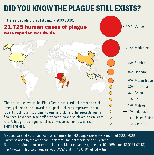
- I correctly state that the total number of plague cases shown in the red title is worldwide, not just the 12 countries in the map.
- I use 4 discrete colors for the plague countries and the bubbles, therefore they are easy to match between the two.
- The 4 colors I use for the plague countries are much brighter than the other colors in the infographic, making it easy to see that is the main point of the infographic. I also draw a darker outline around the plague countries, making them stand out.
- I draw a dotted line between the legend bubbles and the country names, therefore it's easy to see which name goes with which bubble.
- I align the numbers in the bubble legend, so they're easier to visually compare.
- I make the URL in the footnote a drill-down link, so you can easily click on it to read the research study, without having to re-type it.
Hopefully you've learned a little about the plague, and also some tips about graphical mistakes to avoid ... indeed, things to "avoid like the plague!"
Graphing mistakes to avoid ... like the plague! Click To Tweet
5 Comments
Great job improving that. My only other suggestion would be to let the map tell the story. As it stands, the bubble sizes in the legend dominate the graphic (maybe that's intentional) and make the map seem like an afterthought. Smaller, consistently sized color samples in the legend would allow more room for the map to tell the story, as well as resolve the issue of country names separated from their legend sample.
Disclaimer: 20+ years in the GIS industry makes me biased towards maps in infographics. :)
Hmm ... I might have to try a second version that way! My original thinking was that the proportionally sized bubbles help counter-act the "area size bias" caused by the varying sizes of the countries themselves.
Great infographic! Love to learn. Could you post your SAS code for it?
Certainly! - http://robslink.com/SAS/democd95/plague_world_map_info.htm
Nice makeover!