The movie Blade Runner came out about 30 years ago, portraying a dystopian future set in 2019 Los Angeles. Many of the technology predictions in the movie have actually become reality - but how about the weather and pollution? The movie was all about smog and a lack of sunshine, and I wondered what has happened with the real pollution levels in Los Angeles during the past 30 years? This seems like a good topic for The Graph Guy to look into!
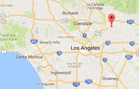
After a quick search, I found some pollution data on the Environmental Protection Agency (EPA) website. Many different types of data were available, and I decided to go with hourly ozone readings. I downloaded the 2016 data (since that's the most recent full year of data available), and the 1986 data (since that's 30 years prior). I imported those csv files into SAS, and then chose one of the several data-collection sites in Los Angeles county California - specifically site number '2005' (not to be confused with year 2005). It's located at latitude 34.1226, longitude -118.1272, which is northeast of the city of Los Angeles. Here's a map with a red marker on that location:
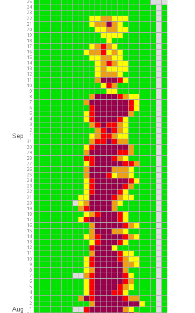
I wasn't really satisfied using any of the standard graphs to plot the data, so I created a custom GMap grid where each square in the grid represents one hourly data reading - in total, that's a grid of almost 9,000 squares for one year of data! The graph is 4,500 pixels tall, so I've screen-captured just a portion of the August/September data to show in the blog. (You can click either of the graphs below, to see the full-size version.)
Cool visualization of the ozone levels in Los Angeles! Click To TweetI color-coded the ozone values based on the Air Quality Index (AQI) for ozone, and plotted them on the grid (the horizontal axis labels are chopped off here, but the time values go horizontally from hour 0, to hour 23. The darkest red values represent an ozone reading of 116-374 parts-per-billion (ppb), which is considered "Very Unhealthy," and the green values are "Good". Here's the 1986 graph:
1986 Los Angeles Ozone:
Fast-forward 30 years ...
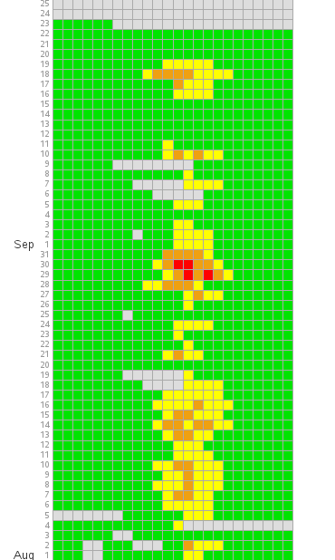
I then generated the same graph using the year 2016 data, and wow what a difference! None of the August/September days in 2016 have the dark red "Very Unhealthy" ozone values, and there are a lot more green days in the graph with "Good" ozone readings!
2016 Los Angeles Ozone:
And now for the big question ... What caused the reduction in ozone pollution in the past 30 years in Los Angeles? Was it due to changes in nature, shifts in manufacturing, or changes in technology & behavior? Feel free to provide your theories in the comments!

4 Comments
Hey Rob,
Constructive feedback on the graph.. I had to scroll down (several thumb-wheels) to get to the X-axis to see what the individual boxes represented. Also, I was expecting the data from Jan - Dec with Jan at the top, not the bottom.
Just my thoughts on the presentation. Of course, some type of comparison would be nice. And wonder what happened at 23:00 reading in 1986 every day. Must be when they rebooted! :)
Hmm ... perhaps I can duplicate the x-axis labels at the top of the graph also, to improve that!
Very nice graph! Could you share the SAS code?
Ethan
Certainly! ... http://robslink.com/SAS/democd95/ozone_info.htm