"Coming to America" - it's been the name of a funny movie and a dramatic song (can you name the actor & singer without cheating?!?) It's also been a dream for many, and an action for some. People have been coming to America both legally and illegally for many years, but there's one special category of immigrants you might not generally think of - refugees. In this blog post, let's visually explore the U.S. refugee admission data and see if we can find any trends.
Original Graph
When I was looking for data on this topic, the State Department page referred me to the Refugee Processing Center page on Admissions & Arrivals. I downloaded their spreadsheet which contained a graph and data. Here's a screen-capture of their graph:

Here are a few problems I noticed in their graph:
- With the bar segments being stacked, you can see the annual total, but it's difficult to see & compare the regional trends over time.
- It's a bit difficult to distinguish some of the colors in the graph, and match them up to the legend.
- The graph seems a bit cluttered, with so many year labels under the bars, etc.
- There's no way to determine the exact values from the graph.
- It's not clear that the final bar is 1 month short of a full fiscal year.
- And ... they misspelled Caribbean as 'Carribean'.
My Graph
Of course, it's considered poor form to complain about someone else's graph, if you don't create your own version ... therefore I imported their data into SAS and tried my hand at creating a new/improved graph. Here's what I came up with (click the image below to see the full-size version with HTML mouse-over text).
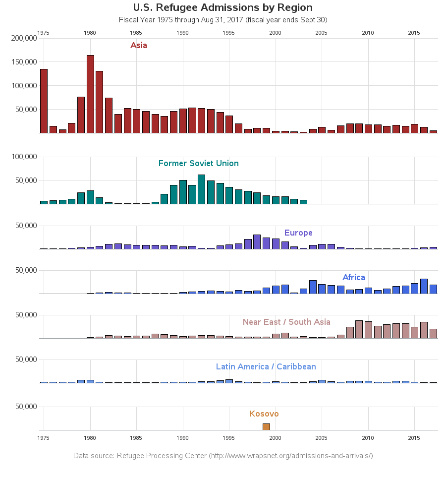
My biggest change was creating a separate graph for each region, and then arranging those graphs such that you could see the the geographical shift in refugee admissions over time (from Asia, to Soviet Union, then Europe, Africa, and Near East / South Asia). I used the same colors as the original graph, in case someone might want to use the two graphs together (I think it's useful to look at both graphs). I placed the region labels inside the graph area to conserve space, and I made them the same colors as the bars to make it clear which labels went with which bars. And I specify exactly when the fiscal year ends, in the title text.
Technical Details:
- The bar chart would typically label every bar with the year, but I suppressed that by using the axis statement's value=none option, and then I annotated my own years at 5 year increments. Note that I annotated the years at the top of the first graph, which is a capability not possible without using annotate.
- The bar charts weren't lining up exactly the same horizontally, because the of the spacing in the digits of the numbers (a '1' takes less space than a '2' for example). Therefore I suppressed the numbers along the y-axis, added a consistent amount of blank space (using an angled title), and then annotated my own numbers into that blank space.
- This chart is actually 7 separate bar charts arranged one after the other on the html page, therefore I couldn't use the typical title & footnote text. I used Proc GSlide to create a separate text slide for the title, and one for the footnote.
- To get the region labels inside the graph area, I annotated this text rather than using a typical title statement.
- I keep the lengths of all the y-axes consistent and proportional, by using the length= option on the axis statement.
- And I used Proc GChart's html= option to create the HTML mouse-over text in the web output, so you can see the year, region, and number of refugees for each bar.
What events do you think might coincide with the increased/decreases in refugees from the various regions over the years? Do you think the graph will change much in the final month of the 2017 fiscal year? Feel free to leave a comment with your theories!


8 Comments
It's down near the end of your Technical Comments but I wanted to underscore it as critical to a better graph: "keep the lengths of all the y-axes consistent and proportional, by using the length= option on the axis statement"
You split it up into multiple graphs - very much needed! - but this requires keeping the axes the same in the separate plots. This is is must, as you have demonstrated here. (It's also an on-going complaint I have with Tableau - there is no direct facility for this and the work-arounds are difficult and, well, work-arounds. It should be automatic, as you have done here. These are great graphs!
Glad you pointed that out! It's one of those "the devil is in the details" kind of things, and having someone other than me point it out is a good way to show people how important that is! :)
Great job of bringing clarity to the data. Fascinating information.
Thanks!
Hello Robert,
Please can you share the SAS program that produced the graphs
Certainly!
http://robslink.com/SAS/democd95/refugees_in_us_info.htm
Seems like a good use case for SGPANEL procedure.
I look forward to seeing your sgpanel version! :)