Orbitz recently published a map showing the most popular international travel destination for each of the 50 US states. It was an interesting map ... but of course, me being the Graph Guy, I had to pick it apart and create my own version. Follow along, and explore this interesting data, while also learning some data-mapping tips!
Before we get started, here's a photo from my friend Joy to put you into the mood for some world traveling. Can you guess what country this is? (Here's a hint - it's one of the "most popular" destinations mentioned in the maps below!)

Here's the original map that caught my eye.
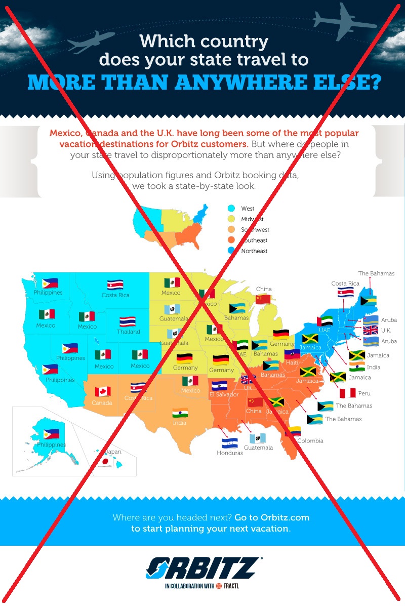
I found the map very interesting, but I had to work really hard to understand the information in the map. Here is a list of the problems that jumped out at me:
- The map was prominently colored by US region ... but region had nothing to do with the travel data that the map was trying to convey.
- It wasn't easy for me to recognize the country flags, and it was difficult to read the small country labels beside each map.
- It was difficult to know exactly what this data represented, because the titles and explanatory text were a bit wordy, and split into different sections above the map.
- The region colors on the map competed with the country flags, for my visual attention.
- And although I'm pretty good with world geography, I'm embarrassed to admit, I wasn't sure exactly where some of these destination countries were located.
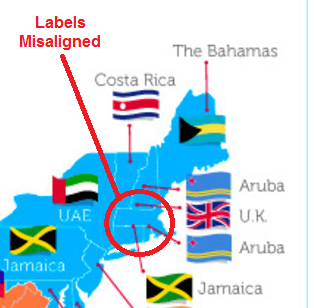
So I set about creating a SAS dataset of the information in their map, so I could create my own map. In doing that, I found one additional problem - some of their labels didn't align properly with the states (see the ones circled in red below). For example, the label for Massachusetts is pointing to New Hampshire.
In my version of the map, instead of using the flags I color the states based on the destination country. This way you can look at the map and quickly see which states have the same destination. I labeled each state with the destination country, and used a text size & color that is easy to read. You can also click the image below to see the interactive version with HTML mouse-over text:

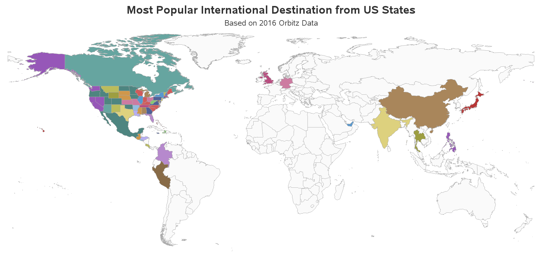
I liked my new version of the map, but it still didn't help me know where these destination countries were located. I know that Guatemala & Colombia are "somewhere south of Mexico", but I wasn't exactly sure where. And where exactly is Thailand again? ... So I decided to create an additional map to augment my first one (remember - I always recommend looking at the same data in several different ways). This time I show the data on the world map, and color-code the destination countries the same as they're colored in the US state map. I had to resize the image below a bit small to squeeze it into the blog, but you can click it to see the full-size version:
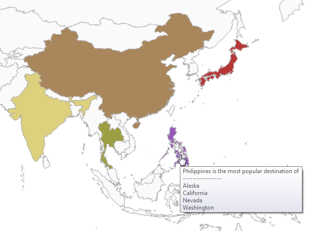
If you click the image above, and then mouse-over the destination countries, you'll see a list of all the US states for which the country is the favorite destination. Here's the mouse-over text for the Philippines, for example:
And now the big (fun) question ... Why?!? Why are certain countries the most popular destination from certain states? Feel free to leave comments with your theories on this topic!
What are the most popular travel destinations? Click To Tweet


12 Comments
Good revision of the original map!
That said, the original map info says they used "population figures and Orbitz booking data." That actually adds more confusion to the question. Populaiton figures? Are the destinations somehow correlated to state population? Huh.
Hmm ... good point!
By extension, it's also interesting to see where people DON'T want to travel. Australia and New Zealand missing? Most of Europe? Hmmm ...
Yes, the UAE probably represents folks who are flying on Emirates to connect to other destinations. The Caribbean destinations like Jamaica, Aruba, and the Bahamas probably represent leisure travelers originating in the USA, while the Canadian snowbirds in Arizona are making their seasonal migration north. The Philippines and the Central American destination countries represent immigrants in the USA returning to visit family in those countries. I believe the airlines use data from the US DOT for their planning purposes, which includes the final destination in the itineraries (maybe called form 1A, or something like that).
Interesting details!
I wonder if some destinations aren't final? This is fascinating - a map that inspires more curiosity!
Aha! - I like the way you're thinking! :)
Whether or not these are final destinations is key - from my local airport the only US destination I can fly to direct is Orlando so very often when I've flown to the US it's been just as quick and no more expensive to fly to Paris or Schipol in the Netherlands, change planes and fly direct to, say, Washington or Seattle than it would be to travel the 130+ miles to Heathrow by train and fly direct.
The same is true of the reverse journey so my "destination" might be listed here as France when in fact my final destination is the UK...
Interesting point!
The "popular destination" refers to discretionary tourist travel or diaspora-based family travel? I am struck by Philippines as the most popular travel destination from California and WA state? California is a huge state and I have never heard of Philippines as a tourist magnet...Mexico does have a lot of seaside resorts but what's the meaning of the "cluster" of US states that are heading there. This is why I wonder if this means diaspora related travel. Ditto for Texas and India...
This is really cool! Thanks for posting!
And thanks for reading! :)