How do the North American amusement parks compare in popularity? If this question was to come up during a lunch discussion, I bet someone would pull out their smartphone and go to Wikipedia for the answer. But is Wikipedia the definitive answer - how can we tell if Wikipedia is wrong? Tag along as I answer all of these questions by graphing the data!
When I was a kid, I always liked amusement parks -- what's not to like about riding as many rides as you want, for a flat fee, eh?!? And these days I see pictures of my friends taking their kids to amusement parks (What? - my friends are old enough to have kids?!?) And speaking of kids enjoying amusement parks, here's a picture of my co-worker Mary's 3 kids enjoying The Seven Dwarfs Mine Train @ Magic Kingdom. OK - the one with the beard is actually her husband (but he's a big kid at heart!)

But which amusement parks are the most popular? I did a Google search on 'amusement park attendance' and it pointed me to a Wikipedia page. I checked out the North America section, and they had a table showing the top ~20 parks ranked by attendance (I assume they're ranked by 2016 attendance?). Here's a shrunk-down screen-capture of a portion of their table, just to give you a feel for it:
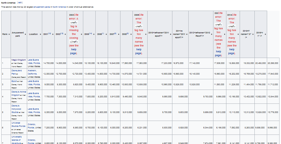
At first glance it looked like a decent table - with the rank, the park name, and annual attendance totals. But as I looked more closely, I noticed some of the column headers appeared to have HTML code errors. And the last column didn't have a column header at all - the column beside it was labeled 2016, so did that imply that the last column showed 2017 attendance (that seemed impossible, since we're only 2/3 through 2017).

After doing some data validation using the data source references at the bottom of the Wikipedia page, I found that the column headers in the table were misaligned, and the final column was 2016 data. I copy-n-pasted the table (minus the headers) into an Excel spreadsheet, and then painstakingly verified the attendance for each year to determine what the correct year column header should be. I then imported the spreadsheet into SAS, and transposed it so I could work with the years as values (rather than variables/column-headers).
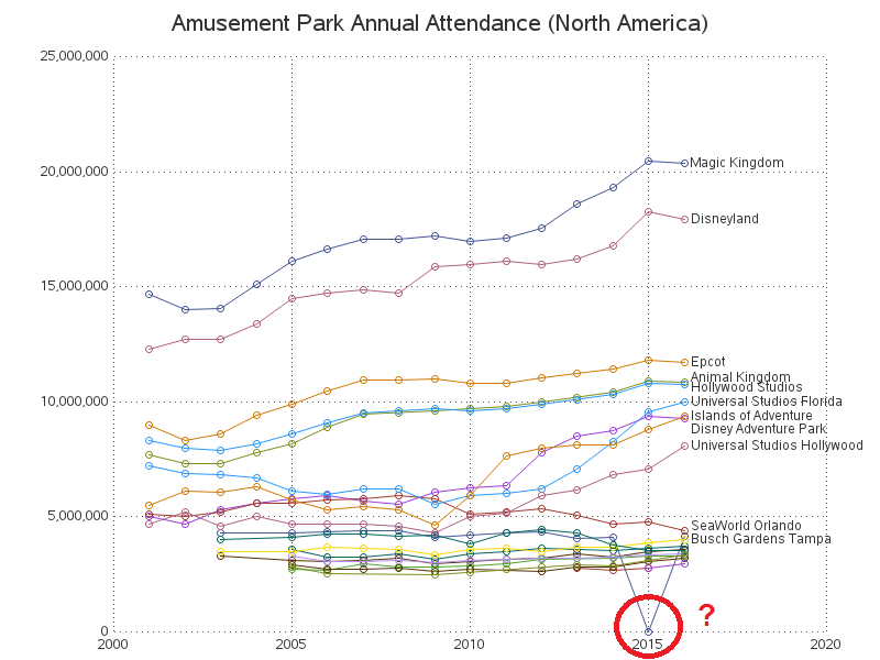
I plotted all the data, with a separate line for each park, and I think the graph makes it a lot easier to compare the parks and see the trends over time. But what was that one 'blip' towards the bottom of the graph? The HTML mouse-over text told me it was Busch Gardens Tampa, with 4,252 attendees in 2015. Wow - that outlier value seems a bit 'suspect', eh?
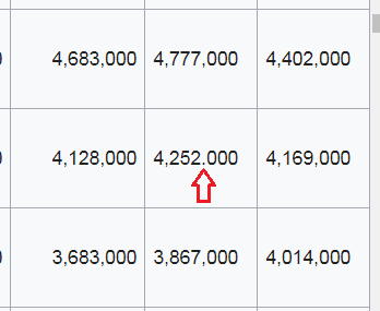
I looked up Busch Garden Tampa's 2015 value separately, and found that it should be 4,252,000. I zoomed-in on the Wikipedia table showing all the parks' data, and found that there was a period/decimal/dot in the table, where there should be a comma. Aha - a second error in the Wikipedia table!
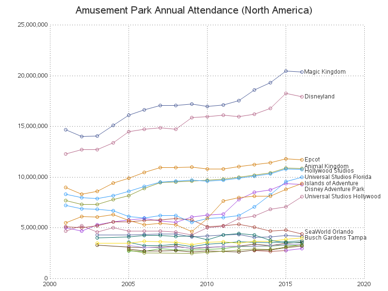
So I corrected that value in my spreadsheet, imported the corrected spreadsheet into SAS, and generated my plot again. Click the image below to see the full size chart, with HTML mouse-over text:
I think it's always useful to view the data in both a table and a graph. Aside from the graph being a good way to catch errors in the data, here are some things you can easily see in the graph, that you couldn't see in the table:
- There are 2 parks (Magic Kingdom & Disneyland) that have way more attendance than the other parks.
- The top 2 parks had been seeing an increase in attendance the last few years, but their attendance decreased in 2016.
- In 2010 there were 3 distinct 'groups' of parks with similar attendance - and since then, 4 parks have moved from the bottom group to the middle group.
- And in the bottom group, SeaWorld Orlando has seen a decline in attendance the past few years.
Have you been to any of the parks in this list? Based on your personal preferences, what other metrics would you use to determine the 'best' amusement park (rather than just the park with the highest attendance)?
What's the attendance at top US amusement parks? Click To Tweet


10 Comments
Another born and raised Ohioan, also struggling to find CEDAR POINT. Since some of the parks are not open year-round, perhaps you could do a graphic to show the ones clustered near the bottom.
It really is the best park if you like the coasters, right?
As a born and raised Ohioan, it's my duty to stop in here and say, WHAT ABOUT CEDAR POINT?
Cedar Point is in the graph! ... But it's one of the lines clustered down towards the bottom, that were too densely packed to add separate labels. If you view the interactive version, you might see a 'Cedar Point' mouse-over text (... if you work at it really hard - it took a while for me to see one). :)
Interesting! I wonder if Cedar Point would jump out of the bottom cluster if you did a graph just for the show summer months. :)
Too bad the parks dont give attendance on a more granular level. How is attendance at non-peak vs. peak? Do some parks have greater holiday spikes than others? For example if a park offered a notable "extravaganza" during particular holidays that increased their attendance, does that make them as popular as other consistently-attended parks?
Good questions! :)
Yeah, I'd like to see daily attendance at Magic Kingdom so I can pick a quiet day to go!
Neat graphs. It turns out the HTML code errors & misaligned column were due to some recent vandalism. That and the periods instead of commas have been fixed. For future reference, I hope you know that anyone can edit Wikipedia ;-)
I do agree that showing this data in graphical form can be easier to compare over time. Interesting. I would also like to see Legoland California and Disneyland Paris, two parks I hope to visit someday.
Thanks for the Wikipedia fixes!