As Hurricane Irma makes its way through the Caribbean, and heads towards the United States, the big question on everyone's mind ... is the hurricane going to hit my city? Or, as some people like to say, "should I buy milk & bread?" Let's analyze & map some data to find out!
These days, there are lots of hurricane forecast maps to choose from. Here's an example from the nytimes website - it's a map of the forecasts from the European Center for Medium-Range Weather Forecasts, National Weather Service.
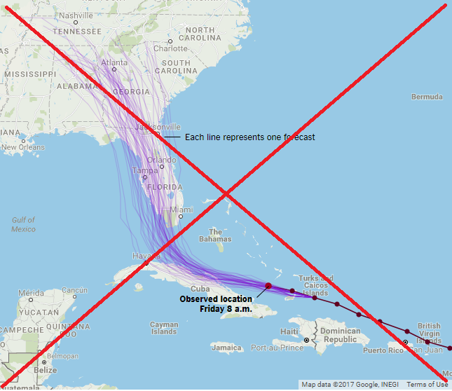
Like most maps on the web, they use a tile-based 'streetmap'. The more you zoom in, the more details (such as city names, and streets) you see. But in my experience, it's a lot of work to do all that zooming and panning. I prefer for my maps to show the desired level of detail from the start, without requiring the user to zoom and pan.
So, of course, I decided to create my own map! :)
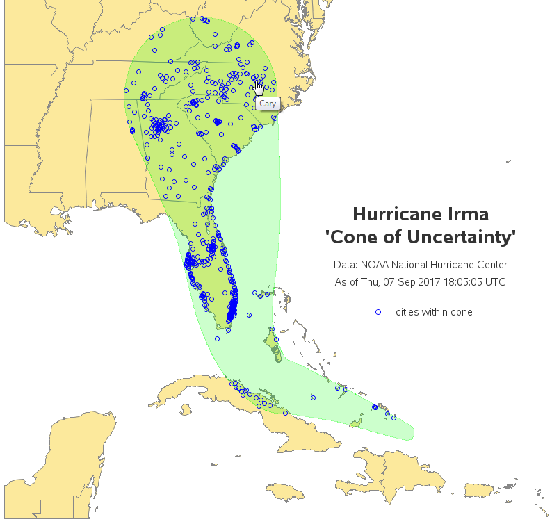
First, I had to find a source of data for a hurricane forecast. I decided to go with one of the best - the NOAA National Hurricane Center. I found that they have a page where you can download shapefiles for various aspects of the hurricanes, and I downloaded the zip file that contains the 'Cone of Uncertainty' for Hurricane Irma. I unzipped the file, and then ran SAS' Proc Mapimport on the shapefile (al112017-034A_5day_pgn.shp). This gave me the latitude/longitude points along the edge of the cone, and I used a SAS data step to convert those points into an annotate polygon (using the 'poly' and 'polycont' functions). Next, I used Proc Ginside to determine which cities in the mapsgfk.world_cities dataset were inside the cone polygon. I then used Proc GMap to create a choropleth map of the area of interest, and annotated the cities of interest, and the hurricane's 'cone of uncertainty' on the map.
The map turned out pretty nice! Notice that you can easily see (at a glance) which population centers fall within the cone. Here's a screen-capture of the map, with mouse-over text showing that Cary (location of the SAS headquarters, and also where I live), is within the cone.
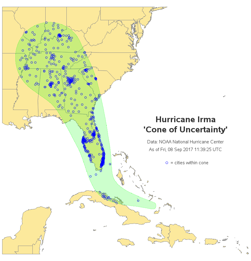
Well that was yesterday's (Sept 7) forecast. I downloaded the latest forecast this morning (Sept 8, al112017-037_5day_pgn.shp), and now the cone has moved west. Now Cary is no longer in the 'cone' ... but my friend George, who is a boat captain in Key West, is now in the cone (batten down the hatches, George!) Below is a snapshot of the new map - you can click it to see the full-size map with the HTML mouse-over text:
With the new forecast track, it looks like North Carolina's coast is going to be spared a direct hit from this powerful hurricane. That's welcome news for all the people with houses and boats along the coast. And here's a picture of some boats, sitting peacefully on the water (photo by Karen M. Allen). Did I mention that I like boats? :-)

So, what are the takeaways for this blog post?
- Hurricane forecasts can change from day to day.
- SAS software can import shapefile polygons, and overlay them on a map.
- SAS software can determine which points are inside of a custom polygon area.
- And a custom map can help you analyze data much more quickly & easily than a generic map.
What features do you like to see in a hurricane-related map? (feel free to share in a comment)
Cities in the path of Hurricane Irma! Click To Tweet


7 Comments
Wanted to learn how to create the eye-catching graph. Could you share the SAS code?
Ethan
Here's a link to the code!
http://robslink.com/SAS/democd94/hurricane_irma_2017_info.htm
It's a good idea, but even the cursor on my brand-new Lenovo laptop fails to distinguish between the circles when they are tightly clustered. For example, in upstate SC I cannot tease out as many names as there are circles clustered together. South Florida is a lost cause--the clustering is far too dense to separate the circles. I wonder if there's any possibility of picking up the fisheye lens view from Network Visualization Workshop for use in such cases? Or am I overlooking some hidden feature of your map?
Perhaps (I haven't used that particular part of SAS yet) - give it a try, and let us know if it helps! :)
I very much agree with you about zooming and panning on maps. I always find that a pain, particularly when using a tablet - you zoom in, find you're slightly off the position you wanted to be, pan a bit, find you're lost and have to zoom out again and re-start the process......
It's probably a little bit in bad taste but I had to smile slightly when I saw the phrase "Cone of Uncertainty". I hadn't heard that before and it reminded me of a "commentator's cliche" in cricket - "The Corridor of Uncertainty" which has it's own wikipedia entry https://en.wikipedia.org/wiki/Corridor_of_uncertainty and which is often used to gently mock the commentator most frequently associated with it. There's probably an equivalent in baseball but we don't really do baseball over here :-)
The "cone of uncertainty" is an often misunderstood concept. From http://www.nhc.noaa.gov/aboutcone.shtml, it represents "the probable track of the center of a tropical cyclone, and is formed by enclosing the area swept out by a set of circles (not shown) along the forecast track...The size of each circle is set so that two-thirds of historical official forecast errors over a 5-year sample fall within the circle." In practical terms, storms such as Hurricane Irma might have hurricane-force winds 70 miles from the center and tropical-storm winds 185 miles from the center. Thus the "cone of potential destruction" is even wider than the cone of uncertainty.
Good explanation/details!