International Talk Like a Pirate Day is Sept 19 ... which always gets me thinking and wondering about modern-day pirates. Most movies usually focus on pirates from the Golden Age of piracy (a couple hundred years ago), when pirates typically stole ships and booty (treasure). But modern day pirates usually board a ship, and then hold it for ransom. They don't want the ship, or the stuff it's hauling - they want cold/hard cash! You might be surprised to learn that there is quite a bit of piracy going on these days (over 100 attacks per year), and there's a veritable treasure trove of data about the attacks.
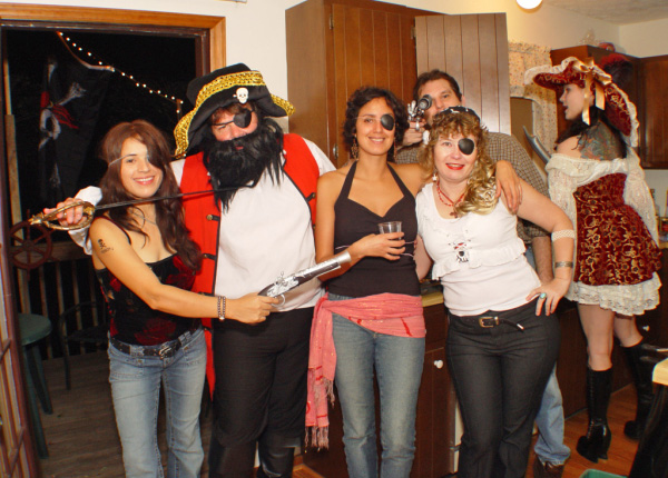
But before we get to analyzing that data, here's a picture of a few of the guests at my very first Talk Like a Pirate party, back in 2005. These folks certainly knew how to put the "Arrr" in pArrrty! (Thanks Mary, Marlene, Linda, and of course Captain Kirk!)
Now, let's analyze some pirate data! ... A special division of the International Chamber of Commerce, called the Commercial Crime Services, maintains a database of all the pirate attacks, and has a webpage where you can view them on a Google satellite map. It's a decent page, and I like that you can zoom in to see exactly where the attacks have occurred, and then click the markers to see all the details. Here's a screen capture:
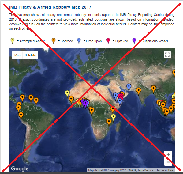
I learned a lot about the pirate data on their page, but I kept thinking of ways I might could use SAS to analyze the data in additional ways (as you probably recall, I always recommend visualizing the same data in several different ways, to better understand it). So I set sail on a journey to create my own analysis. The first step was to parse the data out of the html on their web page. Their html was all one long line, which made it a bit tricky to handle ... so I enlisted the help of data-meister Rick Langston. After Rick helped me get the data read in, I was able to start analyzing the data with ramming speed!
Below is an image of my map - you can click it to see the full size interactive version with the HTML mouse-over text, and drilldowns to the incident reports.
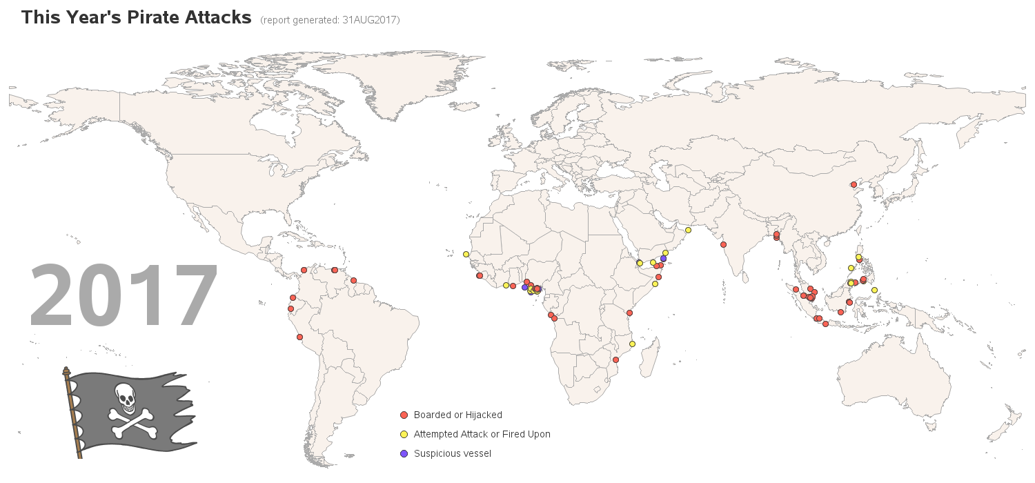
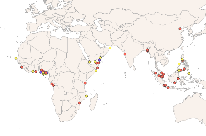
The full/wide map has to get squeezed-in (resized) a lot to fit in the blog space, so here's a little subset you can hopefully see at full size:
Here are a few of the enhancements and improvements in my map:
- The land & water are light colors, so they don't compete with the pirate-attack markers.
- The map is clearly labeled '2017' (whereas the original map had '2016' in the text paragraph).
- I include a pirate flag, so you immediately know the map has something to do with pirates.
- I use three color categories instead of five.
- I used smaller markers, so they don't overlap as much.
- And you can hover your mouse over the land areas, to see the country names.
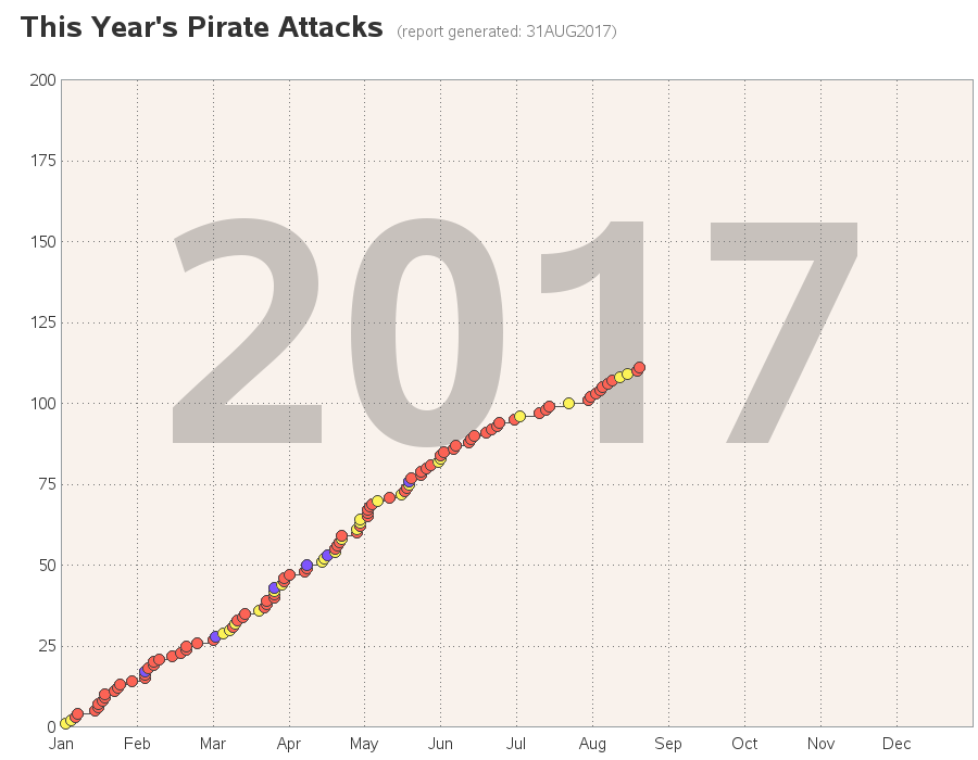
But a map just doesn't give you a concept of timing. For example, did these attacks happen randomly throughout the year, or were they clustered curing a certain months or seasons? To help answer this type of question, I calculated the cumulative total, and created a plot of that data. Looking at the graph, it seems that the rate of attacks is pretty steady, except for a slowdown during the month of July:
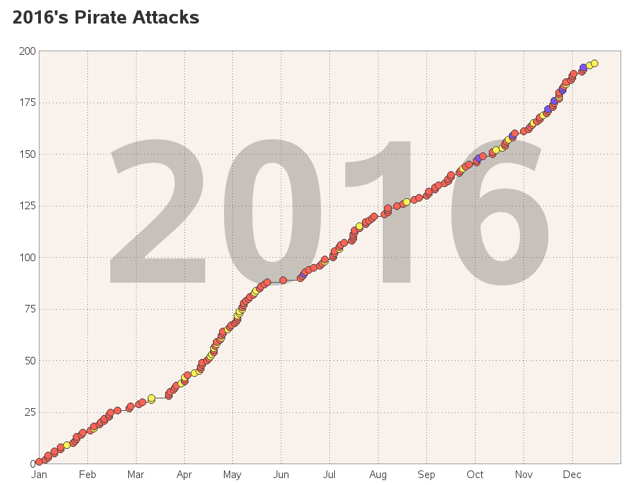
And how did that compare to the year before? ... About the same, except last year's slowdown was mid-May to mid-June:
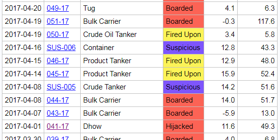
The map & plot provide a pretty good visual representation of the data, but what about a good-old table? Sometimes a table of all the values is very useful. The original webpage had a table report, but it only shows a the most recent handful of incidents. I provide a table of all the incidents in my version. Note that I colored the cells in the table using the same colors as the plot markers, and I made the incident report number a drilldown link to the incident report. Here's a screen-capture of a portion of my table (click it to see the full table).
I use a lot of pretty cool tricks to create these graphs & table, and if you'd like to have a look at the SAS code, click this link.
Now for a fun question - what's your favorite pirate movie? Arrr!!! b-)


1 Comment
Excellent article. Nice picture of neat party!