If you know me, you probably know that I spend a lot of time on the water. I like speed paddling (dragon boat, outrigger canoe, surfski, and racing SUP), and I also have a big pontoon boat at Jordan Lake where I try to go fishing at least once a week. That is, if there's enough water in the lake! ... And not too much water in the lake! And with that lead-in, let's analyze the Jordan Lake water level for the past 30-some years!
Before we get started, here's a picture of one of my paddling friends, Eva, demonstrating her balance skills on Jordan Lake. She's had many different kayaks (including a skin-on-frame kayak she made herself), and is quite a skilled kayaker. Why is she standing on her kayak, you might ask ... Perhaps she didn't want to spend money on a stand up paddleboard? Or perhaps she's practicing, in case the water level suddenly rises above her kayak (think about that one for a minute! LOL) Whatever the reason, it's something impressive that I doubt many people can do:

And now, let's analyze that lake level data!
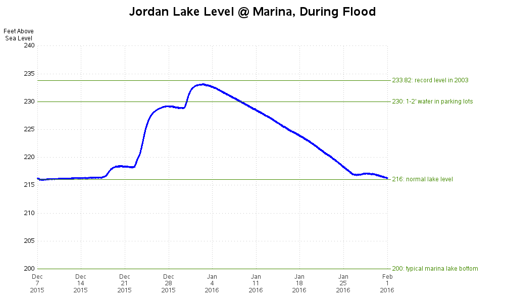
Previously, I wrote a blog post about the lake level for one particular flood, during about a two month time period in 2015/2016. Here's the graph:
In that graph, I used the most granular data I could find. But if I want to track the lake level for 30+ years, I won't be able to show nearly that much detail. I decided to go with monthly data values. But a lake can be at many different levels during a month. So which value(s) should I show: The average level? The highest level? The lowest level? A snapshot of the level at the beginning (or middle, or end) of the month?
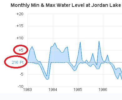
After experimenting with plotting the data in several different ways, I decided it was most informative (from a motorboater's perspective) to see the high & low water levels for the month. This would help me identify the times of flood, and the times of drought - both of which are not the best times to be driving a motorboat around the lake. And rather than simply creating 2 line plots, or plotting both lines on the same graph, I decided to fill the areas between the lines. Below, I zoom in on a few areas, to show the axis, and what the floods and droughts look like in the graph.
For the y-axis, rather than just showing the lake level (ft above sea level), I just show that value for the normal level (216 ft), and then I label tickmarks & reference lines each +/- 5 ft above and below. I think it's much more informative to know that the lake is 5 ft above normal, rather than 221 ft above sea level. (Note that this is a change/improvement from the previous graph!)
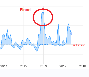
Here's a zoomed-in snapshot that shows the flood of Jan 2016 (the same flood I showed in my detailed graph, two graphs above). Notice that the peak is more than three reference lines above the normal level, indicating that the water level was more than 15 ft above normal.
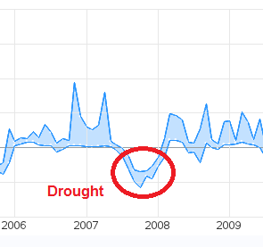
And here's a zoomed-in snapshot of the drought from a few years ago (2007). Notice that the water level dipped to more than 5 ft below normal. One good thing about a drought is that you can see a lot of the rocks & stumps that are usually lurking just below the surface of the water, so you'll know what areas to avoid once the water level is back to normal. It also forces you to get to know where the deeper/safer channels are in the lake.
And here's the graph of 30+ years of data. It is very wide, and therefore the image isn't going to fit well in this blog page, but I invite you to click this link to see the version where you can scroll the graph left & right, to better view zoomed-in portions of the graph:
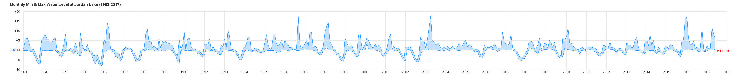
So, looking at the 30-year graph, do you see any trends, or changes over time? Has the lake level been more, or less, stable during the last 10 years, than the first 20 years?


8 Comments
Very nice information ---was wondering if you have updated the graphs with recent data since 2017 ?
The highest I have ever seen Jordan Lake was the week following Hurricane Fran. It's faded now, but if you look up the supports for the US64 bridge over the lake, you'll see where someone spray-painted a high-water line not too far under the bridge itself.
Neat! - Now I'll be looking for that mark, every time I go under that bridge! :)
For the sake of your readers who don't live in the Triangle, Jordan lake is a reservoir that is formed by damming a river. A primary purpose is flood control of the downstream (Fayetteville, NC) regions. The nominal height of the reservoir is 216 ft above MSL. During floods, the engineers let the lake rise until it is safe to release water (in a controlled manner) without damaging downstream sites.
Well said!
Very well put Mr. Wicklin. Speaking as the water control manager for BE Jordan , US Army Corps of Engineers.
HI, That's an interesting graph representation. May I know how did you determine the normal water level? Is it the mean across all data points?
Oh - I didn't calculate the 216 ... that's just the "full pool" level they publish on several websites (such as http://everettjordan.uslakes.info/Level.asp)