I recently saw an interesting PEW study showing the percent of each state's revenue that came from federal funds. They had some pretty nice graphs ... but just like jell-o, there's always room for more graphs, eh!
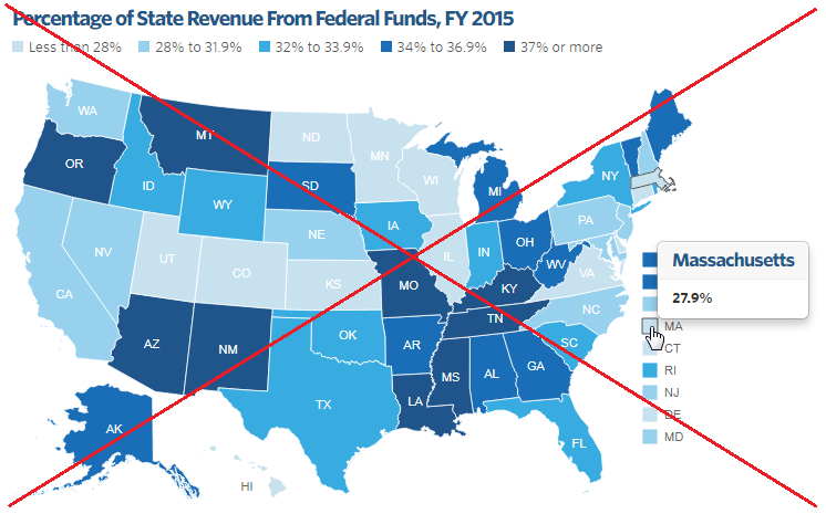
Let's start with the map. Their map had an informative title, a reasonable gradient color scale (only 5 colors - not something crazy like 10!), and useful mouse-over text. For the small states like Rhode Island, they had an extra colored box out to the side. In one way that's a good idea, but it can sometimes cause confusion (for example, I thought it was the color legend when I first saw it). When you mouse over these small-state color boxes, they highlight/outline the corresponding state in the map, which is a nice touch.
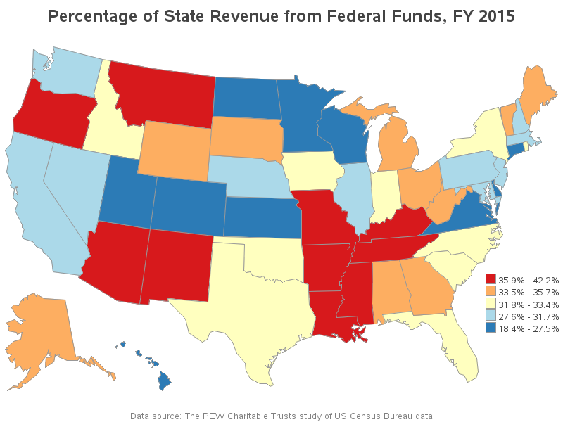
I always say it's best to view the same data in several different ways, so I decided to create a slightly different version of their map, using SAS. Rather than a gradient color scale, I used quantile binning to place the states into 5 bins (GMap's levels=5 option), so it's easy to see the top and bottom 20% for example. I mapped the five bins to a divergent color scheme, which I think is useful for analyzing this type of data. I arranged my legend in a column, with the largest values at the top, and I also added a footnote showing the data source. If you click the image below, you can see the interactive version, where you can see mouse-over text similar to the PEW map.
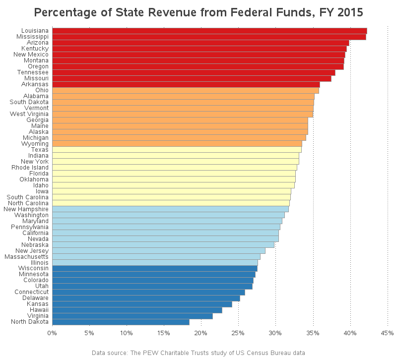
While I was working with the 2015 data, another way to chart it came to mind. Although the map shows which quantile each state is in, it would also be informative to see how much difference there is in each state, and a way to see the rankings. I thought a sorted bar chart, colored the same way as the map, would be a natural fit:
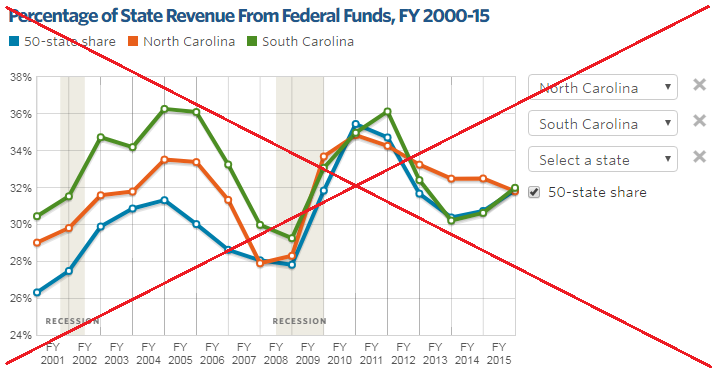
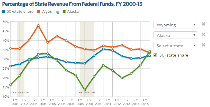
Next, let's have a look at PEW's line chart. They provide an interface that lets you choose up to 3 states to plot in an overlaid line chart, and also show a line for the 50-state share. It's a nice graph, with easily-readable lines, and a good color selection. But I didn't really know which states might be interesting to show over time, so I just picked my home state North Carolina and our neighboring state South Carolina. It's an OK plot, but I really didn't want to spend the time to select & plot each of the 50 states to find which states might show interesting trends over time.
So I decided to create my own version, and plot all 50 states together. This is not really a best practice for plotting data, but it does let you quickly see whether all 50 states follow the same general trend, or if some might be outliers. I colored the lines using the same 5 bins & colors as the map and bar chart, and then I looked for lines that seemed out of place. For example, I could tell that there was an orange line above the red lines in the top/left portion of the graph, and an orange line below the blue lined in the bottom/middle of the graph (see the points I circled in red below). Apparently those 2 states had quite a bit of change in their finances between those years and 2015.
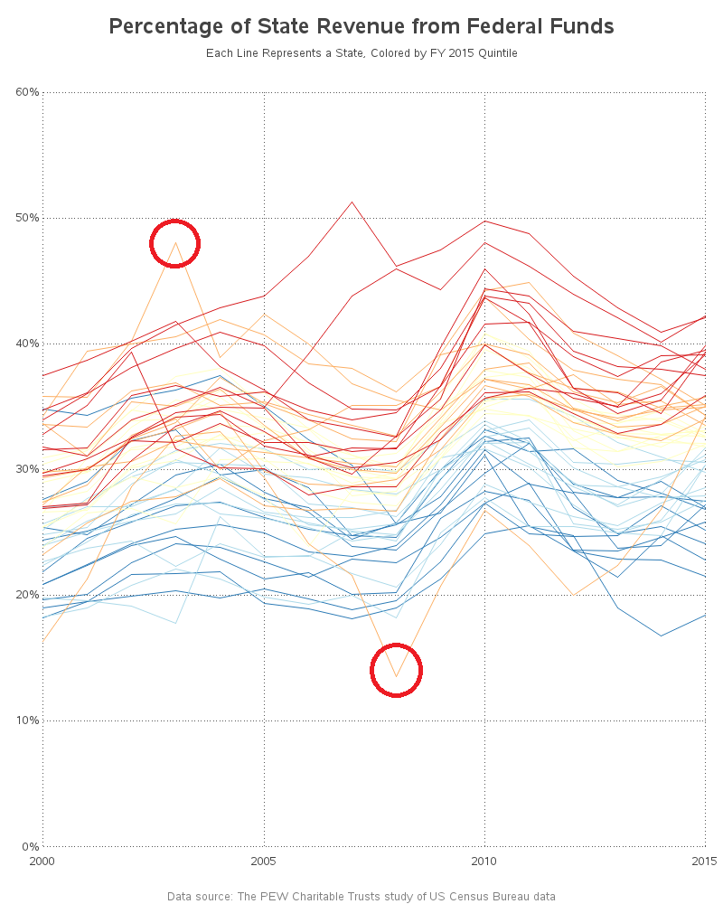
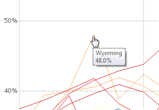
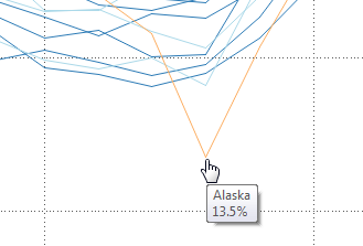
But which states were these circled lines?!? There wasn't room in the graph for labels. And in order to use SAS GPlot's mouse-over text, there has to be markers along the plot lines. But I turned off markers because they made the graph too crowded. Not to worry - there's always another way, with a highly flexible software like SAS! I annotated 'invisible' (white on a white background) markers behind the lines, and set up HTML mouse-over text for those invisible markers! (click the image above to see the interactive version with mouse-over text) The two screen-captures below show that the two interesting lines are Wyoming and Alaska.
Now I know which lines might be interesting to show in PEW's cool interactive graph creator! In the PEW graph below, I plotted Wyoming (orange) & Alaska (green), along with the 50-state share (blue). Looks like those two states have had a wild ride in the past 15 years!
Hopefully you like this combined approach, and see that graphing the same data in several different ways can help provide a better understanding than a single graph!
And now for the big questions ... Is it good, or bad, for a state to rely on federal funds for a large percentage of their revenue? What other forms of revenue do states have? Do you have any insight into what important things these graphs show (or don't show)? Feel free to leave a comment.


5 Comments
It is a fact that states whose residents are most likely to object to "Big Government" are vastly over-represented among the states the receive a lot of Federal funds.
Hi Rob - I sure do have an application for the sorted bar chart above. Is the code available?
As always thanks for the cool graphics!
Here's a link to the code for the charts: http://robslink.com/SAS/democd94/state_fed_revenue_info.htm
Interesting stats. Does the PEW data allow you to plot federal funds (in dollars) per person for each state?
That would be interesting, and help give a more complete picture ... but I don't think PEW's interface allows you to plot that data!