Carbon Dioxide ... CO2. Humans breathe out 2.3 pounds of it per day. It's also produced when we burn organic materials & fossil fuels (such as coal, oil, and natural gas). Plants use it for photosynthesis, which in turn produces oxygen. It is also a greenhouse gas, which many claim contributes to global warming. Let's stay away from the "global warming" debate, but I thought it might be interesting to plot some CO2 data!
For the first example, here is a famous graph showing the atmospheric CO2 concentration, measured for over 50 years.
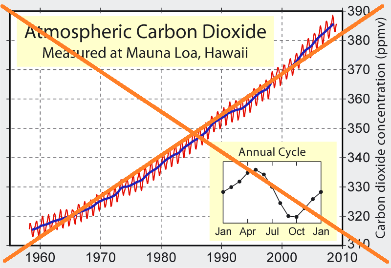
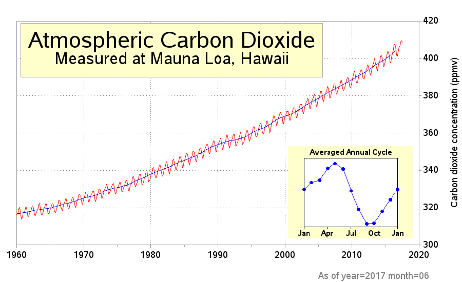
It was an interesting graph, and I liked a lot of the features, such as the axis values along the right-hand side, and the inset graph showing a typical annual cycle. But it stopped before 2010, and I was curious what the data has done since then. I found the monthly data available via NOAA Earth System Research Laboratory, and wrote some SAS code to import it from their web page. I then created a plot very similar to theirs, and included the most recent data. Looks like the upward trend has continued. I always try to make little improvements when I imitate a graph, and this time I added a footnote indicating the year & month of the final data point, since that's not easy to determine by just looking at the graph.
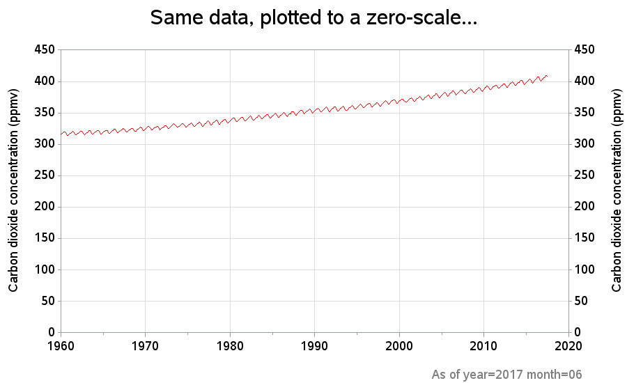
This looks like a fairly significant increase in CO2 levels, but I was curious if perhaps the axes might be affecting how we perceive the data. I suppose it's fair to let the axes auto-scale from the minimum to the maximum values as a 'first glance' at the data, but I find it is often better to choose scales that show the minimum and maximum possible values. I'm not an atmospheric CO2 expert, so I'm not sure what those values might be ... but I thought it might be interesting let the scale go to zero, and see what the graph looks like. The data still shows an upward trend, but certainly looks less dramatic when plotted this way.
This second example uses data a little "closer to home" - rather than showing the global/atmospheric level, it shows the annual U.S. CO2 emissions. This nice graph was created by Travis Hartman, and published recently as a Reuters data dive titled "CO2 emissions on the decline":
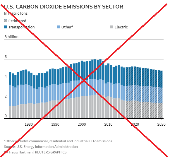
I really liked Travis' graph, but there were a few small changes I wanted to make. For example, rather than putting a '*' in the legend, and requiring the user to look in the footnote, I wanted to put all the pertinent information in the legend. I also thought it would be better to put "metric tons" in the axis label, rather than in the title, so the numbers and units are all in the same place. And, after having to look to find the data, I thought it would be nice to provide a little more info in the footnote, pointing the user to the specific tables.
And I guess the biggest change in my version is that I decided not to include the estimated future values. I just leave that area blank, and let the user's eyes fill that in for them. Sometimes I think it is useful to let the data speak for itself.
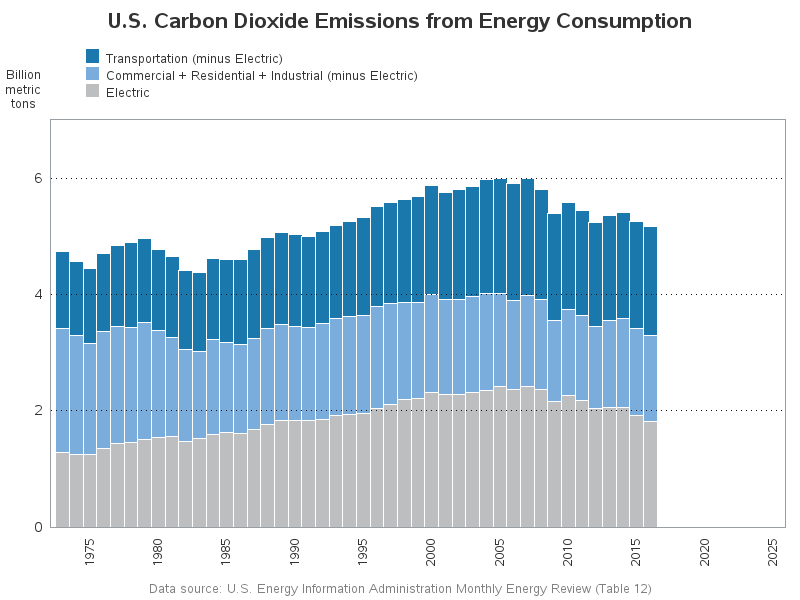
So, what do you think caused the reduction in CO2 emissions in the US? Here are some possibilities that come to mind. Feel free to add more, and discuss, in the comments:
- Gas prices shot up to $4 per gallon in 2008, which reduced consumption and made people start thinking about buying more fuel efficient cars (such as hybrids).
- We had a recession starting in 2008, which reduced a lot of production & consumption.
- After the worldwide recession, there was a reduction in demand for steel (and a glut of excess steel on the world market), which triggered the closure of a lot of US steel mills.
- Many coal electric power plants have shut down, and been replaced by natural gas ones.
- The use of solar power is increasing (due to government incentives/requirements, and also due to the falling price of solar panels).
- Perhaps people are working & living more efficiently with the internet & apps. For example, using Amazon instead of driving to the store, and using virtual meeting software such as WebEx rather than driving/flying across the country.
- And last, but not least, there are fewer people wasting gas driving around lost, now that (most) everybody uses GPS.

6 Comments
Can you justify given your limited knowledge of atmospheric physics why you think scaling the plot at zero would be less dramatic than the conventional analysis? What are your underlying assumptions? Also, from your manipulated graph, let assume if it is accurate. How do you explain the steady increase in CO2 from 1960 to 1990 and from 1990 to let say 2010?
When you start the y-axis at zero, it gives you more of a visual perception of the change as a percent of the total (similar to bar charts). If you limit the axis to just show the min-to-max, then the increase is going to look more dramatic.
(I'm not sure what what you're asking in the 2nd part of your question.)
Travis' graph forgot to include CO2 emissions from the Agricultural Sector. The second part of my question was overall, how do you explain the steady increase in CO2 emissions within 30 years vs just 20 years and how has the US CO2 emission declined within the context of the global CO2 emissions?
Hmm ... well, I wouldn't say Travis' graph "forgot" to include CO2 emissions from agriculture. He has labeled which sectors he includes in his graph.
I'm no expert on the emissions data, but I would assume things like the closing down coal power plants & replacing them with natural gas plants (and also a little bit of solar power generation), and vehicles that are more fuel efficient, and TVs & air-conditioners that are more energy efficient, and people cutting back on many things during the long recession. (But those are just guesses, of course!) :)
Sounds good Robert! Nice work by the way!
Light bulbs.