When I was in college, I lived in the Alexander dorm, where each room had an American student and an International student. I learned a lot about the rest of the world, and I also heard a lot of different languages being spoken. I'm really impressed when I hear people speak multiple languages fluently, and it's a skill many employers are willing to pay a premium for! In this blog post, let's have a look at some of those bilingual jobs...
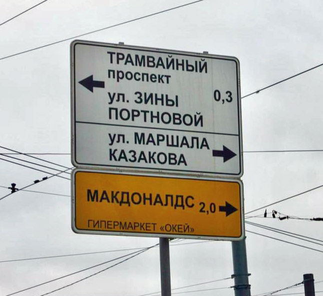
Before we get started though, here's a picture of a sign in another language, provided by my friend Joy. Do you know what language it's in? Can you translate what it says? Leave your guess in a comment! Who knows - this could show your aptitude for a job as a translator, or a bilingual driver. :-)
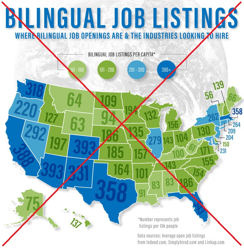
What got me started on this project was that I saw the following infographic image posted on reddit. It was set up in the wonky style that seems to be all the rage with certain infographic designers these days - they create a very tall image containing many graphs, and you have to scroll up/down to see them all. There's no way to navigate to a certain graph in the image, and no way to pull just one graph out of the infographic (other than cropping it out, or doing a screen-capture on the desired piece, etc). Below is a shrunk-down version of their infographic - you can click it to see their full size jpg file that is 6,353 pixels tall.

I decided to create my own version of the infographic with improved map & graphs, and also make the layout more easily usable and navigate. I started with their map - it was an interesting & eye-catching map, but after studying it a while, I found that the colors were a bit confusing. For some reason they used two different color gradient scales together (green, and blue) and the dark green was lower than the light blue, etc. Other shades of green and blue were used to annotate the numbers on the states, making it even more difficult to quickly relate the colors in the map to the colors in the legend. The satellite image of the world (I guess?) behind the U.S. map added clutter, and I had to spend time to figure out I could ignore it.
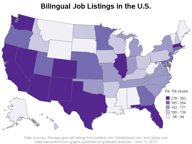
In my SAS version, I used a single color gradient, with five shades (dividing the states into quintiles, so you know what 1/5 each state is in). Rather than trying to annotate the number on each state, I provide that info in mouse-over text (click the image below to see the interactive version). I also added a date to my footnote, since that can be important. I wasn't sure what date to use, since they didn't put that in the original infographic ... I tracked down the article where the infographic was published, and the publication date was June 13, 2017, so I used that date.
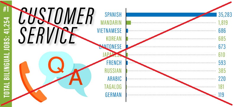
The original infographic had a bar chart for each industry (such as 'customer service'). In each of their bar charts, the 'Spanish' bar was so much longer than all the other bars, that they were pretty much useless.
In my version, I decided to create a bar chart for each of the 11 languages (rather than each industry). At least this is plotting things together that seem reasonable to plot together. Also, it seems more likely to me that someone who speaks a language will want to see how many jobs are available in the various industries ... rather than someone who is interested in an industry wanting to see how many jobs there are in each language. For example, here's the bar chart of Arabic job opportunities:
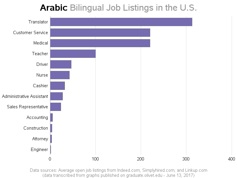
And rather than appending all the graphs together into one huge unwieldy image, I let SAS lay them out separately on a simple html page. This way you can still scroll through them (like the original infographic), but you can also jump right to the individual graphs via the html anchors. Here are the html anchor links directly to the graphs of the various languages: Spanish, Mandarin, Vietnamese, Korean, Cantonese, Japanese, French, Russian, Arabic, Tagalog, and German). The png files for each image are also easier to work with - you can easily save or copy-n-paste the individual graphs into other documents.
How many languages are you fluent in, and have you ever gotten a job (or made money) by knowing multiple languages? What's the best way to become fluent in a second language?


9 Comments
As a native Russian speaker I can dispel any doubts about the first picture:
1. Yes, it is Russian
2. Upper sign (above horizontal line) says "Tram Avenue" and "Zina Portnova street" - 0.3 km
3. Upper sign (below horizontal line) says "Marshal Kazakov street"
4. Lower (yellow) sign says "McDonald's" and "Hypermarket «Okay»" - 2.0 km
Thanks native Russian speaker! :)
What would be an interesting overlay on your industry by language bar charts is some #s on average salary in that industry. Having a HS kid that is tri-lingual (note that she did NOT get that skill from me), her decision on college could be influenced by some $ figures.
The mystery signs are in the Turkic (or is it Russian?) language. They read thus: The upper part of the white sign indicates a train station 3 tenths of a kilometer to the left, with an associated state-run ice cream shop. The lower part of the white sign indicates that a zoo and sausage shop can be found immediately to the right. The yellow sign indicates that a regional car repair facility, with an attached amusement park and mani/pedi supply warehouse, can be found 2 kilometers down the road to the right. A sign lower down on the pole (which is not visible in the photo) says simply "You are here".
Sounds good! (Although I cannot conform or refute the correctness of the translation!) ;)
A car repair shop with an attached amusement park? Sign me up!
Russian, white sign just street directions (avenue and street), no ice-cream mentioned. Yellow: McDonald's direction (small letters: Supermaket OKEY). Can't see anything below, except few SAS/non-SAS graphs which neither of them say about your location.
I think I trust this translation more than the previous one! :)
I think that learning a foreign language can be really hard but I think it's easier to learn it from the locals. I think living in a different culture will eventually help you develop your skills in learning languages.