If you were a fan of the original Star Trek television series, you probably remember lots of little details about the show. And you might even feel sorry for the people who don't get the clever references you make to things from the show. If you're that person, then you'll love this infographic - it summarizes the most memorable things from all the episodes of the original series!
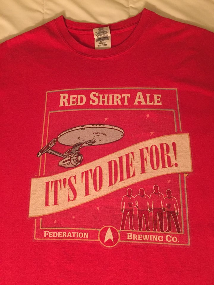
But first, to get you into the mood for a nostalgic trip down Star Trek's memory lane, here's a picture of a clever shirt, making reference to one of those Star Trek-isms. (Thanks for the picture, David!)
I want to start by saying that I am not the original designer of this infographic. All the data collection, design, layout, etc was done by sophie-the-vampire-slayer on tumbler. Here's her note describing her infographic: "A Star Trek Infographic AKA The Numbers of How This Show Ruined My Life. An infographic I did for a uni assignment, researched by sitting down in front of the box set and keeping tally marks." I was so impressed by her work, that I had to try to imitate it with our SAS software!
Here's a snapshot of my SAS version - I encourage you to click it, to see the full-size interactive version, so you can see all the details. It also has HTML mouseover-text, and when you click items in the infographic, it will drill-down to various web pages about that topic (some are direct links to specific pages, and others launch Google searches - note that the Google searches could potentially return images/etc that are not safe for work, so you might want to explore the drill-downs from your home compuer). Other than the pie chart, everything else was done using annotate on a blank GSlide. Here's a link to the code, if you're curious about that.
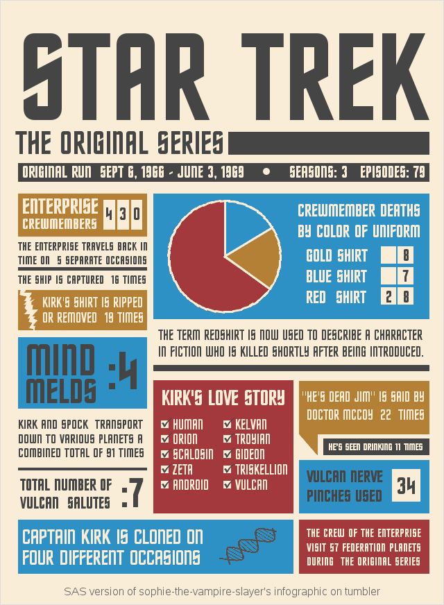
If you compare my version to the original, you'll notice that I hardly made any changes to Sophie's original design/layout (this speaks very highly of Sophie's work!) Below are a list of the few minor changes I made in my version:
- I used a checkmark instead of an 'x' for the items in Kirk's Love Story.
- In Kirk's Love Story, I left-justified the text, so it's closer to the checkbox.
- I used the same font for all the numbers, so they would be consistent.
- I leave off the leading zero in the Deaths by Shirt Color summary (the leading '0' could be mistaken for an '8').
- I used a cleaner/simpler graphic for the dna.
I hope you enjoyed this infographic - feel free to leave a comment, if it has sparked a memory of a favorite Star Trek episode!


5 Comments
Hi there! Original creator of the infographic here! This is amazing! I totally stumbled across this by accident, wow is it a surreal experience to see someone talking about the work I put on tumblr for fun. I didn't think it had ever gotten popular enough for someone to want to imitate it with new software. Tumblr messed up two years ago and I can't even access the blog I used to post it anymore, so I had completely forgot it had gotten around.
I really like the little changes you've made for everything. I made the original when I was 17 in my first year of uni and this was maybe the second time I had ever used illustrator. I've always meant to go back and clean everything up now that I know more of what I'm doing. So it's so great to see your version fix up all the text and smooth everything out. It's like its next evolutionary step!
Hey Original Creator - so glad you checked in! :)
And I'm so glad you referred to my infographic as the "next evolutionary step" rather than "the next generation"! :)
I prefer your "DNA", but her "ripped". Sorry, but yours is _too_ simple, and looks like a lightning bolt.
Another tidbit that would be nice to work in somewhere: "Beam me up, Scotty" is said by Captain Kirk exactly zero times.
Ahh - good eye! ... I did indeed use a lightning bolt from a Windows font (turned up at a steep angle). I might have to consider upping my ripped-shirt game, and create my own custom graphic! :)
Interesting tidbit about "Beam me up, Scotty"!
Ok - I finally replaced my 'lightning bolt' rip with a better ripped-shirt (using annotated image).
Yeah, that looks a lot better!