As a kid who grew up in the 60s & 70s, I was a big fan of the original Star Trek TV series. And in the years since, I have seen lots of the Star Trek “technology” become a reality: cellphones, portable tablet computers, talking computers (Alexa/Siri), etc. But I haven't seen the medical dashboard from sick bay. Seems like that would be a useful thing to have, so I decided to create my own version with SAS software!
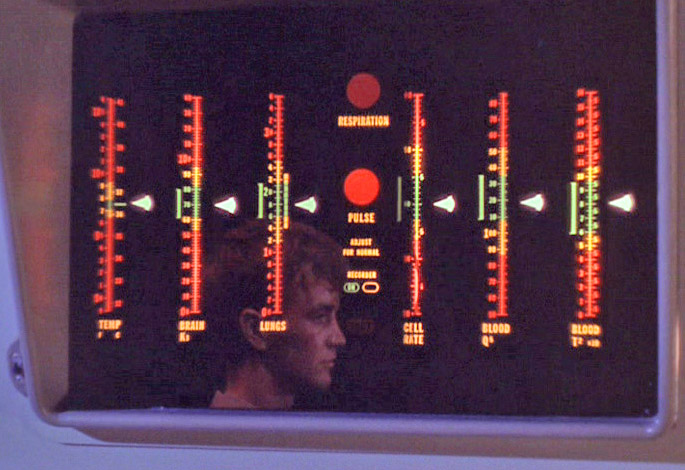
Here's how this project got started ... One of our customers in the health care industry was asking for better ways to display & analyze medical data. My boss at the time (Armistead Sapp) jokingly said “They want the infographic from Star Trek, that was above the bed and allowed Bones to instantly know what was wrong with Captain Kirk”. Here's an image of the medical dashboard from the original TV series, to refresh your memory on what it looked like:
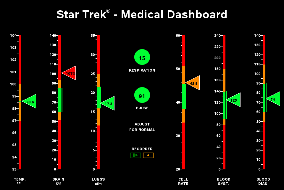
There's not a proc in SAS to create such a graph ... but it's is a very flexible & powerful language, so pretty much anything is possible! I started by creating a custom GReplay template, with a space for each of the 6 bar-like graphs, and then an overall space encompassing the rest of the screen (for the main title, and the stuff in the middle).

I used a very tall/skinny stacked bar chart with an annotated triangle beside it for each of the 6 main charts, and annotated simple graphics for the respiration/pulse/etc in the middle. I made it a gif animation to enable the blinking pulse light. I tried to stay true to the original design they used in the TV show, and only make slight modifications (things I thought the original designers would have liked to do, if they weren’t hindered by the inherent limitations of a gel-sheet with lights behind it). Below is a list of my enhancements:
- I color-coded the triangle-markers, to show exactly which color range they were pointing to.
- I wrote the data values inside the triangle markers.
- The original has a line to the left of each bar showing the ‘good’ range - I moved it to the right side.
- I made the text labels below the bars white instead of orange, since orange is used to represent 'caution' in other parts of the graph.
- I added mouse-over text, so you can read what the data values are … which also works with iPhone/iPad voice-over, making it usable by the blind.
Here's a snapshot of my dashboard - click it to see the full size version, which is easier to read. I also set up a SAS/Intrnet (or Stored Process) version on our intranet (which, unfortunately you can't get to), such that it reads the values from a text file, and refreshes the dashboard every 'n' seconds with the latest data, to make it more like a real-time monitor.
Hope you all enjoyed this (especially the Star Trek fans), and hopefully it has given you a few ideas on how you might use SAS software to visualize some of your data! Here's a link to the SAS code in case you'd like to experiment with it.


4 Comments
OK looks very nice. How do I go about getting it? Is it for sale or a free download or what?
If you have SAS software, you could click the link in the last paragraph to download the SAS code and create your own version. Or, if you don't have SAS software, you could right-click on my image, and save it to your disk (it's an animated "gif" file).
Just to point out that the pulse rate of 91 should be flagged as either yellow or red not green , if this is a human in the resting state.
Very cool! I've held onto this paper for a while, waiting for an opportunity to create something similar at work -- http://www.lexjansen.com/wuss/2013/96_Paper.pdf. The patient profiles in that paper aren't as snazzy as your Star Trek dashboard, but they do show trends over time.