Water is in the news more & more lately - people seem to either have too much, or too little, at any given time. Therefore being able to plot rivers and lakes on a map could be a very useful skill to add to your graphical bag of tricks. A few weeks ago I showed you how to add roads to your SAS maps. Now I'll show you how to add rivers and lakes.
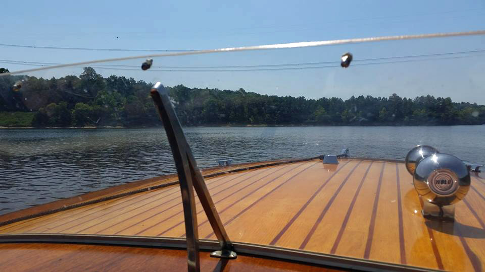
But first, here's a picture to get you into the proper mood for working with river & lake data. My friend Amy provided this picture of a beautiful wood boat out on the water. Like they say in that Alan Jackson song "you can't beat the way an old wood boat rides."
Now, let's plot some water on a map. One of the official Proc GMap examples, example 25, shows how to add roads and rivers to a map ... but some of those rivers look a bit odd, suddenly stopping and then starting again in a mile or so. Those odd gaps are most likely the lakes.
We don't ship rivers & lakes with our maps, but if you can find them in Esri shape file format, then you can probably import them and add them to your SAS maps. Here's where I got the shape files for this example:
Go here https://www.census.gov/cgi-bin/geo/shapefiles/index.php
Select year & 'Water'
Under 'Area Hydrography'
Select a state, and county and Download
Under 'Linear Hydrography'
Select a state, and county and Download
Saved to D:\Public\Roads\NC
Then unzip the files.
tl_2016_37183_linearwater.shp
tl_2016_37183_areawater.shp
and so on...
(the '37' in the filename is for North Carolina, '183' is Wake county - it's the fips code)
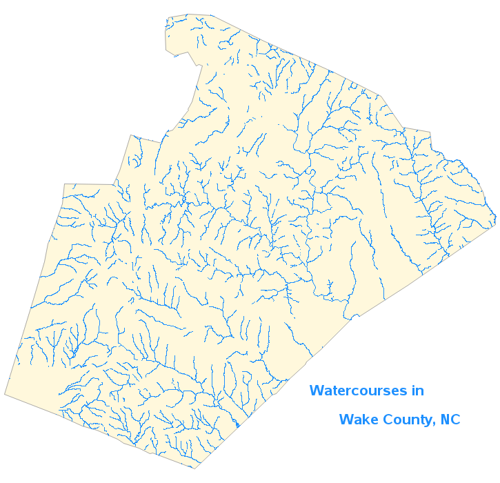
If I import the linearwater shape file, I can convert that to an annotate dataset and draw the linear watercourses (rivers, creeks, etc) using SAS' annotate move & draw functions, the same as in the roads blog example. And if you color the line segments blue, you get a convincing representation of rivers on a map:
But the lakes in the 'areawater' shape files are a bit different - rather than lines, they are polygons. Therefore after I import them, I use them directly as a map (rather than annotating them). And since Proc GMap allows you to overlay polygons in maps, I can simply combine the county map and the lakes map, and plot them together. Here's the code to import the lakes map, and combine it with the county map (there are a few more little details, which you can see in the full code link at the end of the blog):
proc mapimport
datafile='\\l7a695.na.sas.com\public\roads\NC\tl_2016_37183_areawater.shp'
out=county_lakes_map;
id hydroid;
run;
data combined_map; set county_map county_lakes_map;
run;
Below, I color the lake map areas red so you can distinguish them from the rivers...
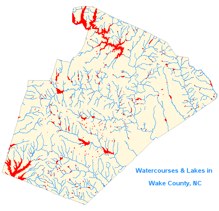
And here I color the lake map areas blue, so they blend in with the rivers. Doesn't that look a lot better than having gaps between the river segments? You could also color the lake map areas by a response variable such as: depth, temperature, pollution level, public/private, etc. Click the image below to see the full size interactive map, with html mouse-over text so you can see the lake names:
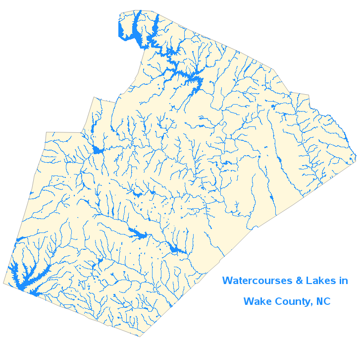
Here's the complete SAS code, if you'd like to download it and see all the details. See if you can generate the Wake county, NC map (above), and then try downloading and plotting the shape files for your county!


5 Comments
I believe I am going to have to go back over Robert's older example code and find more puns......
Will we be able to overlay polygons in VA soon ...
Great work as always Rob.
Hi Bob, VA already supports polygon overlay. SAS ships with boundary data for countries and first level states/sub-division. The doc at http://support.sas.com/documentation/cdl/en/vaug/69957/HTML/default/viewer.htm#n0dva9kxvxnw9en1ofben946kwwr.htm#n06x50q2eotjk0n12w3bwx2vzs1o has some details about geo region maps. VA 7.4 and upcoming release 8.2 also support custom polygon providers which means you can import your own boundary data (e.g shp file). The VA admin guide at http://support.sas.com/documentation/cdl/en/vaag/69958/HTML/default/viewer.htm#n0g5kjtnbvsrwbn1lxl2wahyc5du.htm has more details and examples. Hope this helps. Cheers, Falko
Nice combo ... water + Wake.
:-)
Very clever! This is particularly useful for those trying to map travel time between two locations - there are definitely places where you can't get there from here, and this is a graphic way of representing that. The next logical step would be to add bridges. And I wonder if man-made canals are in the data for waterways. Hmm.