I recently saw an interesting data visualization on the flowingdata website, which analyzed & compared the causes of fatal crashes in the US, by month and time-of-day. At first I thought it was a really cool visualization, but after I studied it a while, I realized that I had misinterpreted their data. Follow along as I describe the problem, and my fix for it.
Here is a shapshot of the flowingdata visualization. I like their layout, labeling, and color selection OK. Also, the buttons along the top let you to easily/quickly switch between things like Urban/Rural, which allows you to visually compare the graphs. It's a pretty cool visualization - I encourage you to click the image below and try out the visualization in their article:
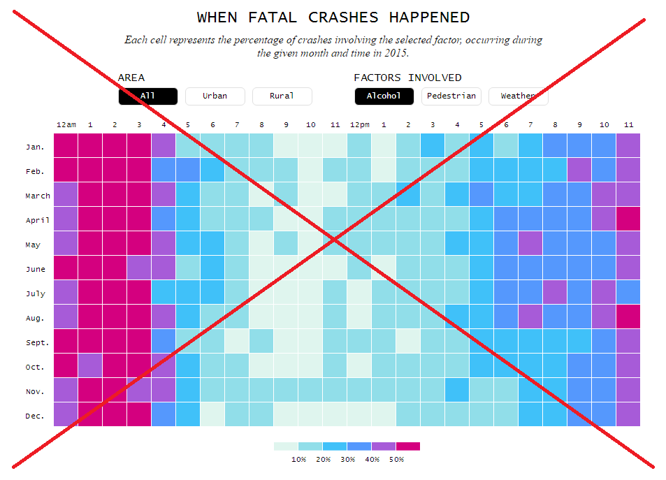
But I didn't read the fine print ... I had assumed that the darker the boxes meant more deaths from that cause during that month/hour. But if you carefully read the fine print (small text under the big title), you'll see that the color represents the percentage of crashes involving the selected factor, during the given month and time. So, for example, a dark box at 3am in February in the graph above doesn't necessarily mean there were a lot of alcohol-related deaths from crashes at that time. Rather, it means that a large percentage of the deaths from crashes at that time were alcohol-related.
I guess my brain works a little differently than the person who set up that visualization, because I expected the colors to represent were the number of alcohol-related deaths from crashes.
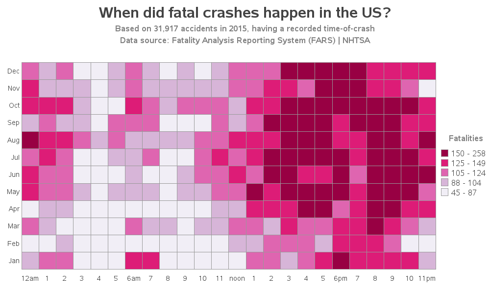
I decided to create my own graph, to see if my way would be more intuitive ... I found the U.S. Department of Transportation’s National Highway Traffic Safety Administration's (NHTSA) data on their ftp download page. And it was already in SAS dataset format (nice!) I set up a grid of polygons similar to the graph on flowingdata, and assigned a unique month_hour id to each. Then I was able to plot the data as colors on the polygons using Proc GMap (yes, you can plot simple polygons with GMap - they don't have to be geographical areas!)
I decided to first plot all the fatal crashes (something you can't do in the flowingdata graph). This tells me that most of the fatal crashes happen in the afternoon and evening, and it appears that Jan/Feb/March might have fewer than the other months. Oh, and you can click the graph images below, to see the interactive version with html mouse-over text (another thing the flowingdata graph doesn't have!)
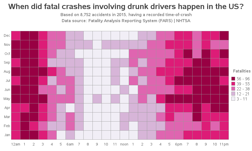
Next, I plotted the fatal crashes involving drunk drivers. There appear to be a lot of these around 1 & 2am, when the bars and night clubs are closing (left side of the graph). And there also appear to be more during the evenings of the warmer months (right side of the graph).
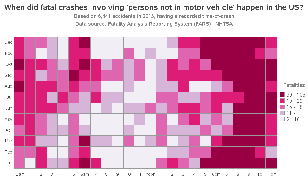
I wasn't quite sure which variable flowingdata used for their 'pedestrian factor involved' graph, but I did find a variable in the data for 'persons not in motor vehicle'. The data documentation indicates this could be pedestrians, people riding bicycles, riding horses, driving a horse-drawn carriage, etc. My title is a little long, but I didn't want to just call it 'Pedestrians' since that could be misleading. It appears that these are most frequent just after dusk (with dusk being later in the summer months - see the curve along the right side of the graph).
I think my graphs are much better for people who just want to get a general sense of the data, and to see when the most deaths occur from various types of crashes. The flowingdata graphs are for a more specific audience, that is interested in comparing between the causes. Both visualizations are good, but I think mine would be preferable for a much broader audience.
Perhaps some of you who work with this type of data can recommend some other interesting ways to visualize it? Feel free to leave your suggestions in a comment!

2 Comments
Another great graph! Could you please share your SAS code to create the graph?
http://robslink.com/SAS/democd92/fars_2015_info.htm