You're sitting in a line of cars at the intersection, waiting for the light to change - when it finally turns green, the 2nd car just sits there for several seconds until someone honks at them, and then they scoot through the light ... but everyone behind them has to sit through another red light cycle. Those (blankety-blank) red light texters!
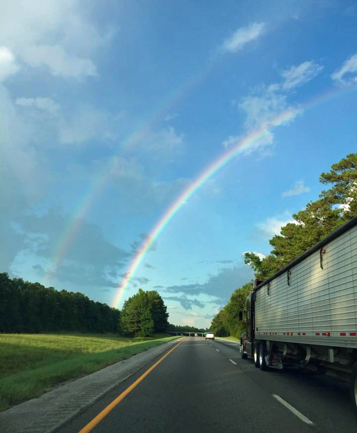
We probably all think the number of people using their phones while driving is high, but never had the data to prove it. Well, with the results of Zendrive's recent study of 3 million drivers, now we do! But before we get into analyzing that data, here's an interesting photo of a rare double rainbow that a friend of mine took with their phone ... yes, while driving (don't worry J.M. - I won't out you!)
And now, let's analyze some data! ... The Zendrive study used smartphone apps to detect phone use while driving (ie, "when the driver handles the phone for a certain period of time for various purposes such as talking, texting or navigating"). Their three month study involved 3 million drivers, 570 million trips, and 5.6 billion miles of driving. Their main finding was that drivers are using their phones during 88% of their trips - wow!
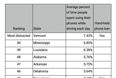
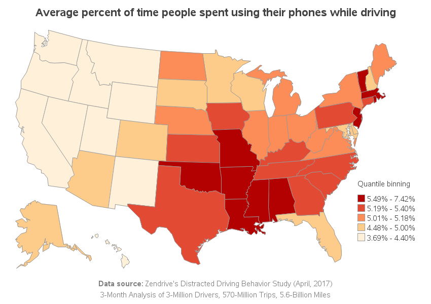
They also provided some more detailed data at the state level, showing the average percent of time people spent using their phones while driving. Here's a portion of their table:
It's great to show the data in a table, but I was glad to see they had also plotted it on a map!
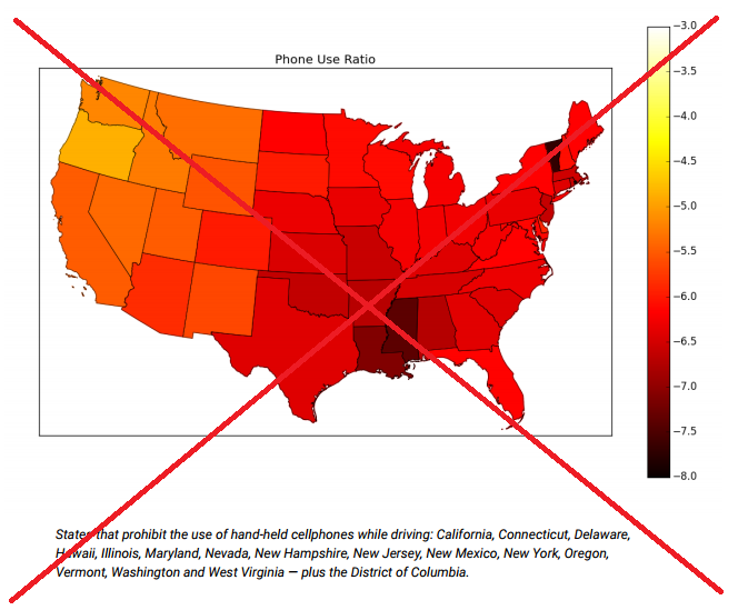
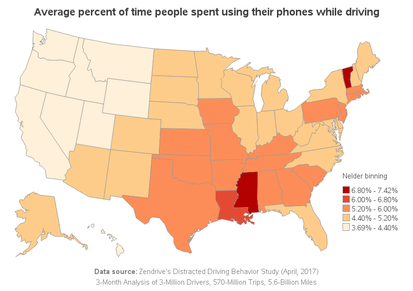
Their map was 'interesting,' and I could quickly identify the states with the highest values. But it was difficult to match the multitude of gradient shades from the map to the legend. I decided to create a SAS version of the map using only 5 gradient shades of color, to see if that might help. I think it's a nice improvement!
But then I started coming up with other ideas that might make the map even better ... for example, using quantile binning. In my next version of the map, each color is assigned to about 20% of the states (quintiles). Whereas the previous map made it easy to identify just the highest two states, this map makes it easier to identify the highest (and lowest) 20% of the states. I think this map is generally more useful - but looking at both maps is, of course, even better than just looking at the data in one way.
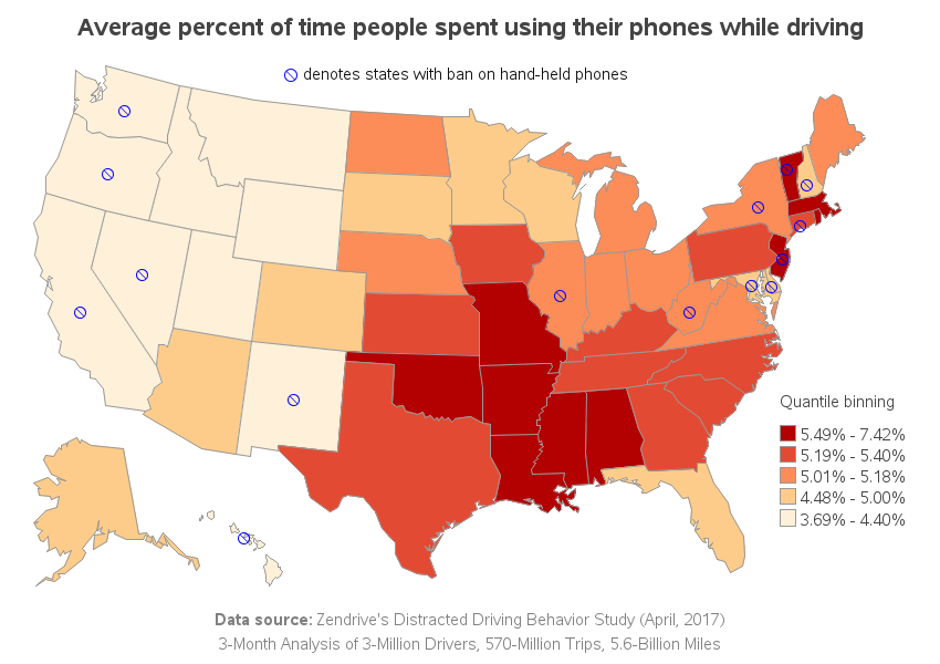
There's one other detail the original map had, that my map doesn't ... they included a footnote listing the states that ban hand-held devices. Their footnote was quite long, and it was cumbersome to read all the states, and try to mentally locate them on the map, and keep track of them all. I decided to represent the information visually, by annotating a no symbol on each of those states.
And now for the pop quiz ...
- What factors cause certain states to have lower (or higher) phone usage while driving?
- Since data were collected via smartphone apps, does it undercount people with flip phones?
- What's your opinion on using phones while driving?
- Where do you fit into these numbers? (higher, or lower?)
Feel free to discuss this topic in the comments section!


8 Comments
How does Zendrive determine the driver, not the passenger, was using the phone?
They don't mention those details in the report I read.
I agree your graphs are better for analysis. But, the all red graph carries a dramatic message that using your phone 5% of the time while you are driving is too high! Also, it takes a lot of courage to take a picture of a double rainbow while passing a truck on a highway. :)
Can you provide a link to code? I'm just figuring out how to make choropleth maps now and want to see how you structured the legend and color ramp. And thanks for including Alaska and Hawaii.
Here's a link to the code: http://robslink.com/SAS/democd92/distracted_driving_info.htm
Fun images but a very serious problem,
I wonder if matching the number of car accidents when a single car drove of the road or crashed into breaking cars to the states data of using a handheld phone while driving would correlate in any way.
Its scary to daily see people crossning lanes suddenly or in the last minute saving themselves from going offroad. In evenings you can see the glow of the phone in front of the steering wheel in far to many cars.
It is likely to be visible in accident data.
You have to wonder about the source of the data when Vermont has the most use AND a prohibition on hand held use. Does that mean people are using their phones 'hands free' or mainly for navigation? It would have been nice to have broken out texting from the other activities as many other places (including NC) have bans on texting while driving.
Thanks for this! I really like the final graph, particularly use of the no symbol. This is timely because I'm about to do an update of our company's distracted driving policy.