Here in the US, it's the nationwide men's college basketball tournament season! Therefore let's use some data from the previous years' tournaments to sharpen our analytics & visualization skills...
But before we get started, I must mention (brag?) that my alma mater, NC State University, won this tournament in 1983. They were somewhat of an underdog team, which made the win even a sweeter! And to get you into the mood for some college sports, here is a picture of my friend Jennifer's girls, all dressed in their NCSU colors. I was probably about this age when NCSU won the championship ... yeah, that's it - that's the ticket! ;-)

Problems with the original graph
And now, let's get to the analytics! ... I had seen a visualization created using Tableau software. It was interesting, but I had to study it for quite a while before I "got" what it was showing. Once I "got it" I thought it was pretty interesting data, and I wanted to create my own version, and try to make things a little more intuitive, etc. Here are a few of the things in the Tableau version I thought could be improved:
- There were too many shades of color to visually discern.
- A diverging gradient color ramp was used, but there didn't seem to be enough games with the neutral/middle color.
- None of the title or legend text above the graph explained clearly what the graph was showing.
- The regions were not in a geographically logical order.
- The graph didn't fit within my screen, but I had to scroll down to the bottom of the graph (which was off my screen) to scroll the graphic left/right.
- And the title claims 30 years of data are being shown ... but it's actually 32.
Tracking down the data
There was a link in the original graph to the data source, but as I read on that page it wasn't the original source, but rather a copy of the data they had imported from this pdf document. The tool they had used to import the data from the pdf wouldn't run on my PC, therefore I did some Google searching, and found an alternate way to read the data from a pdf. I imported it using a web service called pdftables.com, and I was very impressed - they imported the data very cleanly, and let me save it as an Excel spreadsheet. I cleaned up the spreadsheet a bit (deleting the extraneous year headers I didn't need), and used SAS' Proc Import to get the data into a SAS dataset. I then used a few data step tricks to do things like rename some of the variables and fill-in (retain) the dates for all the rows of data that had games on the same day.
Creating my improved visualization
As with many of my visualizations, I created a custom Gmap of simple squares, and then programmatically annotated text labels around them (some of the positions are data-driven, and some are hard-coded). It's all a matter of sorting your data in a logical way, and then adding x/y offsets for the polygons based on the data. I can't stress how useful and flexible this technique is! Here's a link to the SAS code if you'd like to see all the details - it's a bit tedious, but nothing really difficult to follow.
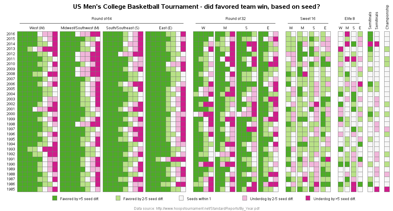
And here's an image of my final graph. I encourage you to click on it, to see the full size interactive version, with html mouse-over text for each of the boxes/games.
Improvements
Here are the changes I made, to overcome the problems in the original graph:
- I only used 5 shades of color, which is a number that is easy to visually discern.
- Rather than making my neutral/middle color represent games in which the seed values were exactly equal, I had it represent games in which the seed values were within 1.
- My main title tells you clearly what the graph represents.
- I ordered my regions West-to-East, as they would be arranged in a geographical map.
- I made my graph a little smaller, so it will hopefully fit on your screen - but if it doesn't fit, you can use the browser's scroll bars to, without having to first scroll to the bottom of the graph to scroll left/right.
- My title doesn't claim that only 30 years of data are being analyzed.
Your insight?
Does this graph give you any insight into the basketball tournament? Do the predicted winners usually win? Have the trends generally stayed the same from year to year? Would it be useful to color the games by some other variable or calculated value? I'd love to hear your thoughts and suggestions in the comment section!


8 Comments
A few people requested seeing the graph, sorted by the minimum seed in each game (rather than the seed difference). Here is that version:
http://robslink.com/SAS/democd91/us_mens_basketball_tournament_v2.htm
Can you please put in the link to the code. Would like to steal a bit for another project
http://robslink.com/SAS/democd91/us_mens_basketball_tournament_info.htm
Nice represebtation. I agree with Gordon in that always sorting the rounds by the lower seed. Especially in the round of 64 you want the data sorted by lowest seed. Very interesting idea that can be used in real life analyses as well. Thanks.
In both graphs, the round-of-64 games are sorted by winning seed, which pushes the upsets to the right of the regional column. I would have expected the subcolumns to be (1-8) vs.(16-9), which would have spread the upsets out, and really high-lit the 15 over 2 upsets (and, if NCAAW data were used, 16 Harvard over 1 Stanford some years ago).
That strategy does complicate the 32 &16 round's columns, but they could be (1-4) vs (8-5) and (1-2) vs (4-3), with higher seeds from prior-round upsets slotted where their vanquished opponent would have gone [ex: the left subcolumn in the sweet 16 would have 1,4,5,8,9,12,13, or 16 seeds].
Good job considering "±1" seeded matchups "even". Games between equal seeds are only possible in the semis and the final.
I like Rick's insights. I noticed the 1985 Villanova upset too. Just from looking... eyeball impression... can you make an argument that the East region has fewer upsets? Maybe it's my ACC bias since Duke and UNC are often sent there while my beloved Wolfpack (when we qualify) are usually sent far, far away. :)
These data tell me that the seeding committee does a good job. (1) There are relatively few pink or purple cells (upsets) overall. (2) The number of pink/purple cells decrease as you move right to the games in the later round. (3) Upsets are relatively rare in the semifinals and finals. (4) Only twice (1985 and 1997) has a significantly lower-ranked seed defeated a higher-ranked seed for the championship. (5) The 1995 Villanova team was truly a "Cinderella Team" with five upset victories en route to a national championship!
Great insights - thanks Rick!