If you're a fan of SAS' ODS Graphics, you probably know that it does pretty much everything except geographical maps. But it's flexible enough that you can "fake it 'till you make it"! This example describes how to fake a geographical (choropleth) heat map using Proc SGplot polygons.
In my previous blog post, I showed how to use Proc SGplot to create a county map of Maryland, and color the counties by region. In that example, I basically hard-coded the region & color in the SAS code. Hard-coding is fine when you only have a handful of map polygons, but when you've got hundreds (or thousands), you'll want to do it in a more data-driven way. In this example, I show how to create a gradient shaded heat map where each county is color-coded based on the data values.
What Data?
You might remember my blog post from last year, where I used Proc Gmap to show the number of drug overdose deaths in each US county, and the dramatic increase in recent years. That data tells an important story, and therefore I'm using it again in this example.
What Map?
If you have SAS/Graph, you have access to many maps in the 'maps' and 'mapsgfk' libraries, the SAS mapsonline website, and maps you import from ESRI shapefiles using Proc Mapimport. If you don't have a SAS/Graph license, you'll have to be a little more imaginative in obtaining your map datasets. In this example, I use maps.uscounty (it's a little older than mapsgfk.us_counties, but I prefer the projection and the way Alaska and Hawaii are positioned).
Since Proc Gmap is specifically designed to handle map polygons, I can easily use a compound id statement like "id state county", and it will even handle counties with multiple polygons. But with Sgplot, you need to create a new single id variable, that has a unique value for each county, and each segment of each county. I do that using the following code:
data my_map; set maps.uscounty;
length id_plus_segment $50;
id_plus_segment=trim(left(state))||'_'||trim(left(county))||'_'||trim(left(segment));
run;
Combine Data & Map
Proc Gmap lets you specify a separate dataset for the map and the response data, but Proc SGplot only allows one dataset to be specified. Therefore you need to combine the map and the response data to use Proc SGplot. There are many ways to join datasets in SAS, and I like to use Proc Sql:
proc sql noprint;
create table combined as
select unique my_map.*, my_data.year, my_data.rate_bin, my_data.county_name, my_data.rate2
from my_map left join my_data
on my_map.state=my_data.state and my_map.county=my_data.county;
quit; run;
Plot the Map
Now that the map and data are combined, I can use Proc SGplot's polygon statement to draw a map polygon for each county, and color the polygons based on the response data (in this case, the number of drug overdose deaths). Note that I wanted very specific legend bins/buckets for the colors, therefore I assigned a numeric rate_bin in the dataset, and then used a user-defined-format (ratefmt.) to print those numeric bins as the desired text range in the legend. I control the order of the legend by sorting the data in the desired order.
proc sgplot data=plot_data sganno=anno_year noborder;
format rate_bin ratefmt.;
polygon x=x y=y id=id_plus_segment / group=rate_bin fill outline dataSkin=none lineattrs=(color=grayaa);
keylegend / position=bottomright location=inside across=1 noborder outerpad=(bottom=50px right=10px) title='Deaths per 100,000' exclude=('.');
styleattrs datacolors=(cxd7301f cxef6548 cxfc8d59 cxfdbb84 cxfdd49e cxfef0d9);
xaxis display=none;
yaxis display=none;
run;
And here's what the output looks like. A pretty decent imitation of a geographical map, don't you think?!?
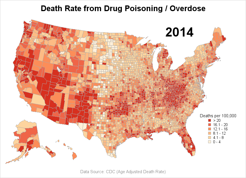
Looking at the map with an analytic eye, I see that there appears to be a hotspot (bright red area) along the mountain areas of the east coast. But I'm not sure specifically which states are included in the hotspot. Therefore, let's add state borders to make that easier to see.
Add State Outlines
There's no easy built-in way to 'turn on' state borders in the county map, but we can use Proc Ginside (if you have a SAS/Graph license) to create a new polygon dataset of just the state outlines, with the internal county borders removed.
proc gremove data=my_map out=state_outline (keep = state segment x y rename=(x=state_x y=state_y));
by state;
id county;
run;
data state_outline; set state_outline;
length state_plus_segment $50;
state_plus_segment=trim(left(state))||'_'||trim(left(segment));
run;
We can then combine that state outline dataset with the death rate (response) dataset, and add another polygon statement in the sgplot to overlay the state outline polygons on the map:
polygon x=state_x y=state_y id=state_plus_segment / tip=none outline lineattrs=(color=black);
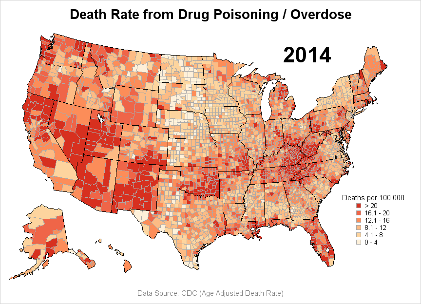
The Final Maps
And now we get the final map, with state outlines included. With this map we can easily tell that the red hotspot along the east coast isn't limited to just one state - it's part of several states (including West Virginia, Kentucky, Tennessee, and North Carolina).
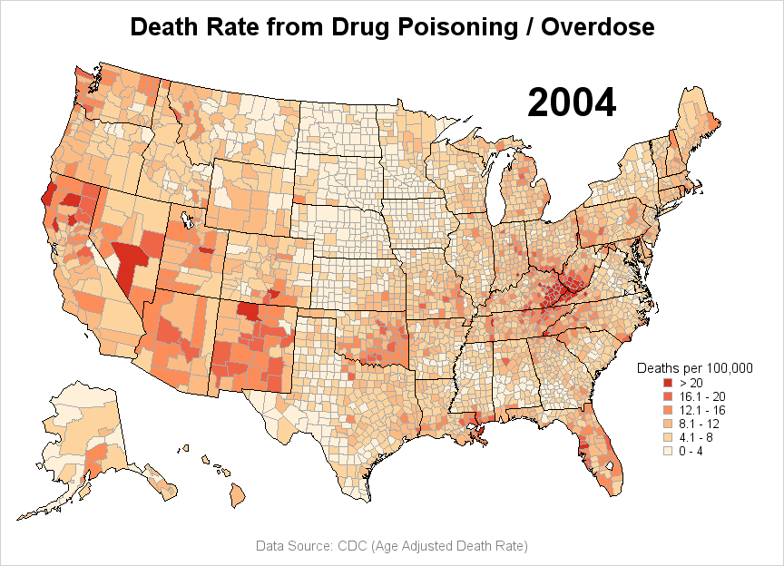
With the code to plot the data for one year in-hand, it's a very simple matter to create a similar map for other years. Here is a map of the 2004 data, for comparison. Wow - the death rate has certainly increased in the past 10 years!
Note that you can click the 2 final maps above to see the interactive version which has mouse-over text for each county. And here's a link to the full SAS code, if you'd like to download it and experiment with creating your own maps (as you might have guessed, there are a few little details that I didn't cover in the code snip-its in the blog). Hopefully you can use this code as the starting place for 'faking' your own SGplot maps!
Click here to see more examples about creating maps with Proc SGplot!
Dec 2017 Update: An official Proc SGmap is now available!


3 Comments
Keep this coming Robert! I really appreciate your articles. Coming from R, SAS has been a pretty steep learning curve for me but your articles helped a lot.
Just to clarify terminology: The title of this blog says "heat maps," but the map you show is usually called a choropleth map. For a discussion of how to create a traditional heat map (a grid of tiles) with PROC SGPLOT, see "Create heat maps with PROC SGPLOT". You can also use the GTL; see "Visualize a matrix in SAS by using a discrete heat map."
Robert,
I like it and bookmark it.