When we send spacecraft from Earth to Mars, do the Martians consider them to be UFOs? I might not be able to answer that question definitively ... but I do have some really cool graphs showing the data for all those missions to Mars!
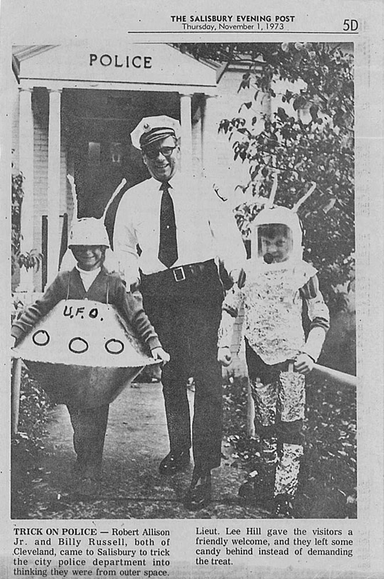
You might remember a previous blog post where I plotted the locations of UFO sightings in North Carolina. So you already know that I've always been a little bit intrigued by the possibility that UFOs (and visitors from another planet) are real. But I bet you didn't know that I actually had a spacecraft when I was a kid! My best friend Billy's dad had a metalworking shop, and he came up with a spacecraft design which he let us help him build (this is where I learned how to use a pop rivet!) We built two of these ships and wore them for Halloween (I've still got mine hanging up in my garage!). And we even staged an "alien invasion" and somehow got our picture in the Salisbury Post with the Police Chief - I'm not sure whether he's welcoming us, or arresting us.
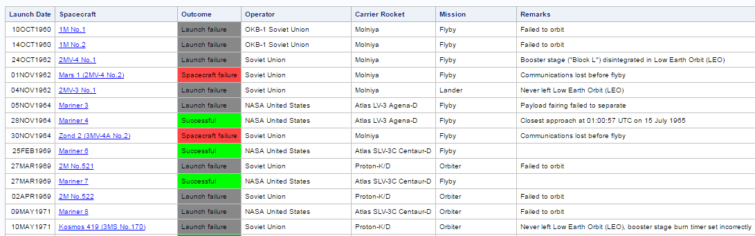
While recently surfing the Internet, I happened upon several articles about proposed missions to take people to Mars. In skimming several of the articles, I found interesting factoids such as: a day on Mars (or a sol) is about 40 minutes longer than a day on Earth, and a year on Mars is almost twice as long as a year on Earth. And according to this table, we have sent way more spacecraft to Mars than I thought. Apparently I slacked off on my reading about missions to Mars when there was a lull in flights during the 1980s, and I just assumed there hadn't been much going on since then ... and, man, was I wrong!
The list of missions seemed pretty long and packed full of interesting data, but I wanted an easier way to get my brain around it all. So I got the table into a SAS dataset, and created a timeline plot, using different colors and marker shapes to represent the outcomes of the missions. I researched each mission, and found how long it took for the spacecraft to travel from Earth to Mars, and included that in the plot as the height of the 'needle' lines connecting the plot markers to the horizontal axis.
By looking at my graph, I can quickly tell when the launches occurred (note the lull from about 1975 to about 1995), and how long it took each spacecraft to reach Mars. I kind of assumed the more recent missions would have faster ships and get there sooner, but my graph shows that's not really the case - the missions in the 1960s and 70s got to Mars in about 6 months, and so did the missions in recent years (if anything, the more recent missions look like they might have taken a little longer!)
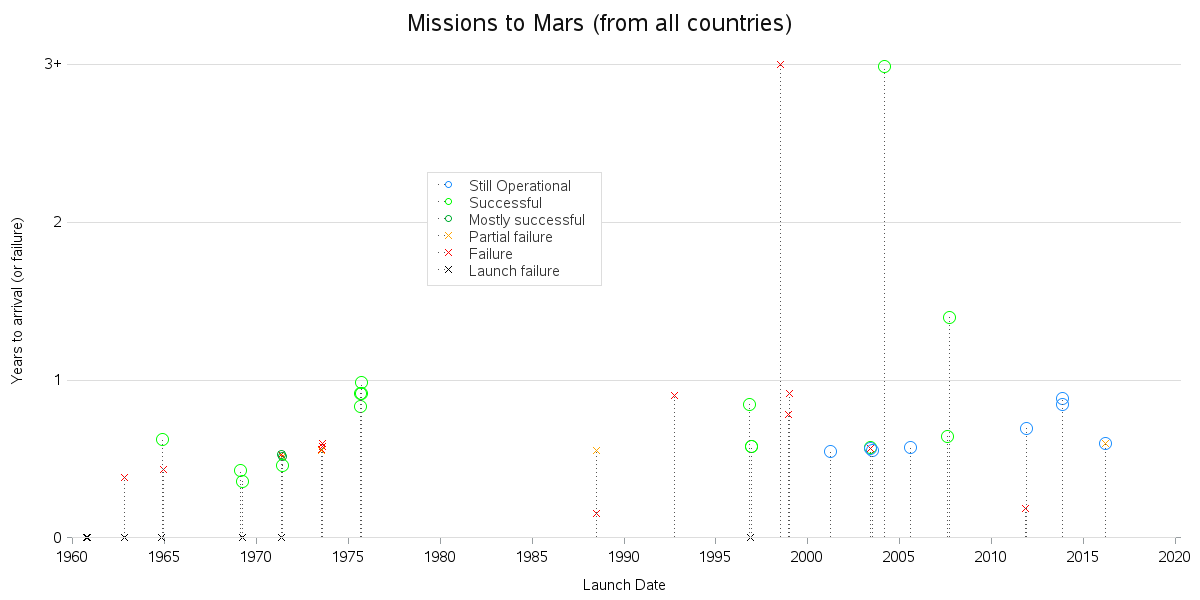
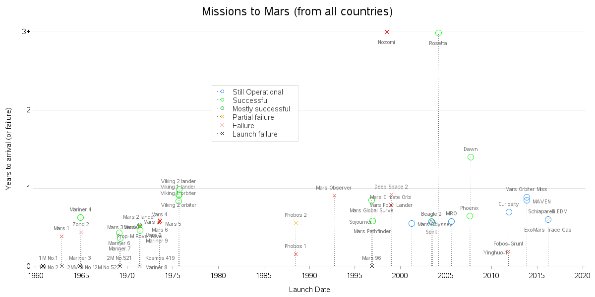
You can click the graph above to see the full size interactive version with html mouse-over text, but I thought it might also be useful to show some labels on the graph (especially in the cases where several plot markers are stacked in the same location, making it difficult to see the mouse-over text for each one). Therefore I used Proc Gplot's pointlabel option to label the markers. It's a bit cluttered, but I think it is still a useful variation of the plot.
In addition to the plots, I also created a table of the data, and color coded the outcome of each mission using the same colors as the markers in the plot. Note that I also added html href links to each spacecraft name, so you can easily click them to launch a Google search.
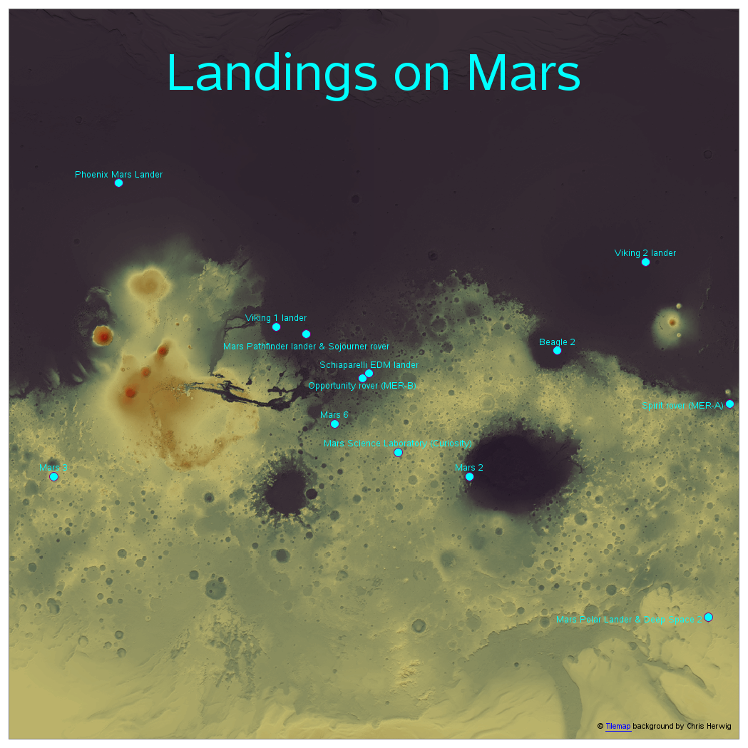
I guess the thing that surprised me most was the number of missions that had actually landed on Mars (note that even a crash landing is a landing). So I decided to plot those on a map. I looked around, and found a slippy tile map version of Mars that Chris Herwig had created (similar to our OpenStreetmaps of Earth), and I recycled my Earth code to display the Mars map with the landing locations. Click the image below to see the full size version, with html mouse-over text for the markers.
So there you have it - a trip to Mars, and you didn't even have to leave your desk! Hopefully you've learned a few things about missions to Mars, as well as a few new SAS tricks!

4 Comments
This post is already a few years back but there are still no solid explanation as to where these are coming from. It is still a mystery. They are definitely more advanced compared to us and we can keep up with them.
Thanks Robert. Really cool information that makes the term "Small world" seem a reality. Maybe you can eventually write a book titled "Small World and Beyond." Guaranteed to be fascinating!
Cool! If you have time at SGF, check out my Red Rover paper / presentation!
It's neat to think of our space explorations from the other side. I hadn't really given that much thought before.
I highly recommend the book The Martian by Andy Weir. The movie's pretty great, too.