The NC Scholastic Chess Championship is coming up this weekend, and my buddy Michael Thomas asked if I might could create a few graphs to help analyze the event data. How could I pass up an opportunity like that?!?! Read along, and find out what graphs I created, and the tricks I used to create them using SAS software!
With sports analytics, the typical thing to do is to plot the data collected during the game - how many points, assists, fumbles, etc. Chess is a little different ... and also this tournament hasn't actually happened yet. So the big question is "What would be interesting to plot?"
The Map:
Well, since it's a state wide tournament, with teams coming from schools across the state, I thought it would be interesting to see all the team locations plotted on a map. With the map, we can see which teams had to travel the farthest, and which areas of the state had the most teams attending.
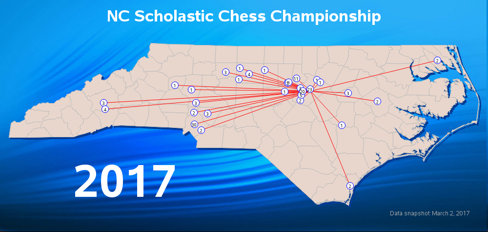
Click the map to see the full-size interactive version, where it's easier to read the numbers on the dots - those numbers show how many teams have registered from each city. If you hover our mouse over the dots, the html mouse-over text will show you the city name, the number of miles from that city to the tournament, and a list of all the teams attending from that city.
I used Proc Geocode to estimate the latitude/longitude coordinate for each city, and then annotated them on the map. I also used annotate to place the 'ripple.jpg' image behind the map. And if you look closely, there is a 3d shadow effect along the edge of the map which I also created with ... you guessed it, annotate!
Perhaps the coolest coding trick was the data step I used to build up the contents of the html mouse-over text. I sorted the data by city, and then for the first data observation for a city I pre-pended the city name and miles. For all the schools in the city, I append the city name and a carriage return ('0d'x character). And then after the last school in a city, I append a double-quote to end the html title= tag.
data anno_dots (drop = teamid teamname); set raw_data; by city; length html $1500; retain html; if first.city then do; html='title="'|| trim(left(city))||' ('||trim(left(city_count))||' teams)'||'0d'x|| trim(left(put(distance,comma8.1)))||' miles to tournament'||'0d'x|| '-------------------'||'0d'x; end; html=trim(left(html))||trim(left(teamname))||' ('||trim(left(teamid))||')'||'0d'x; if last.city then do; html=trim(left(html))||'"'; output; end; run; |
The Histogram:
The registration data was available online, so I decided to pick through that and find something interesting to plot. The data contained each entrant's school grade (K-12), and I thought it would be interesting to create a histogram that would show the distribution of players by grade. Looks like the maximum number of players are in the 5th grade, and the number of players trails off after 7th grade (junior high, and high school).
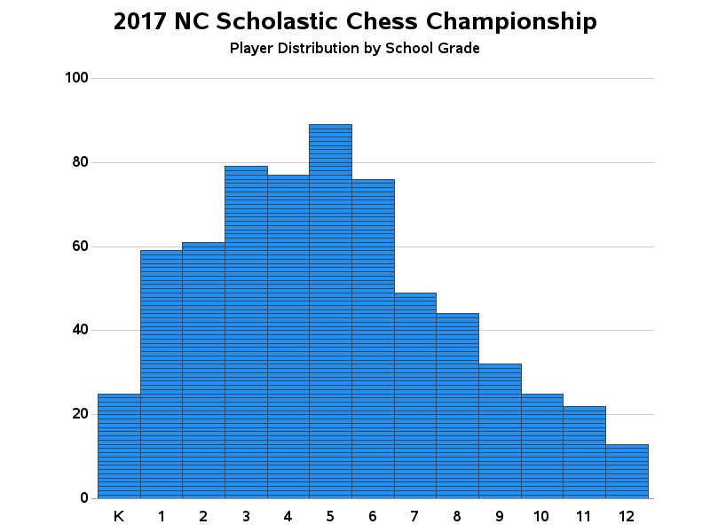
Rather than using just a normal bar chart to show my histogram, you might notice that each of my bars has a bunch of little lines dividing it into segments. Each segment represents a student, and if you click the above image to see the interactive version of the chart, you can hover your mouse over each bar segment to see a student's name. Typically when you use Gchart's subgroup= option to create a stacked bar chart, each segment is given a different color, but I used a pattern statement with a large 'repeat' value to have the same color repeated in each bar segment.
pattern1 v=s c=dodgerblue repeat=2000;
The Scatter Plot:
The registration data also contained each player's numeric rating. This seemed like an interesting value to analyze in a scatter plot, to see if there were trends by grade (age), or if the scores were more randomly distributed.
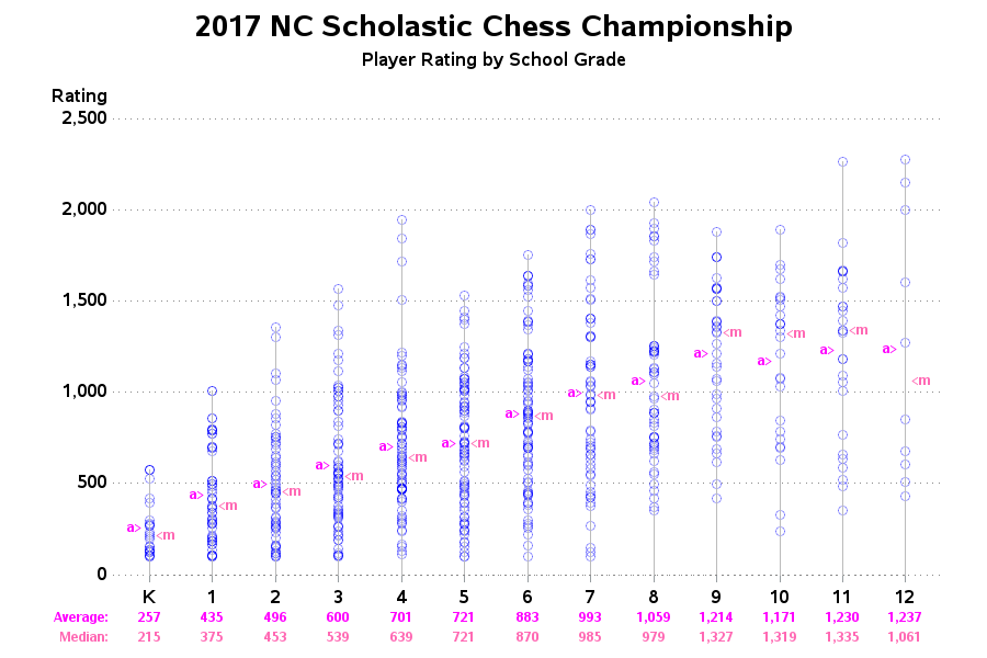
The raw scatter plot did seem to show higher ratings (in general) for students in higher grades, but it's sometimes difficult to tell with certainty - especially when multiple plot markers can 'stack up' in the same location. Therefore I calculated some summary statistics (average and median) and annotated those with 'a>' and '<m' indicators in the plot. I also printed a little table of the average and median values below the horizontal axis. (Alternatively, I could have used a box plot, but I thought a larger audience would be able to understand the simple average and median.) As with the other graphs, you can click the above image to see the interactive graph, which has mouse-over text with the student names.
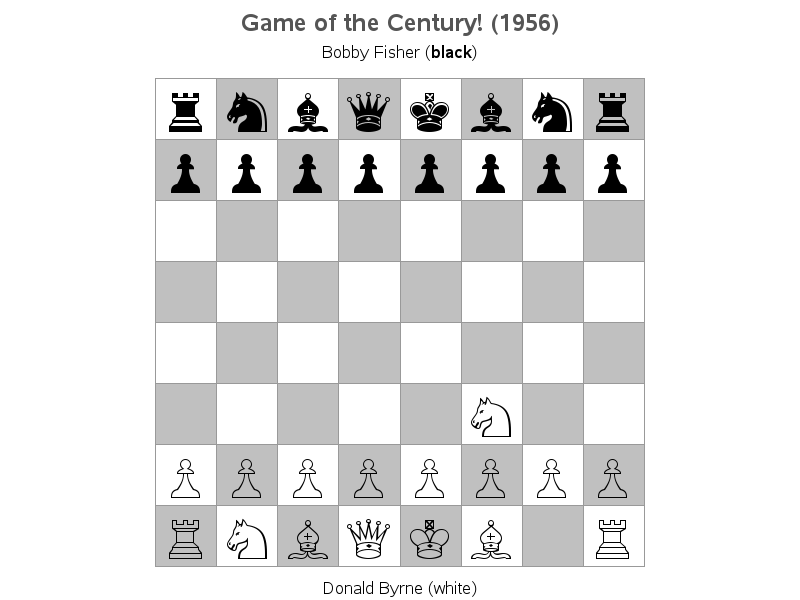
The Animation:
Having my brain in "kids playing chess" mode for several days while creating these charts, of course I couldn't help but think of Bobby Fischer (who was a young chess prodigy). After a few Google searches, I found that there was actually data available describing some of his early games ... move-by-move! This got me wondering if I could maybe create a graphical representation of one of his games.
After a bit of thinking, I figured that I could create a custom geographical map, where each land area represented a square on the chess board, and draw the board using Proc GMap.
I could then use annotate to add the chess pieces to the board map, similar to how I annotated the dot on the NC map (first example in this blog post). But how could I get things that actually looked like chess pieces? I could annotate jpg images (but I would have to get non-copyrighted images, and have to worry about the proportions, and transparent backgrounds, etc). I could create my own chess piece outlines using annotate polygon commands (poly/polycont) ... but that would require a lot of work to figure out x/y coordinates of each point along the edge of each chess piece.
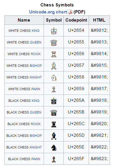
And then I learned that you can represent chess pieces using symbols that are defined in the Unicode character set (see list of the chess symbols below). You can represent a white king, for example, in SAS annotate code using function='label', text='2654'x, and style='albany amt/unicode'.
Now that I can create a chess board, and annotate chess pieces on it, I can represent the state of the board after each move. But who wants to look at 50+ separate images of a chess board, to see the entire game?!? Why not combine all these images into a single gif animation ... and that's exactly what I did! Below is an image of the first move of the game - click the image to see the full gif animation:
I'm always happy to share the SAS code used to create my examples, and here is the code for these, in case you'd like to download it and experiment: map, histogram, scatter, animation.


3 Comments
Chess players are actually lazy - so I think they prefer to play through the games as in the example link I provided, or via other websites such as http://www.chessgames.com/
A couple of diversions on the same theme:
https://www.youtube.com/watch?v=Z6u0JbO4YH0
https://www.youtube.com/watch?v=U5vnpOp0U_g
And there is also this classic:
https://www.youtube.com/watch?v=8XNCMFLJORY
A gif animation with fixed time intervals is a very bad idea when presenting chess games. In this game you really should have time to study in detail the position when Fischer sacrifices his queen. A mouse-click for each move is a much better way and is used by almost any application you find on the internet. One example from my local club: http://www.follosjakk.no/index.php/partier/196-diverse/partier/1338-follo-partier-klubbturneringer-2017
(Click on the right arrow to see next move, left arrow to go back one move)
In addition to just presenting the moves, it is also interesting to show the chess computer's evaluation of the moves, plotted as a graph with each half-move on the x-axis.
Yet another way is to compare each move with the computer's top choices: how much poorer is the actual move played, compared to the computer? At the end of the game, all these values are summed up and can be compared over games. This technique is one of the methods used in detecting frauds in chess games, particularly when weaker players are involved. If a player consistently plays the best move in each position, there is reason to suspect the player has somehow received help from a strong chess program.
Hi Per - those are good observations ...
Although web browsers don't typically allow the user to manually step through a gif animation at their own pace, there is an alternative ... You could download the gif animation file to your hard drive, and then use a dedicated gif animation viewer which provides much more control than the browser. For example, I just now did a Google search for "free gif animation viewers", and the '7GIF' software seemed to be a decent one (http://www.softpedia.com/get/Multimedia/Graphic/Graphic-Viewers/7GIF.shtml). I downloaded & installed the software, opened my chess_animation.gif file in it, and was then able to step through it frame by frame (by clicking on the ctrl+right arrow to see next move, ctrl+left arrow to go back one move).
It's a few extra steps ... but I bet chess players are OK with the idea of taking several steps to reach a goal! :)