Living to 100 isn't as simple as just paying a certain amount of money for your healthcare. But that is an interesting aspect of longevity, so let's have a look at the data ...
In my previous blog post, we analyzed how much people from various countries spend on healthcare. And I posed the questions: "If the US spends more, do we get more? If other countries spend less, do they get worse healthcare?" In this post, I try to answer those questions by using longevity as the measure of healthcare quality.
Before we get started, here's a picture to get you into the mood for a longevity blog post. This is my friend John's Granny, celebrating her 99th birthday. I sure hope I'm still blowing out candles at 99!

And now, on to the data analysis! I started by looking for analyses that have already been done on this topic. There are quite a few, but the one that caught my attention was the following graph that Paul pointed me to in his comment on my previous blog (from the ourworldindata.org website).
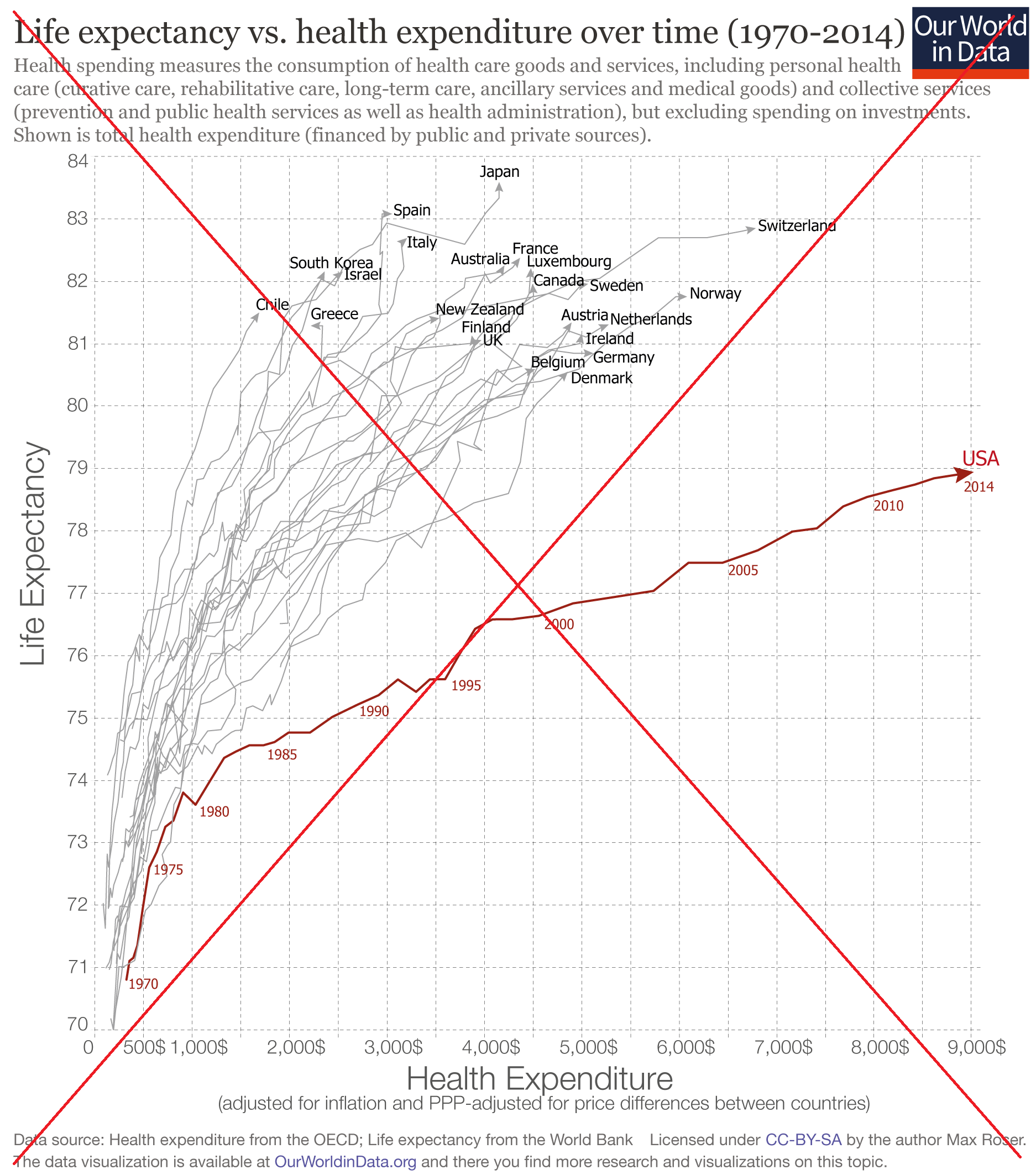
It was a very interesting graph, and thankfully they had links to the two data sources they used. I downloaded the data (an Excel spreadsheet of life expectancy from worldbank.org, and a csv file of healthcare spending data form oecd.org), put together some code to import it into SAS, and set out to create my own graph.
I liked their original graph, so I only made a few small enhancements. I used light blue lines rather than gray (so they were more easily distinguishable from the reference line grid), I added small markers on the red USA line at the locations of the 5-year labels, and I repositioned the country labels so you could better tell which line they went with. Also, if you click my graph image below, you can see the full-size version with html hover-text for the lines, so you can easily tell which line represents which country.
One difference I notice in my graph and the original is that my graph shows more years of data for Germany, and it dips below the USA line in the 70s and early 80s (perhaps that data was not available when they generated the original graph?)
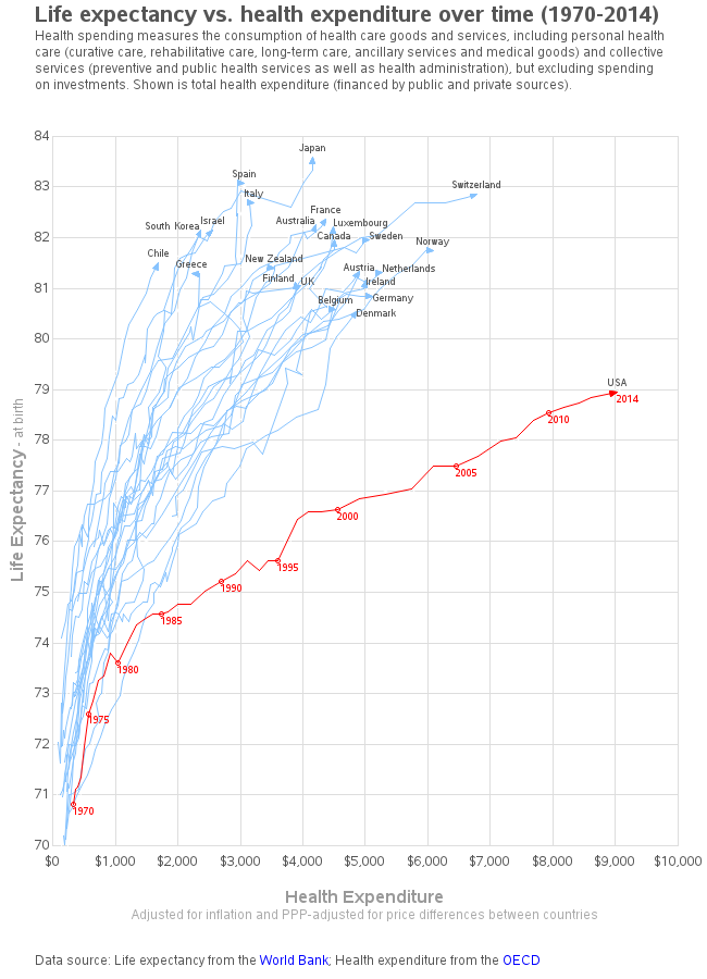
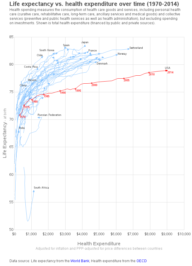
While creating the graph, I noticed there was also data available for several other countries, and I thought it would be interesting to see all the data plotted. So I created a second version of the graph, with all the countries. There wasn't enough room to label each line, but you can use the html hover-text to determine the country names for the unlabeled lines (click the image below to see the interactive version).
Did you find these graphs interesting? Do you like the first graph, or the second graph (with more countries) better? What other data might we use to measure the quality and effectiveness of healthcare?


5 Comments
I've seen several presentations/discussions about this kind of graph in which the lines are parameterized by time. The "perception experts" argue that these graphs tend to be confusing to the non-expert because they initially appear to be time series plots, but they are not. In plots like these the parameterized curves can double back on themselves or loop around (see Greece). Also, it is hard to compare, say, costs in the year 2000.
An alternative is to use a simple time series plot ("spaghetti plot") in which the X axis is time, the Y axis is life expectancy, and marker/line colors reflect cost. When there are many countries, you can change to a "lasagna plot."
Sounds interesting - Looking forward to seeing your re-visualizations! :)
Great post! Thanks for the mention :-)
I also think it would be neat to use the data and forecast out until the curves hit 100. After all, the question is the cost of healthcare to hit 100 years old!
true!