Have you ever wondered how far you live from the closest nuclear power plant? I've crunched the numbers for cities here in the US, and created an interactive SAS map to help answer that question!
The average age of US nuclear power plants is 35 years, and there just doesn't seem to be a push to build a lot of new ones (contradicting one of my favorite 1980s songs). Perhaps a few famous nuclear accidents (Three Mile Island in 1979, Chernobyl in 1986, and Fukushima in 2011), along with worries about what to do with spent radioactive fuel/etc, make it a bit too risky for most power companies to pursue. But the nuclear plants we've already got will probably be around for quite some time ... which gets us back to the original question, "How far do you live from the closest nuclear power plant?"
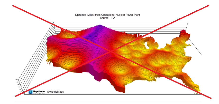
I did a few Web searches to see what might already be out there on this topic, and found the following map on the metricmaps website. It was an eye-catching map, but what did it mean? After a bit of studying, I guessed that the yellow areas were close to a nuclear plant, and the violet/purple areas were farther away. I wasn't sure if the height on the map represented the elevation, or the distance from the plants (I'm thinking the latter, but that doesn't really seem like a good way to visualize it, since that can easily be confused with actual elevation). Also, it was difficult to tell how far specific cities are from nuclear plants.
So I decided to create my own map that was a bit less artistic, and a lot more analytic. I downloaded the data in Excel spreadsheets format from the Energy Information Administration (EIA) page, and imported them into SAS datasets. I determined the active nuclear power plants in one dataset, and then used an SQL join to merge in the lat/long location of the plants from another dataset.
I then used an SQL join to create pairs of every nuclear power plant and every city with over 10,000 people, and used the geodist function to calculate the distance from every power plant to every city. Then for each city, I took the shortest distance, and that is the nuclear power plant the city is closest to. It's a "brute force" method, but it took less than 1 second to run on my laptop.
Here's the image part of my map - click it to see the interactive map, with html mouse-over text for each city. I think my SAS map "answers a lot more questions" than the metricmaps version.
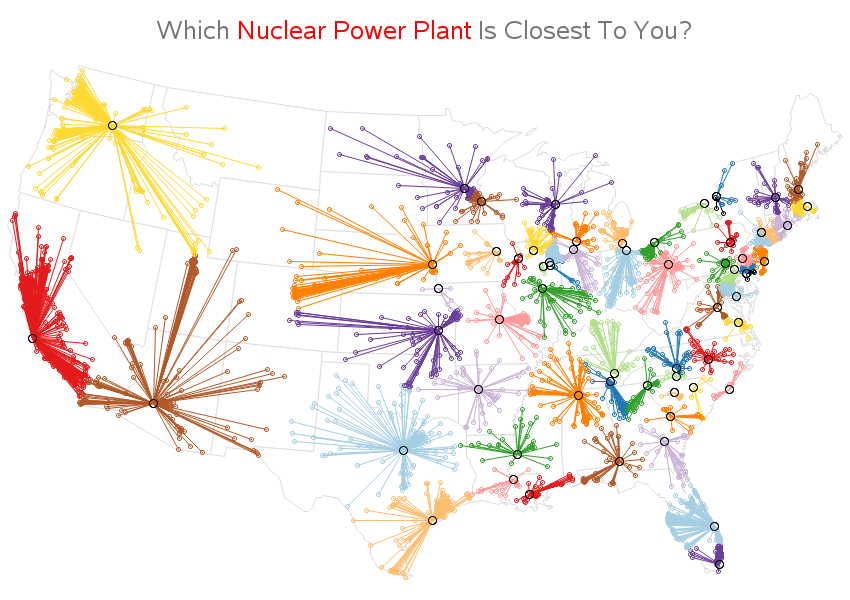
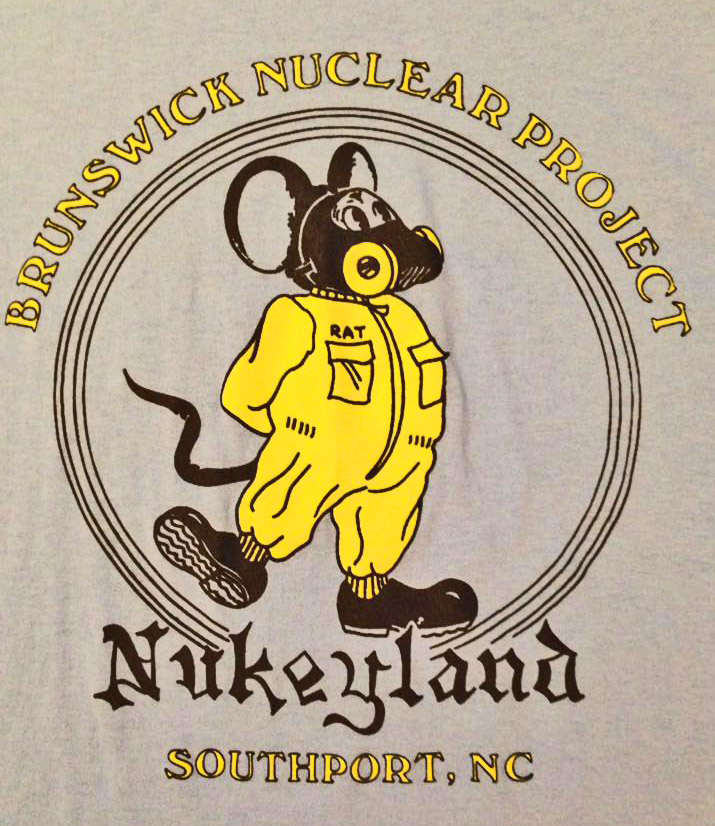
What's the closest nuclear plant to your city? The Harris plant is closest to me. One of my co-workers, Thelma, grew up in Brunswick County, NC (home of the Brunswick nuclear plant), and when she moved there someone gave her this shirt - how cool is that in a warped sort of way! :)


17 Comments
Is the interactive map still active? I tried to access it using IE and Chrome and just seem to get an image with no roll-over text, etc.
Yep - it's still interactive with mouse-over text! Try mousing-over the large circle in the middle of each cluster to see the easiest mouse-over text. Once you see that one, now try mousing-over the smaller city dots at the ends of the lines (these have very tiny mouse-over areas, so it might be a bit difficult to place your mouse over the exact spot - patience & practice will help!) :) http://robslink.com/SAS/democd88/nuclear_distance.htm
Hey! Nice map. What's the benefit of having these node-link clusters instead of using a voronoi diagram? The node-links make me think of connectivity not spatial distribution.
Since I determined the closest nuclear plant using simple straight-line distance calculations, I thought it natural/intuitive to use straight lines to connect the cities to the nuclear plants.
This is a great map! Would you please share the code for creating it?
Certainly! http://robslink.com/SAS/democd88/nuclear_distance_info.htm
Better watch publishing stuff like this or Homeland Security might get after you! Cool visualization though.
This is interesting, thanks for sharing. Is there a map that shows the impact radius of each plant and how these overlap?
I'm not sure of the impact radius - I think it would depend on a lot of factors, such as wind and terrain (for example, mountains might help block it off). If I could get such data, I could plot it! :)
Haha! Hopefully not! (it's all public data!) :)
You're missing one in Raleigh :). There is a mini "reactor" on NCSU campus. It may be there but just overshadowed by Harris.
Ahh yes - the good old NCSU nuclear reactor! :)
https://en.wikipedia.org/wiki/North_Carolina_State_University_reactor_program
I think the EIA database only lists the nuclear reactors that produce power commercially. But it might also be interesting to add *all* the nuclear reactors (including old/decommissioned ones, research ones, ones on nuclear subs, etc!), if I could somehow get a definitive list! :)
Like your idea, but hard to pinpoint small details. wouldn't let me expand. What you didn't take into account on plotting these was that the wind patterns usually blow W to East. Very interesting though. I'd suggest the other graphs be made separate to break out the details better. ex. Active vs decommissioned vs Schools and ship yards. Could they then all be overlayed?
Annotate's pretty flexible - you can overlay as many things as you want! :)
There is a cluster of reactors in eastern Idaho, look up INEEL (I think that's the current acronym). Experimental research and training Navy nuclear power plant operators are the main activities.
And Arco, Idaho was the first town (briefly) powered by nuclear power.
Any place basing modern submarines or aircraft carriers probably should be included
Interesting stuff!
Nice. I used to get a calendar every year, until I moved out of the 10 mile radius.