If you're into 1980s pop music, then I bet you love Billy Joel's song We Didn't Start the Fire. But do you know every word, and the significance of every reference? Let's use SAS software to create an interactive visualization that will help you fully understand this song!
I first saw an infographic visualization about this song on Rachel Lee's design page. It was visually captivating, and the layout reminded me of a couple of my favorite 1980s arcade games (Tempest and Gyrus), or maybe a concentric version of Tetris - how could I not be drawn in?!? ...
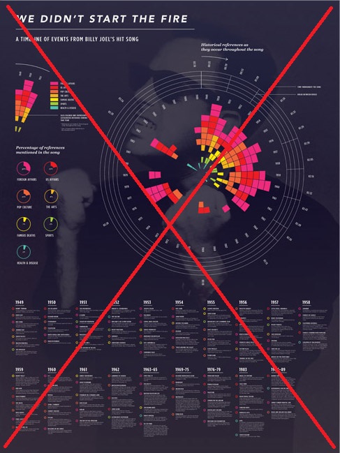
In Billy Joel's song, he mentions things in chronological order, and the infographic mirrors that (starting with 1949 at the top, with spokes proceeding 1 year at a time clockwise), with each colored box representing a different thing mentioned in the song. But the placement of the boxes along the rings (outer to inner) seems a bit arbitrary - they're arranged in the order of the color legend (from outer to inner). This makes for a pretty 'rainbow effect', but isn't really useful for analytics.
You can look at the year labels around the outer edge of the circle, and then find that year at the bottom of the page to see the list of things mentioned in the song from that year. You can then match up the colored circles beside the text, and try to guess which colored box in the graph it corresponds to (but it's difficult to know for sure).
This infographic was so visually captivating that I really wanted it to work, but it just didn't help me understand the song. I spent a lot of time zooming and panning, trying to relate the text at the bottom to the graphic at the top, but it was more cumbersome than rewarding. I even read a page that shows the 8 preliminary versions leading up to the final infographic, but that still didn't help. It was just more of an artistic infographic than an analytic tool.
So, as often happens, I decided to create my own version, and try to make some improvements.
- First, I wanted to have my version fit on one screen, and allow the user to read everything without needing to zoom & pan.
- I kept the circular design with each spoke representing a year, but rather than just looking like a cool video-game design, I decided to make it look like a vinyl record.
- And rather than ordering the colored boxes like the legend, I arranged them in the order they appeared in the song (from the outer ring to the inner ring).
- Instead of using rainbow colors (which are difficult to distinguish), I chose a nice palette with 7 discrete colors on the colorbrewer website.
- And rather than trying to fit all the descriptions at the bottom of the infographic, I include them in html mouse-over text (you'll have to view the interactive version to see that). And if reading the mouse-over text isn't enough, you can click on each colored box to launch a Google search on that item.
[Click the image below to see the interactive version, with mouse-over text!]
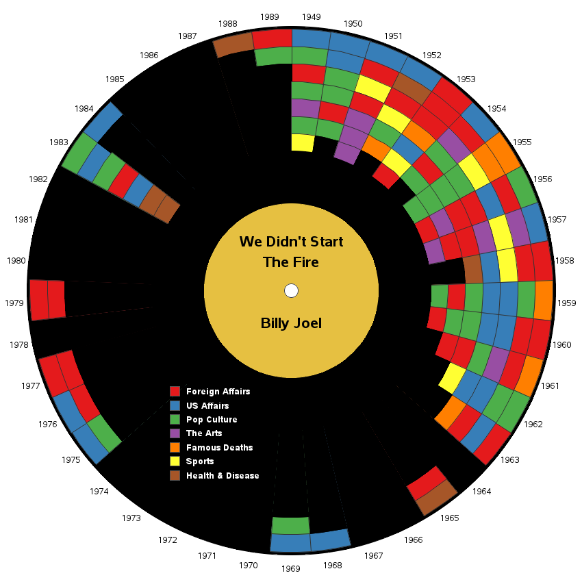
I invite you to view my full size infographic and simultaneously listen to the song, and mouse over the colored boxes (can you keep up?!?). After that, go back and study it in more detail, reading the mouse-over text for the things you need more info on (and if you're really interested in a certain item, click the colored box to launch the Google search).
I hope you enjoyed this infographic as much as I enjoyed creating it! Feel free to leave feedback and suggestions in the comments.

13 Comments
Pingback: My top 10 graph blog posts of 2016! - SAS Learning Post
This is great. Thanks for sharing.
Hi Robert, I love your creations.
This is amazing
I like if you can make "vedio or audio clip of Billy Joel's song We Didn't Start the Fire" hyperlink to yello colored inner circle of the infographic in your web page (http://robslink.com/SAS/democd88/we_didnt_start_the_fire.htm)
Hmm ... that's a great idea!
I thought about having the song play automatically when anyone views the page, but I thought that might get annoying (and there might also be copyright issues). But having a link to the official video would be a nice feature!
Ok - I've made this change that you recommended!
I added the following to the code that draws the yellow center/label polygon:
html=
'title='||quote('Click to see the official music video')||
' href='||quote('https://www.youtube.com/watch?v=eFTLKWw542g');
Now you can click on it to view the music video. :)
Would you be willing to share the code? I'd love to see the details!
Certainly! - Always happy to share the code for any of my examples! ...
http://robslink.com/SAS/democd88/we_didnt_start_the_fire_info.htm
Why is Watergate dated '75? None of the events in the hover-text happened then.
Also the period from the first chart dated '69-'75 has 5 items, yet only 4 are on the second image within that time period.
1975 was when most of the people were found guilty (I guess I could have used 1972, when the crime was committed?) When you hover over the blue 1975 polygon in my graphic, you should see the Watergate hover-text.
Yes, the original/first image seems to have several more colored boxes on the left side than mine. I believe that their graphic has more colored boxes than there are items in the song (perhaps they used multiple colored boxes for items that spanned several years? - it's difficult to tell, since they don't have hover-text).
I just saw him in concert. How timely! I posted your graphic on my Instagram page and tagged a member of his band. I'll bet he'll get a kick out of it.
Excellent! :)
Please provide me with modern technology with more explanations like this always.
Thanks
Seeing Billy Joel's expression of my generations siren song visually was an eye opener. Thanks.