Where is solar and wind power generated in the US? Let's visualize this data on a map...
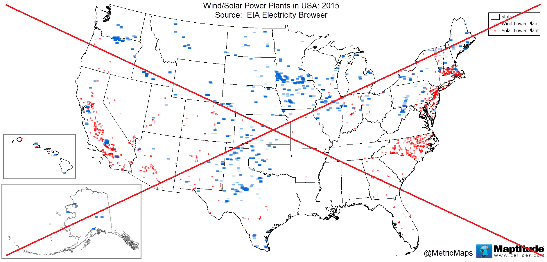
I recently saw the following map on the metricmaps.org website. It caught my attention because it looks like North Carolina has a lot of solar power plants, whereas our neighboring states have very few. This seemed odd at first glance, and made me wonder if their map might be incorrect ...
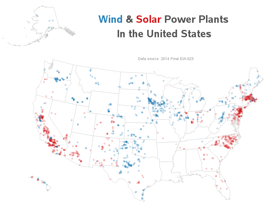
I had recently been mapping other data from the Energy Information Administration (EIA), and since I already had their data imported into SAS, I thought I'd try re-creating the wind/solar map.
I only made a few changes to their map. I decided to use the 2014 final data rather than the 2015 early release data. I made the title a little bigger, and I used circular markers for both solar and wind, rather than using 2 lines for wind (the circular markers are easier to see the mouse-over text when the markers are densely packed).
Here's my SAS version of the map - click on it to see the full-size interactive map, with mouse-over text showing the name and address of each plant.
How'd he do that?
I often share the technical coding details, so the SAS programmers out there can get an idea of how to create similar graphs. In this case, I downloaded the EIA Excel spreadsheet with the energy production data, and imported into SAS using Proc Import. I had to also download & import the spreadsheet with the plant information (which contains the lat/long of each plant), and merge that with the production data using a Proc Sql join. I combined the data and the map, and used Proc Gproject to get the map projection (or the look) I wanted ... but it was a little tricky because I handled Alaska and Hawaii separately, so I could move & scale them differently. I annotated the power plants on the map using the annotate pie function with style='pempty' (so the pies were just circular outlines rather than filled). And last, but not least, I used the note statement to place the title text inside the map area (whereas the title statement would have forced the titles to be north of the northernmost map area).
My map looks very similar to the one on the metricmaps website (even with a different year's data), therefore I think their map is an accurate representation of the EIA data. Perhaps NC has more solar power plants than its neighbors because of the Senate Bill 3 that required the state to generate at least 12.5% of its power from renewable sources by 2021? Or perhaps other states aren't documenting small solar power installations?
Whatever the reason, I'm happy to see that NC is well represented on the solar power map. And as I was hovering over the red markers, I found the marker for the SAS Solar Farm - the mouse-over text says that it produced 3,375 megawatt hours of power in 2014. Not too shabby, eh!?!
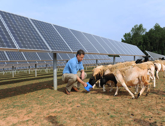
Here's a picture of some of our solar panels here at SAS, and the sheep that keep the grass trimmed under them (yes, it truly is a solar farm in both senses of the word!)
What's your opinion on solar power? Do you think it will play a major role in satisfying our future energy needs, or will something else come along that will revolutionize the way we produce and consume electricity?


3 Comments
If the US have continuously build their renewable energy, that country will become The Most Green Energy in a World.
Perhaps you've heard of the solar power plants that continue to produce energy at night? One uses an array of mirrors that superheat molten salt, which then generate steam that can turn turbines long after the sun sets. I think ideas like this need to augment the "only during the day" solar plants.
Makes a lot of sense!