How is it that 91% of the US didn't vote for either Hillary or Trump in the primary, but yet they're still the final two candidates in the presidential election? Let's break it down with a simple graph!
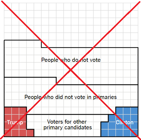
I recently saw a really cool slideshow on the nytimes website, that answered this question very nicely. They used an 18x18 grid of squares, with each square representing 1 million people, to represent the 324 million people in the US (18x18=324) . Each slide labeled a subset of the grid, representing various groups of people who voted (or didn't vote). In the end, the red and blue squares showed that just 9% of the population voted for Hillary and Trump in the presidential primaries (ie, 91% didn't vote for them ... most didn't vote for anyone). Here is one of the final slides.
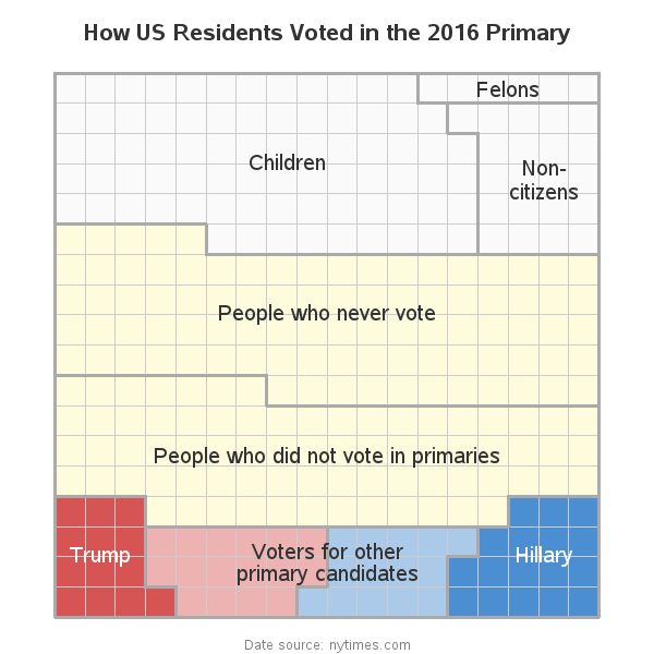
I really liked their slideshow, but it was missing a graph that showed all the groups labeled at the same time. So I decided to create one myself using SAS software.
This might surprise you, but I used some code I had recently written to create the following Pokémon Pikachu picture, to create my voter grid graph:

This Pikachu is a grid of data-driven colored squares, therefore it only required minimal changes to repurpose the SAS code to create the voter grid graphic. I changed the dimensions of the grid, added some code to annotate borders & labels around certain groups, and in almost no time I had my own graph. Try clicking the image of my graph below, to see the interactive version with mouse-over text that provides more details about each group:
Do you think the grid graph is appropriate for analyzing this type of data? What are the advantages and disadvantages? What other kinds of graphs might be better, for answering specific questions?

8 Comments
Pingback: My top 10 graph blog posts of 2016! - SAS Learning Post
Pingback: A statistical crossword puzzle to exercise your brain - SAS Learning Post
Actually everybody who is eligible to vote actually do vote: T
a. Those who not vote for any candidate have expressed their choice by NOT voting: C
b. Those who vote for Candidate A
c. Those who vote for Candidate B
Are we assuming that C = Total - ( A + B ) ?
Hmm ... perhaps some eligible voters are making a statement by not voting. But I think some just don't care, or are too lazy.
What about a one-dimensional line, with Clinton voters at the far left, Trump voters at the far right, voters for other Dems next at the left, voters for other Reps next at the right, and the remainder in the middle? I wonder which would look more representative?
P.S. I love your version!
Tom
Interesting idea!
I really liked the 2016 primary voting grid graphic. It's always good to provide sources though. I'd be curious which sources were used to calculate the numbers. How, for example, was the number of people who never vote tabulated?
If you view the interactive version of my graph, and click the 'Data source' footnote, it will take you to the nytimes page with the original article, and read their background info on the data. I'm with you though - I would like a lot more info on exactly how the numbers were arrived at!