The way your graph looks can make all the difference ... two people can graph the exact same data in essentially the same way, but one of the two graphs can be perceived as much better than the other. Hopefully reading my blogs will help you create the better graph!
Way back in my formative high school and college years (1980s & 1990s), there was a lot of emphasis on having the right look. A popular song at the time was ZZ Top's Sharp Dressed Man, TV shows like Miami Vice always had a certain fashion sense about them, and the Dress For Success book told us all what to wear for our interviews. My buddy Anil was probably the sharpest dressed guy in our dorm, and he is now in Abu Dhabi working for one of the largest sovereign wealth funds in the world ... so, apparently all that sharp dressing worked! Here's a picture of Anil dressed for a typical day at college (can you guess what year this was?)

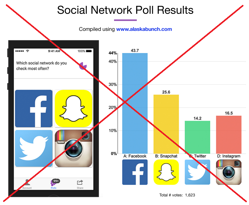
Well, graphs are no different ... If your graph doesn't have the right look, then it will not be nearly as successful. I recently found some interesting graphs showing social network poll results, that make a good example of this. They weren't bad graphs, per say, but they just didn't have the right look.
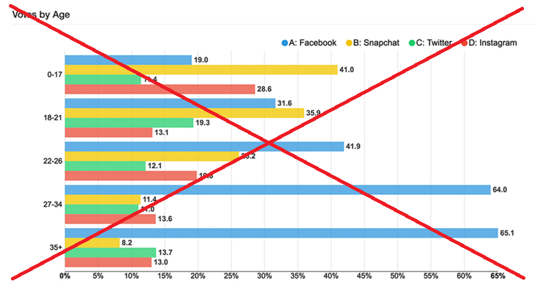
Their first/overall graph was too cluttered. Why did they use a smartphone screen-capture on the left to show the survey question - why not just have that in the title of the graph? Why did they put the A/B/C/D in front of the social network names? (presumably to control the order of the bars - but why?!?) Why duplicate the social network logos below the bars, and also in the smartphone screen capture? The graph caught my attention, but I had to spend way too much time figuring it out.
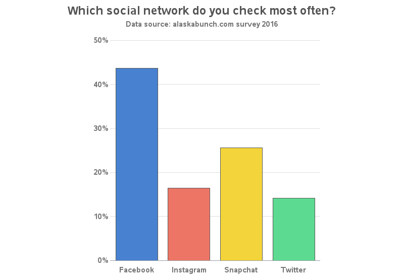
In my SAS version, I basically used the same layout and colors, but simplified the graph considerably. And if being able to understand a graph easily & quickly is 'success' ... I think my graph is definitely more 'dressed for success' than the original one was. :-)
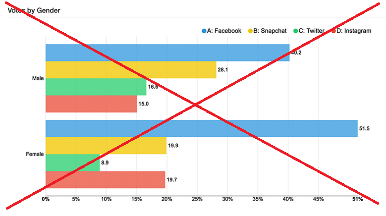
They also showed the survey results by gender. This graph was a lot better than their first one, but it still had the A/B/C/D in the legend, and I'm not sure why they decided to label 51% on the response axis. Also, I think it's a bit confusing that they used vertical bars for the first chart, and now changed to horizontal bars - either orientation would be OK for this data, but I think it would be best to use the same orientation in both charts.
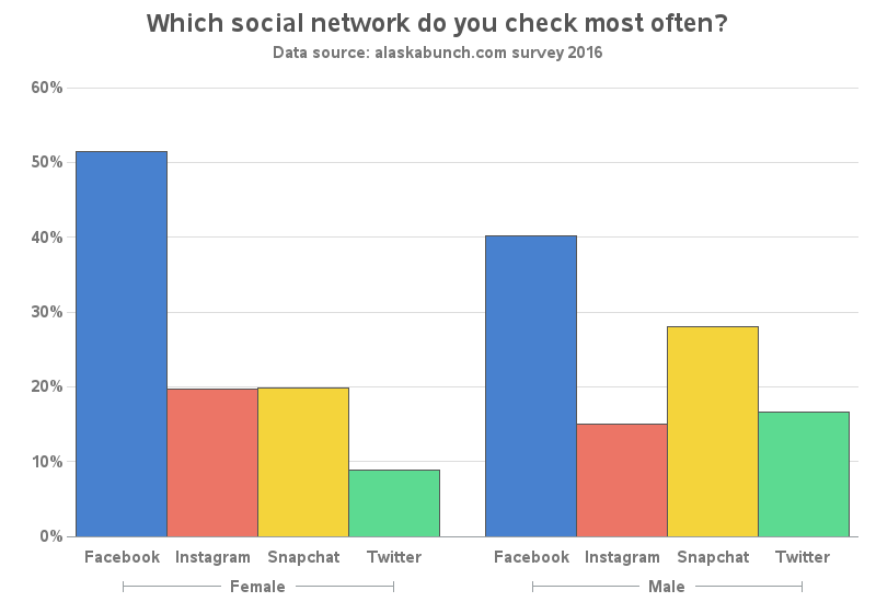
Here's my version of the gender plot - note that I used vertical bars so it's the same layout as the first chart, and I labeled the bars rather than using a color legend.
They also showed the data by age range. The main problem here is that I would put the lower age ranges at the bottom of the graph, and the higher ages at the top of the graph.
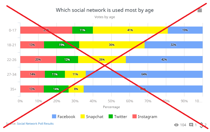
Someone on Statpedia created another version of this graph, using stacked bars. I like the stacked layout better, but their graph still had the lower ages at the top of the graph.
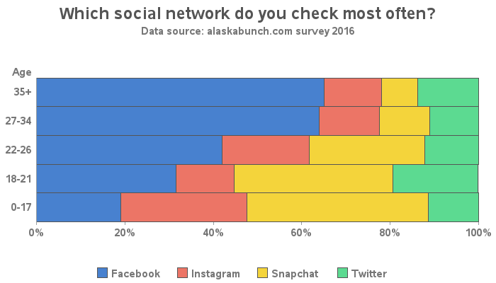
Here's my version of the graph. Note that I put the higher ages at the top of the axis, and I eliminated the space between the bars. My legend is also in the same order as the bar segments are stacked. I think this is a nice sharp (dressed) graph!
Now for the big question - do you agree with the survey results? Why do you think the younger people check Snapchat more often, and the older people check Facebook?


11 Comments
I would prefer to keep the logos, at least in the overall graph. I am not so sure about the others; well: maybe for the gender plot. But then there is the matter of inconsistency: why have them in some, and not in others?
As to why we oldies (but goldies(??) (Beatles reference!)): accepting ONE social medium (the first that was introduced) is OK, but more? "No, thanks, this is getting much too complicated!"
According to some recent statistics from Norway, the same tendency is seen here: Facebook is the preferred social medium among "older" (40+) people.
Glad to see you're going through the thought process of the pros & cons of adding the logos!
I don't know about other 'old' people, but the older I get, the more set-in-my-ways I tend to be, and dislike change. For example, I started out as a Myspace user, and when this newfangled thing called Facebook came along, they had to pry me away from Myspace kicking-and-screaming. ;)
A very interesting work! Is it possible to share with us your codes?
Here's a link to the code:
http://robslink.com/SAS/democd87/social_networks_2016_info.htm
Big improvements over the originals, Robert.
I think the viewer would be best served with annotating the values at the ends of the vertical bars, rather than being forced to run her/his eye between the axis and the bar ends, and only ESTIMATE the precise values.
Similarly, since the bar segments are fortunately small enough to accommodate the actual percents of whole, I think that the horizontal stacked bar chart would be better presented by those percents annotated within the bar segments. The alternative is running one's eye to TWO points on the axis to get bar segment begin and bar segment end values, and then doing mental subtraction.
I always emphasize that people need visuals for easy, quick inference plus precise values for reliable, accurate inference. The "Best Dressed" graphs deliver both visual elements and their precise values to the viewer, and minimize viewer effort to get at them.
Thanks for checking in, LeRoy! As always, you have sage advice for creating the most professional graph, to the highest standards! :)
When it comes to an informal/unscientific/fun graph topic like this, I often find it difficult to decide whether to completely label the data on the graph, or just keep the graph simple/clean (without extra labels) and let the users who are really motivated to 'see' the actual values use the mouse-over text.
I've just now added links from my graphs in the blog, to my robslink version with the mouse-over text (which I hadn't thought about needing to do, until I saw your comment, and noticed that I hadn't done that!)
Thanks again - Robert
When I saw the title of this blog it reminded me of the 1980's band, Roxette and their "Dressed for Success" song :-) https://www.youtube.com/watch?v=kkxj5xVLyj0
Agree the original social network poll result graph with the images seem to distract me from the results. Having a less cluttered, clearer graph is much easier to interpret.
I like how you removed the spaces between the stacked bars as this allows an analyst to compare age groups more easily.
In looking at the age brackets, I find it interesting there are 4 groups below 35 and 35+ - surely there are differences between people in their late-30s and 70's? Or perhaps they had a cut off age for the survey? While dressing a graph is important for visualization and interpretation, it is also important to have a level of understanding of the underlying data too.
As a person in that age bracket, the survey results are not indicative of my activity with about 60% of my social time spent on Twitter.
Yes - they didn't explain how they picked their age brackets, but my guess would be that they figure anyone over 35 was an 'adult' before the Internet became popularly available, so maybe they mostly have similar attitudes towards social media(?)
In the stacked bar chart, it looks like the 27-34 has very similar preferences to the 35+ age range.
I think it would also be interesting to see the difference in "business users" versus "social users" of social media. In your case (spending more time on Twitter), I'm assuming that's more for business use?
Good point about 'business users' versus 'social users' of social media. That would be interesting and also seeing the the cross over 'business social user' ;-)
Yes in my case, definitely spend time on Twitter more for business use.
Rob,
I think the lower ages are at the top because the horizontal bar chart is a vertical bar chart turned (clockwise) by 90 degrees. I noticed the HBAR statement in Proc SGPlot does the same thing. I was trying to make a bar-line plot the other day and wound up reversing the order of the categories and using a format.
Yes - it's not the default, and it usually takes extra work to order the horizontal bars from bottom-to-top, but in cases like this I think the person creating the graph should invest that extra effort! :)