In recent years, more and more people have been registering as independent voters in the US, rather than Democrat or Republican - the independents now control well over 1/3 of the votes. Will they likely vote for the Democrat or Republican candidates in the upcoming election? Let's break down some numbers to try and figure that out...
I was looking around for data and pre-existing graphs on this topic, and found a pretty good article on the Washington Post website. It contained the following graphs, which I thought were fairly insightful:
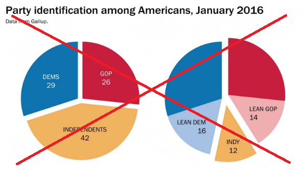
But the more I studied these pies, the more I noticed that they were more of an "attention grabber," rather than something for serious analytics. Here are a few details that could be improved:
- There are no % signs on the numbers, so you have to guess that they are percents.
- The Dems & GOP slices aren't labeled in the 2nd pie.
- 'Exploding' the slices makes it more difficult to compare the angles.
- With no reference lines, it is difficult to tell how much more/less than 25% each slice is.
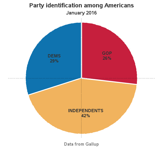
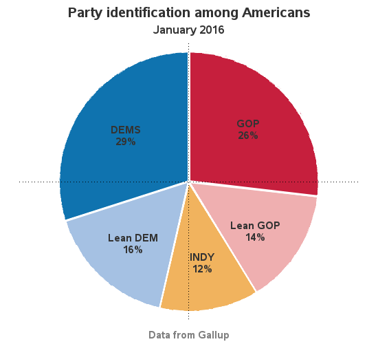
So I re-made the graphs in SAS, and tried to fix all the above problems:
The pie charts show the current (2016) data, but I also wondered how the numbers have changed over time. Luckily, the article also had a graph for that!
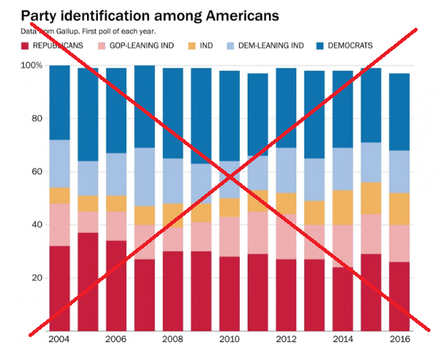
But as I studied their bar chart, I found it difficult to get much precise insight from it. And there were a few aesthetic deficiencies that jumped out at me. Here are the things I tried to improve in my SAS version of the chart:
- There are no % signs on the axis, so you have to guess that they are percents.
- It is difficult to see where the 50% split is, with no reference line.
- The legend colors go left-to-right, but the bar segments are stacked bottom-to-top.
- The gaps between the bars make it difficult to see the 'flow' of data over time.
- Some bars have no year labels, although there is plenty of room to fit them.
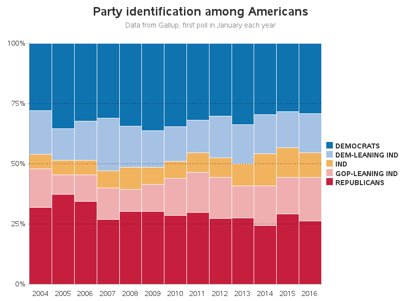
So, historically, it looks like there were definitely more voters leaning Democrat during the 2007/2008/2009 time period, but in 2016 it's pretty close to a 50/50 split. Most independents seem to lean one way or the other, but there are still enough non-leaning ones to influence which party will win. 2016 should be an interesting election year, eh!
Now for some fun...
What would a good blog post be, without a few random photos?!?... Here are some pictures of "I Voted" stickers provided by several of my friends. See if you can match the photos (numbered 1-4) with the correct person's name. (There might even be a way to cheat on this one!)
- Trena: Registered Republican (that's the red slice in the pie chart).
- Becky: Registered Independent, and was voter #26 in the election where she got this sticker.
- Karen: Registered Unaffiliated, but leans somewhat Republican and describes herself as a constitutional conservative (she's the pink slice in the pie chart, like 14% of the voters).
- Margie: Registered Unaffiliated, and describes her thinking as left-leaning Libertarian. (Her nickname is "Clever Sign Chick," so of course would have to make her own sticker.)
Photo #1
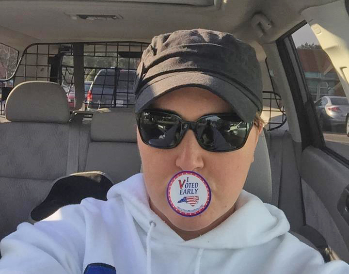
Photo #2
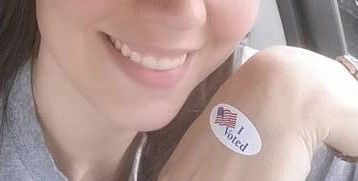
Photo #3

Photo #4

2 Comments
Hello, I recently discovered your blog after installing SAS University Edition. It has been very helpful and informative. I was wondering if you will be continuing to post topics on using SAS Univiersity Edition? Particularly, I would be interested in posts regarding proc sql. Your post back in July 2014 on using proc sql to join tables was great.
Hi Jesse - glad to hear from you, and glad you're using SAS! I typically focus on explaining the graphics in my blogs, rather than details like the SQL joins. But if you look into the full SAS code in my examples, you'll find that many of them use Proc SQL to prepare the data to plot. You will also find some very powerful data-wrangling tricks using the SAS data step in my examples. :)