Lately I've seen several articles about drug overdose deaths being on the increase. But I didn't really like the graphs in those articles, so I tried to create some better ones using SAS ...
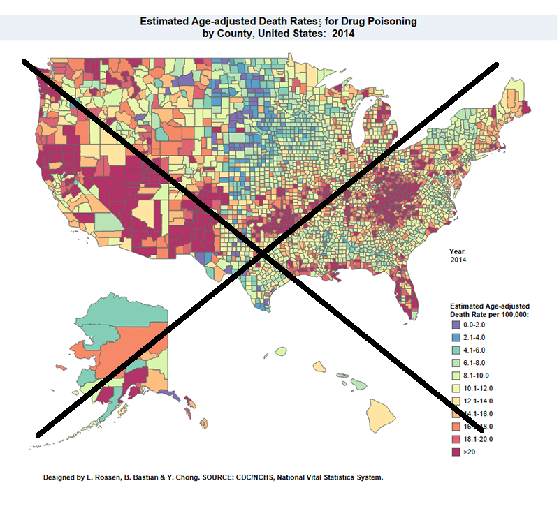
For example, here's a map from the National Center for Health Statistics website (see the 3rd dashboard/tab above the images). I've seen it used in many articles (such as here and here), but I really don't think it's a great map. For example, the odd map projection (the western states look squished), and placement and size of Alaska and Hawaii - none of these physical aspects of the map are what I'm accustomed to seeing. I also don't like that they used a diverging color scheme (red to blue) - this might be appropriate for quintile color binning (where a different color is assigned to 1/5 of the land areas), but in this case sequential/linear binning was used with each color representing an additional 2 deaths per 100,000. Also, 11 colors were used in the legend - this is really too many colors for someone to easily discern, and relate from the map to the legend. And there are no state outlines, therefore it is difficult to determine which state a specific county is in.
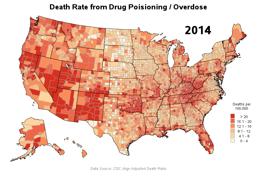
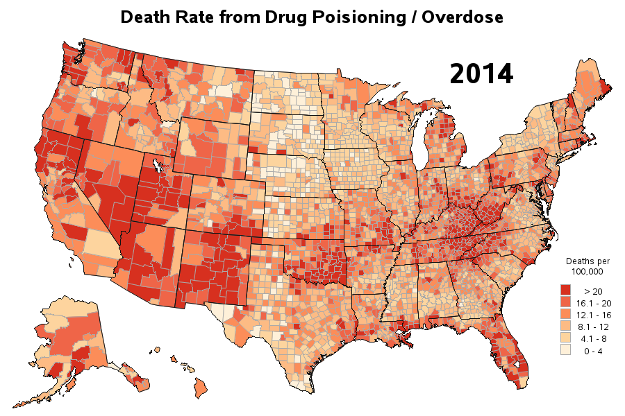
 I located the raw data in csv format, and was happy to find that it imported easily & cleanly into SAS using Proc Import. The data was pre-summarized into the 11 bins used in the NCHS map (above) - but 11 is too many colors to easily discern, and therefore I combined bins such that there were only 6 colors. I then plotted the data on a map using Proc Gmap (using a standard/familiar projection), and used a color gradient with shades of red (rather than using shades of 2 diverging colors like the map above). For a finishing touch, I overlaid the state outlines on the map. You can click the image below to see the interactive version with html hover-text, so you can see the names & values of each county:
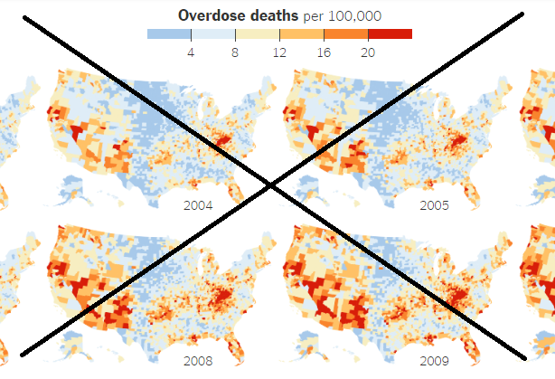
While looking for the data, I happened to come across another visualization that let you see the trend over time, by showing 12 small maps on 1 page (small multiples). Below is a partial screen-capture (the whole grid is a bit wide, and would require too much shrinking to fit into the blog format - but you can click the image to see the full-size example). This map also used a diverging color scheme (blue-to-red), was a bit too small to really see the data at the county level, and lacked state outlines.
Since I had all the years of data in my dataset, I decided to make a few SAS changes to plot the map 'by year', and then package it up into a gif animation (using the simple new syntax that only requires adding 1 line of options to my SAS code). Although I do like small multiples, I think in this case the animation helps the user see where the data is changing.Which states have the highest drug overdose deaths? #dataviz #analytics Click To Tweet
Click here to see my animation (the gif file is 1.7MB, which exceeds the 1.5MB maximum to include in blogs, therefore I can't include it here for you). I set up my animation to loop through 5 times - if you want to see it again, you can probably do that by using Ctrl+Refresh in your browser.

Now for the bigger question - what is causing this increase in drug-related deaths? What other data could we maybe analyze, and look for possible correlations?


11 Comments
It would be interesting to see maps showing the drugs responsible for the overdose deaths in different regions if that data is available. Rise may be due to prescription drugs in some areas, and various illegal drugs in others.
I'd be interested to see that as well! The dataset I found does not have that level of detail, but I bet somebody has it!
Very interesting dataviz! For those of us still learning PROC GMAP, can you please share your code. I'd love to know how you were able to perform the animation. Thank you!
Here's the code for the animation:
http://robslink.com/SAS/democd85/drug_deaths_anim.sas
I'm actually working on a project for the government which is trying to address the problem of overprescribing opioids using Medicare claims. With only 3 years of data (2012-2014), only opioid claims, just for people with Medicare Part D, the increase in opioid claims is staggering. Interestingly the top five prescriber specialties for medical staff prescribing opioids is not what you'd expect (oncology, orthopedics, pain specialties) - it is internal medicine, emergency medicine, nurse practitioners, physician assistants, and family practices by a long shot. I think the best way to start to address the issue is by education targeting these very large segments of the prescribing population. This isn't just a few bad apples - WAY past that.
One interesting idea would be to follow individual use patterns with drug claims: there's some speculation that urgent use of opioids (i.e. following knee replacement surgery, etc.) leads to chronic use of opioids. With the aging baby boomers, these types of surgeries are more and more common.
Finding more effective ways to deal with pain would be great - prescriptions for acupuncture or meditation instead of opioids. This scourge is affecting all walks of life - including those over 65.
Wow - what a wealth of information! Thanks Louise!
great illustration - it raises a lot of questions. My first question is with regard to the various epicenters of activity. What's going on there? Is there a story about those areas (like the KY / TN / VA / WV border area) that is making it a hub? Is that similar to other hubs (like southeast OK)?
My theory (of which I have no data/proof) is that these are areas which had high over-prescribing of addictive pain meds -- and then when the government cracked-down on that, the people who were addicted turned to illegal drugs (such as heroin). And for various reasons (perhaps unpredictable strength/quality, no limits on supply, etc) people are more likely to overdose and die from the illegal drugs.
I've also heard this area has high rates of drug use because of high unemployment rates and the large numbers of workers dealing with chronic pain after many years working hard labor in coal mines.
Wow, that animation is poignant. The map goes from practically white to littered with red. I was just talking to a paramedic friend who works in Charlotte about this last week, and his personal anecdotes match the data.
Yep - Obama has even been speaking on this topic recently! http://www.cnn.com/2016/03/29/health/obama-war-on-drug-abuse/index.html