Did you ever wonder how much fuel all the jets in the world use? Perhaps these graphs will help you get a handle on it...
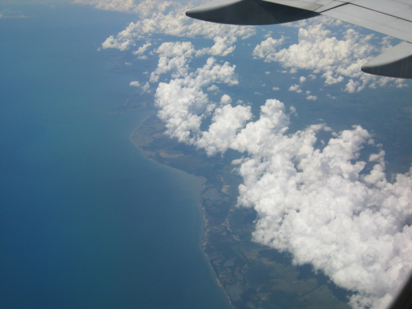
Before we get started, here's a jet-fuel related picture to entertain you. This is a picture I took from the airplane when I went to Peru in 2009. Although it might not have been impossible to drive there, I was certainly happy to be able to make the trip in a jet:
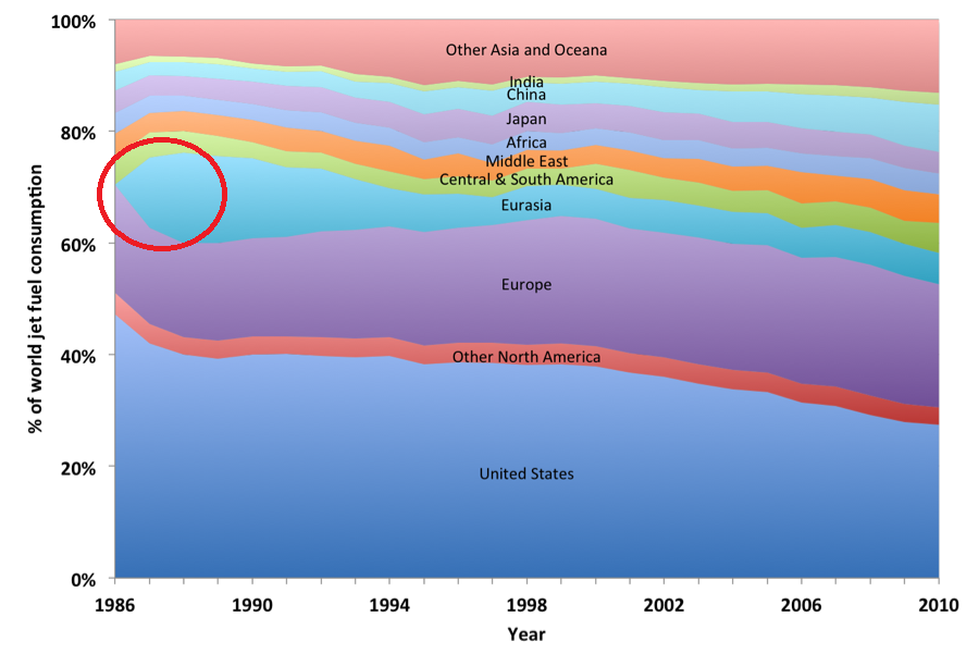
I was recently doing some searches for interesting data, and came across this graph in an article from the International Council on Clean Transportation. One of the key features that jumps out is that Eurasia appears to go from no jet fuel consumption in 1986, to 10-15% of the worldwide consumption in the years immediately after that. This was interesting ... but also seemed a bit improbable.
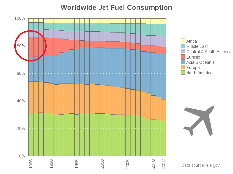
They listed the source of their data as the Energy Information Administration, so I set about finding the raw data, and creating my own graph. I found some very similar data here, downloaded the Excel spreadsheet, and imported it into SAS. In the data I downloaded, Eurasia's 1986 value wasn't even close to zero, therefore I assume maybe the original graph had a 'missing value' in their data(?) Here's my SAS version of the graph:
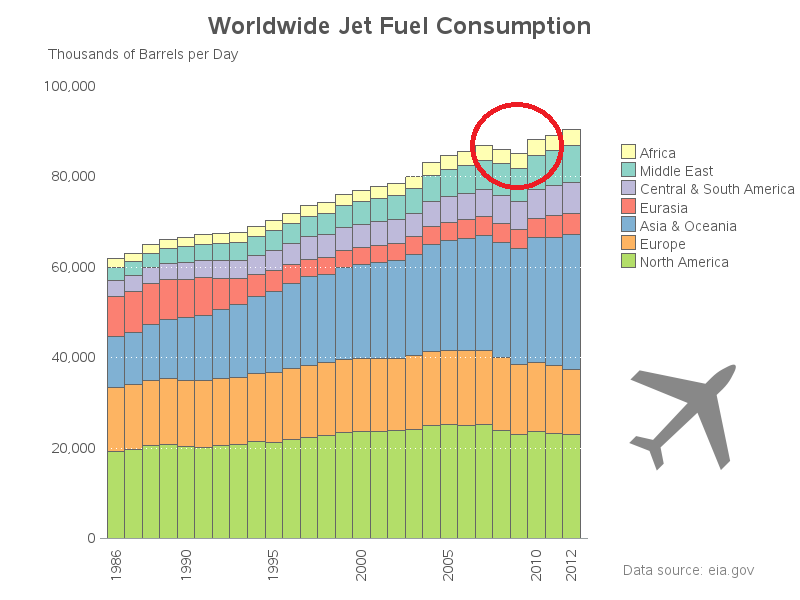
I also thought it would be interesting to see the actual values (rather than the percents), therefore I created a second plot. It is interesting to see that the total worldwide jet fuel consumption has been rising each year, except for the 2008/2009 recession.
Now for the big question -- are jets better or worse for the environment, compared to driving? Of course the answer is probably "it depends". How many people are in the vehicle, and is the vehicle a Prius or a Sequoia? Is it a direct flight, or do you have to fly through a hub that's hundreds of miles out of the way? How much does the particular plane pollute? ... And, the question that always comes to my mind - if we didn't have jets, would people maybe just not travel to that destination in the first place?
So, are you flying more or less than you used to? The last few presentations I've given for customers have been over the Internet (with me sitting in my office here in Cary). I think that makes a lot more sense than traveling thousands of miles to give a 1 hour presentation! :)


6 Comments
Hi Robert
It would be very educational, if you could please share your SAS code you used to create the graphs from the raw excel data?
many thanks
Here you go! http://robslink.com/SAS/democd83/jet_fuel_consumption_info.htm
Interesting that there was seemingly no effect on North American consumption in 2001. I would think the complete shutdown of air traffic in the wake of 9/11 would put a little dent in that.
Interesting discovery and analysis Rob! I certainly find your SAS graphs easier to comprehend and identify trend. Great work.
In terms of your question of flying more or less... Definitely more however the number of web meetings/conference calls has also increased. Perhaps a globalisation work trend?!?
Ha! - In your case, it's no doubt because you're becoming more famous every year, and your worldwide audience demands your presence! :)
Hehehehehe hardly... I think it's becoming "the way we work" today with telecommunication being more accessible and easier than 10-15 years ago. Remember dial up! ;-)